sitechecker.pro logo mobile

Free Complete Site Audit

Access a full website audit with over 300 technical insights.

Something went wrong. Please, try again later.
Trusted by
Sitechecker trusted company

Free Website SEO Checker & Audit Tool

  • Scan the site for 300+ technical issues
  • Monitor your site health 24/7
  • Track website rankings in any geo

Optimization of a website’s performance is crucial and includes optimizing the site’s performance on any mobile device. Modern SEO and web design approaches are focused on mobile phones and tablets, as mobile traffic is dominant now. Friendliness of mobile website versions ensures a high search engine ranking position and a better conversion rate.

Mobile-Friendly Test is one of the tools that helps to check how friendly your site operates on different devices. But what does it mean to be a mobile-friendly site? Let’s move to the core of this question and analyze mobile-friendliness step by step.

The mobile version of the website is a duplicate version of the main site. The mobile version uses a special layout. It allows you to conveniently view and navigate through the resource pages from mobile phones and tablets.

Mobile-Friendly Test is a special tool that helps you see what score your website has according to Google search calculation parameters. This is a set of factors provided by Google that help determine how convenient your site’s mobile version is to users.

Mobile-Friendly Testing Tool Usage: a Step-by-Step Guide

Use Mobile-Friendly Testing Tool to understand how friendly your website is for mobiles and how it looks on different devices.

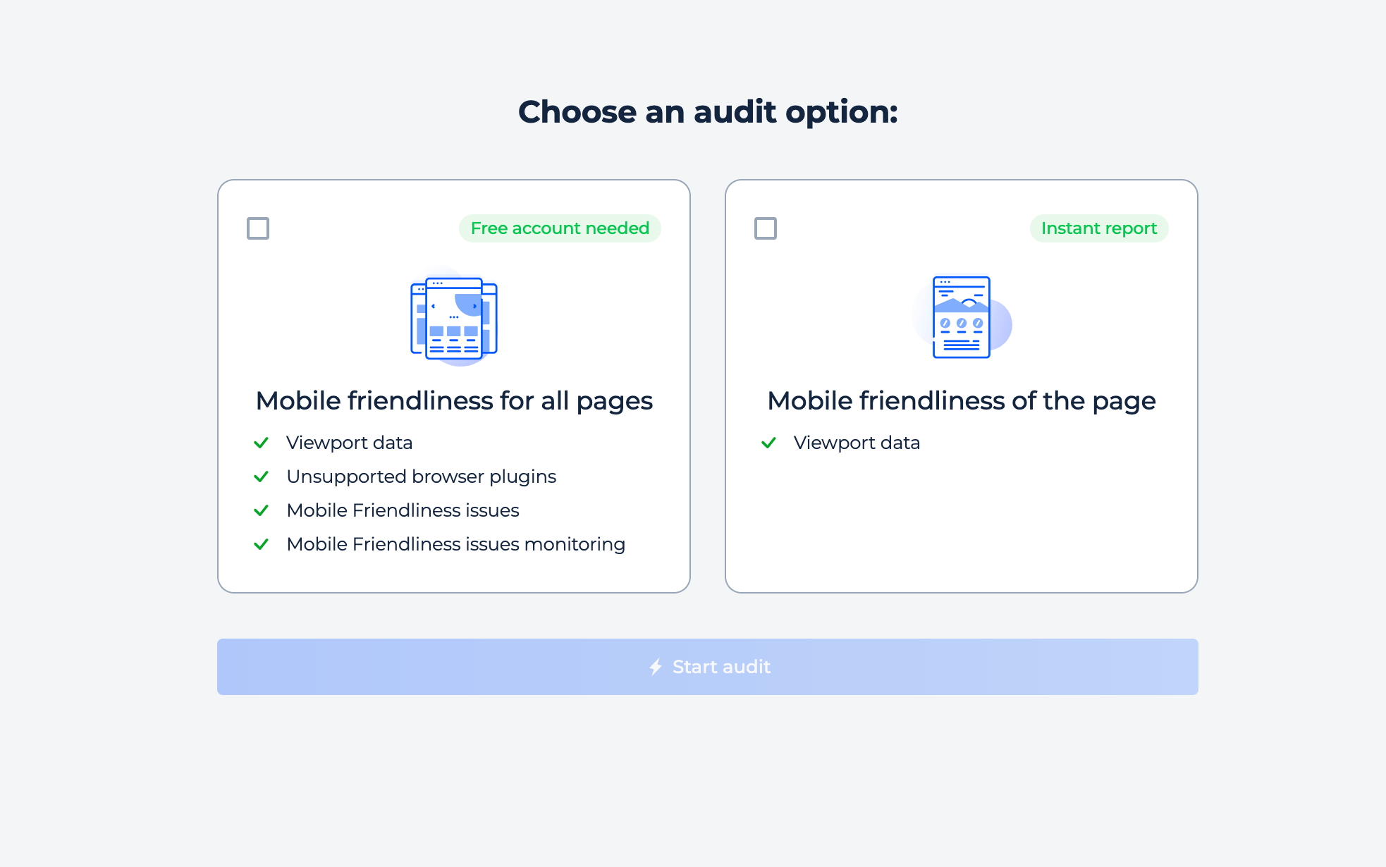
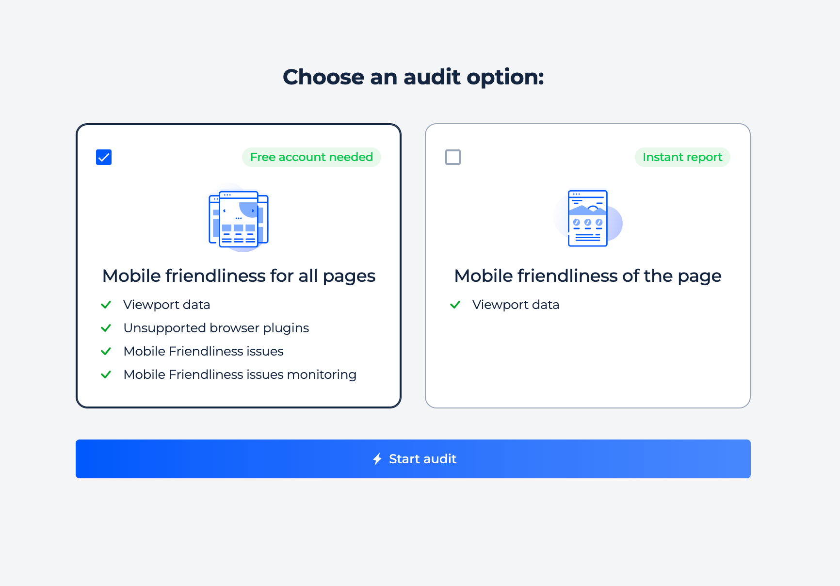
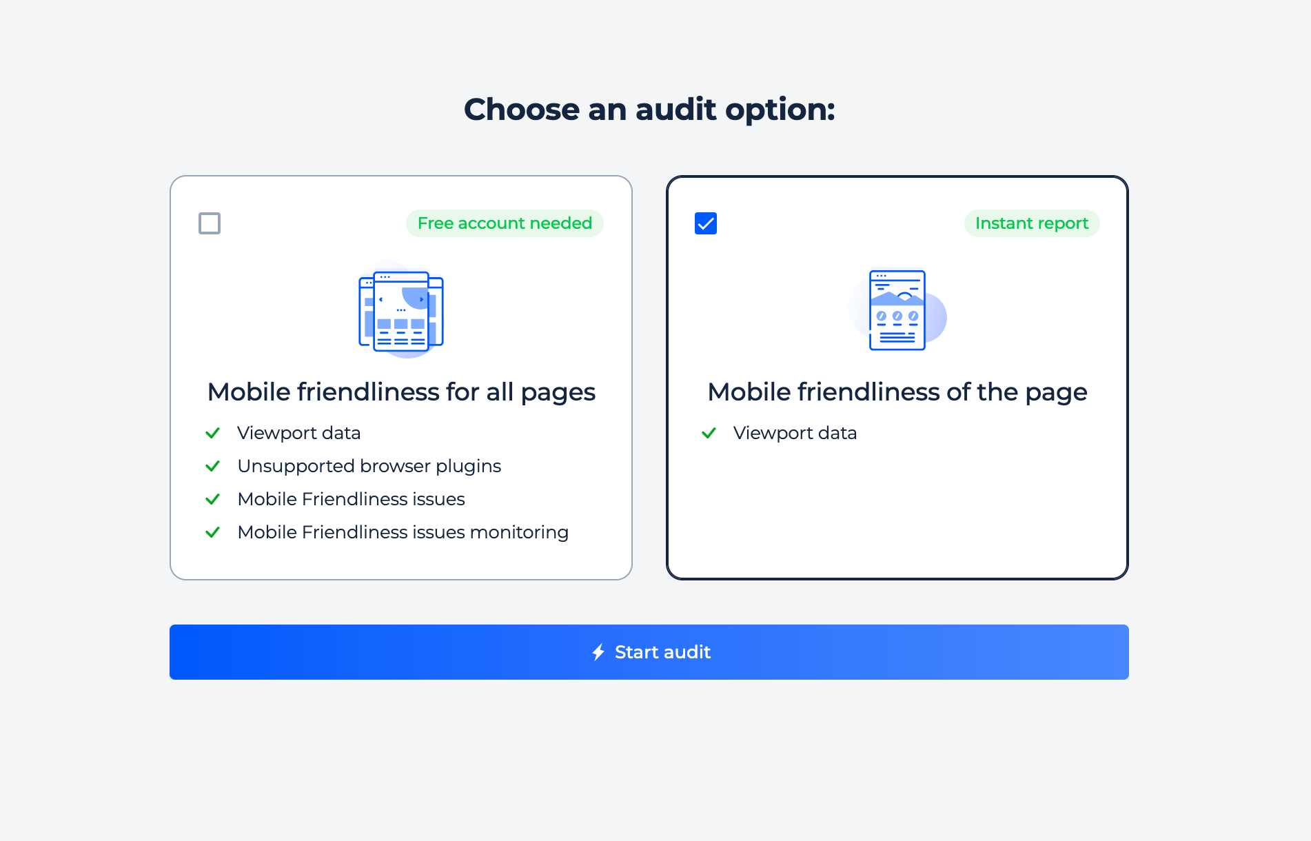
You can use our scanner tool to check either a domain or a specific page. Simply choose the option that best suits your needs, insert the URL or domain, and start your free trial. Our scanner will begin scanning data immediately after you enter the information. For more detailed instructions on how to use our scanning tool, please see below.

Mobile friendly checker URL VS domain

Domain Check

Step 1: Start the free trial by entering your domain

If you want to test if a domain is mobile-friendly, you can use the “check domain” button. To do this, enter the domain name into the box below and click on the free trial button. You will then be able to log in using your Google or Facebook account. This process is quick and easy!

Mobile friendly domain check

Step 2: Get the result

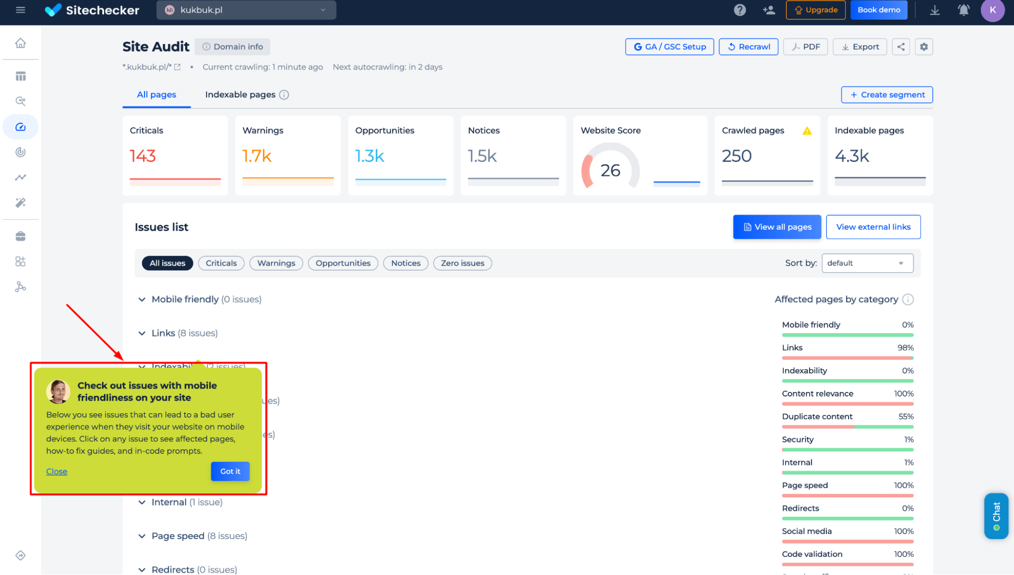
Our crawler will scan your domain and compile a list of URLs with mobile-friendly issues. This will help you not only fix the mobile-friendly problem for your full site but also predict if any new issues may arise. By clicking on an issue, you will be able to view a list of URLs related to that issue, a button to “view the issue in code”, and instructions on how to fix it.

Mobile friendly test site audit report

Domain/website mobile-friendly scanner has the following additional features

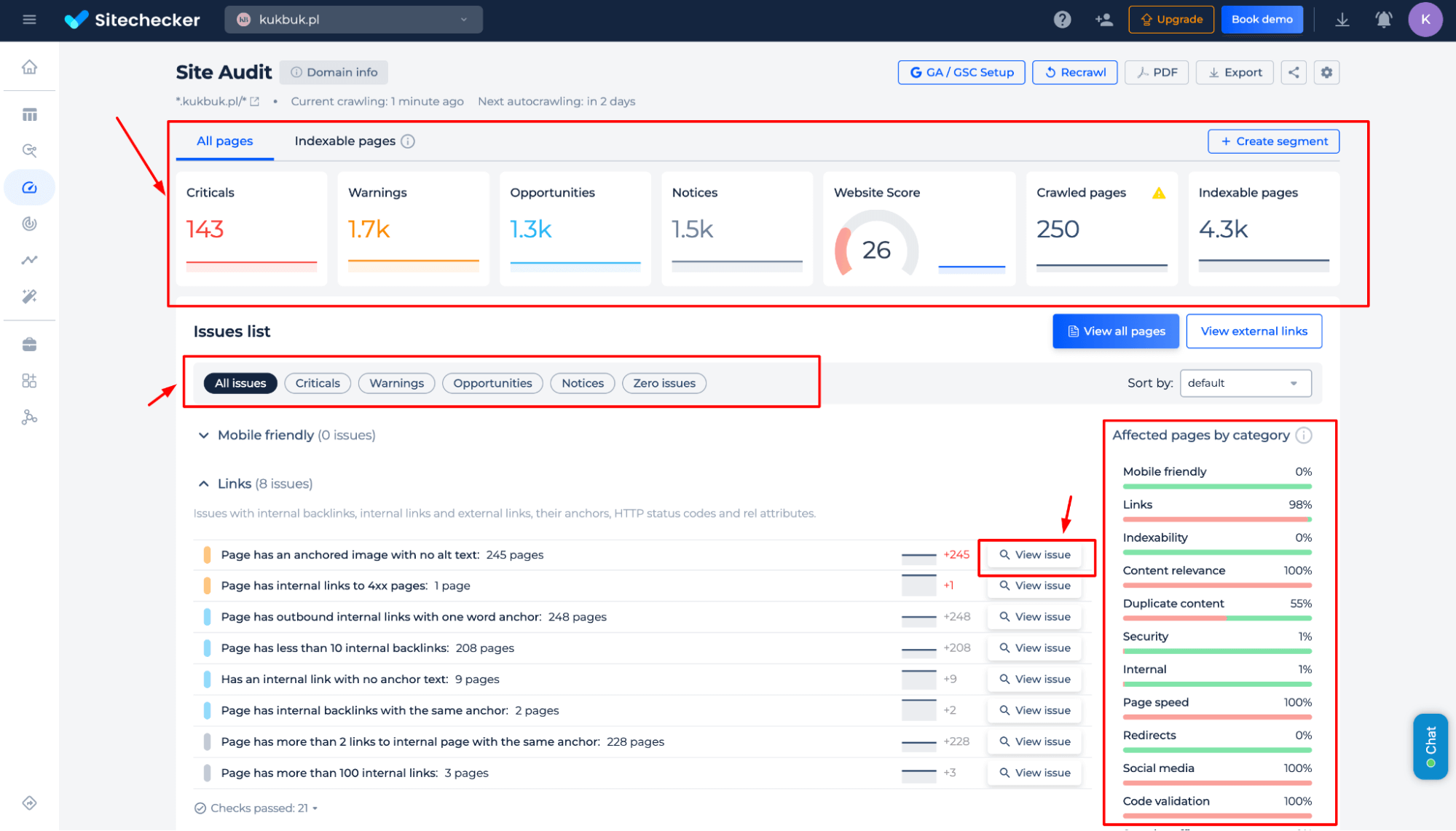
On the mobile-friendly site audit summary page, you will not only get information about any errors, but also a full list of other internal issues present on your site.

You can view these issues by types, such as Critical, Warnings, Opportunities, and Notices. Alternatively, you can view them based on categories, such as Links, Indexability, or Content Relevance. This allows you to focus on fixing the issues that will have the biggest impact on your website’s success.

Mobile friendly checker - domain test feature

Page Check

Step 1: Insert your URL and start the free trial

To get started with your URL test, just choose the “Check page”enter your URL into the box below, and hit the button. You can begin using your free trial immediately, with no need for a credit card, simply by logging in with your Google or Facebook account. Quick and easy – so what are you waiting for? Start now.

Mobile friendly checker - URL test

Step 2: Interpreting the mobile optimization checker results

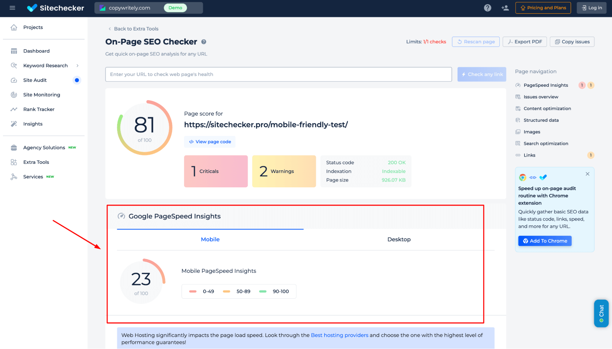
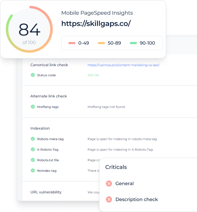
Mobile-Friendly testing tool will show you the preview of your page on mobile devices. Additionally, it will collect Mobile Page Speed Insights feedback about your URL. It is an official Google extension. It analyses websites and provides tips on performance improvements. All these tips will also be provided on the result page. Thus, there’s no need to visit other websites or use other tools to check how friendly your website is.

Mobile friendly tester - URL audit

Features of URL mobile-friendly analyzer

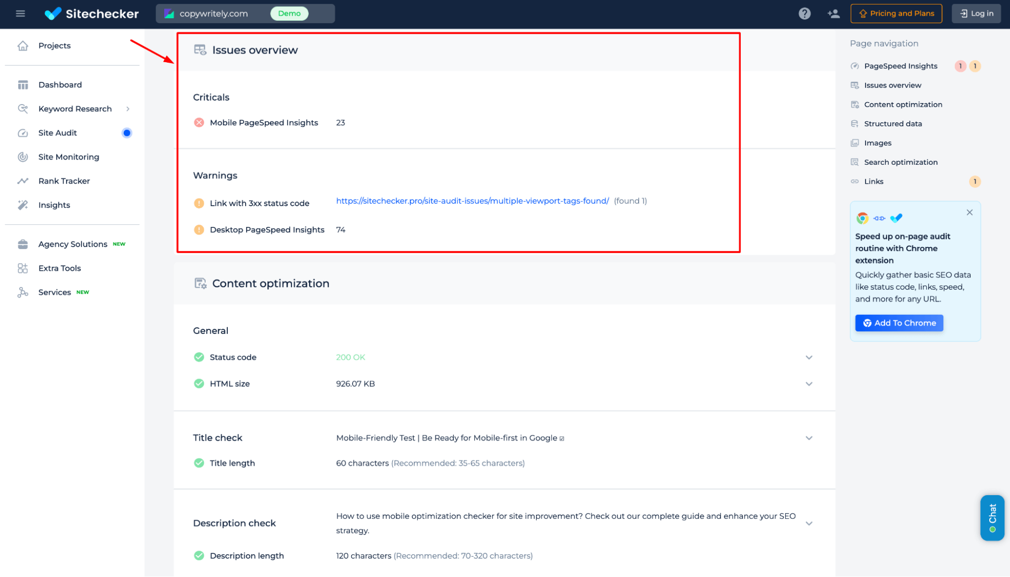
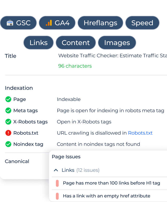
Additionally, the results page will provide you with a page SEO audit that identifies any issues your page may have.

Mobile friendly checker - domain test feature

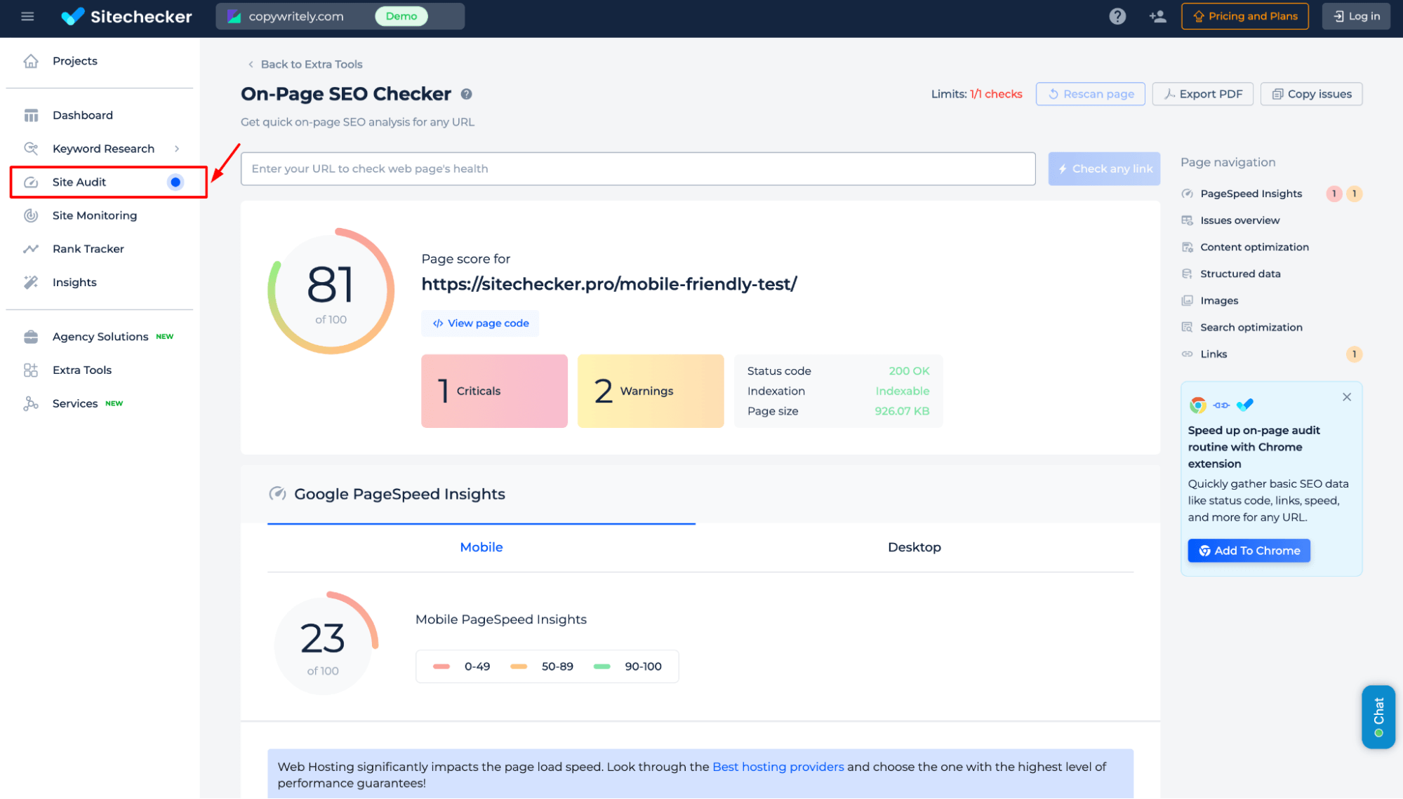
If you want to check the responsiveness of other pages on your site, it is very easy. We have already done the audit for your site. So simply close the page details and enter the URL of the page you want to test into the search box on the “All pages” tab. You can get more information by clicking on the URL.

Mobile friendly checker - domain test search feature

Checking mobile-friendly is important, but not enough to rank high!

Check not only this issue but make a full audit to find out and fix your technical SEO.

Something went wrong. Please, try again later.

Cases Mobile-Friendly Test is Needed

Basically speaking, every site needs the Mobile-Friendly Test. The matter is that users tend to visit websites from different mobile devices; therefore, your site must be easily accessible. Besides, Google SERP also analyses information on the mobile site versions. Use Mobile-Friendly Test if you want:

  • Gain more traffic by appearing in higher search engine positions
  • Correspond to Google demands and improve SEP
  • Increase average time on site from different devices.

Check out what Google says about mobile-friendly version & mobile-first indexing.

Tips to make your website mobile-friendly

Mobile-Friendly Tool will show the problems on your website, as well as recommendations on how to fix them. Additionally, you can follow these recommendations. With their help, you can easily score better rank.

Tip 1: Do not create one more separate mobile-friendly website

Some developers came up with the idea of making a separate site for the mobile version. It means you need to cut out content with important information like photos, videos, etc., on a mobile site.

Moreover, by creating two websites with the same content, you will get two separate links in search engines. Therefore, it will cause trouble with trying to have the content show up.

Note: But if you have decided to do separate versions of your website, don’t forget to place rel=”alternate” mobile attribute. It’s an important step to prevent duplicate content penalty issues on your website. Don’t forget your website to check for duplicate content. So let’s sort out how the “rel=mobile” attribute works.

Add a special tag with the attribute link rel=”alternate” on each page of your desktop version. It must lead to the corresponding page of the mobile version. This will help GoogleBot find the content which is optimized for mobile devices. We need to point to search bots that there is another version of the website page.

Your piece of code will be composed like:

link rel="alternate" media="only screen and (max-width: 640px)" href="https://sitechecker.pro/"

Secondly, each web page of mobile version should contain the canonical tag, which leads to the version of the same page but with the usual formatting:

link rel="canonical" href="https://sitechecker.pro/"

Tip 2: You should only use responsive design

Responsive design is the best solution for a ‘user as a friend’ approach in website design. Why? Because it allows developers to make the site viewable on different devices and screen sizes. 

Responsive design helps to make images and layouts more flexible. It also keeps stylesheet media queries cascading from the beginning. The web page will figure out the user’s screen size and accordingly change the layout. It will greatly simplify the task for developers while creating a site and improve site usability.

Tip 3: Always use a viewport meta tag


The browser rendering engine determines the scale of the website size through the viewport. That is why it is critical to code for multi-device resources. If you do not use the viewport meta tag, your website will not work properly on mobile devices. It literally tells the browser how the page should fit the screen. So if Page Has No Viewport Tag, it is necessary to fix the issue.

What is more, there can be some other problems with the tag including viewport <meta> tag initial-scale being incorrect or when multiple viewport <meta> tags being found in the <head>.

Tip 4: Button sizes and font sizes importance

Button sizes as font sizes are very important for mobile devices. Why? With small website buttons, users may miss them or accidentally hit the wrong one. It is always annoying when your fingers literally cannot hit the right button because of its size. Apple recommends going with 44px by 44px button sizes or above.

Your mobile-friendly website should have a font size of at least 14px; it is not that big! By using a 14px size, you make sure that users will not need to use zoom in order to read the content on your site. You can use a 12px size only for labels and forms. It’s important to fix the issue if the font size is too small for mobile devices.

Tip 5: Images with high-resolution

If you consider your website with a high standard, high-resolution images are mandatory. The latest IOS, Android, and Windows mobile devices have high-definition screens. So, to avoid blurry or pixelated images, we recommend using very high-resolution images.

Tip 6: Do not use default zoom

We definitely do not recommend using auto-zoom for the mobile-friendly website. It can mess up layout elements like navigation content and images. Using meta tag will solve zoom problems automatically. But by default, zoomed images can appear too big or too small, which will annoy users because of having to waste time adjusting.

Tip 7: YouTube videos on mobile site

It is not that easy to use videos on the mobile website version. YouTube video is the best answer to this problem. Videos on YouTube combat all difficulties in viewing videos on mobile — in fact, YouTube already made everything for you; all you need to do is use it.

Tip 8: Wide user mobile experience

What does it mean? You can make a perfect website, but you should always provide a choice to your users. “View desktop version” or “go to the full site” is a necessary button because there are still users who prefer the full site interface, so give them this opportunity.

Tip 9: Always testing

Never stop testing! It is usually possible to make a better version. You should always think like a user and find out what can be further developed, changed, or even deleted. You can try Google’s mobile-friendly tester tool and check if your site is perfect for Google search.

  • Make tests with different moblie devices of different operating systems (Android, Windows, and IOS)
  • Make tests on different screen size devices (tablets, surfaces, and others)
  • Test not only the front page but all of them, all buttons and user actions
  • Ask your friends or a specialist to test it for you, as they should have a fresh look.

These tips should help you make your website mobile-friendly, creating maximum comfort for users and turning them into a permanent audience. Additionally, using a Googlebot Simulator can help you ensure that Google’s crawler can effectively navigate your site across all devices and operating systems, identifying any potential issues that could affect your site’s search engine performance.

FAQ
You can use mobile-friendly test right in your browser. Insert URL of the website you want to check, press Enter and get the results.
It means that a website demonstrates perfect performance on all mobile devices, like smartphones and tablets.
To make your website mobile-friendly, run a test and check the results. You can use our tips to improve the indicators.

What users are saying

Data supplied as of 04/24/2024
Check other of our awesome SEO tools!
Content Optimization
Keyword Research
Link Building
Off-Site SEO
On-Page SEO
Rank Tracking
View more tools

So, soon? Well, before you go…

Get instant on-page SEO analysis of your home page

  • Detect broken links
  • Detect issues with content optimization
  • Check PageSpeed for mobile and desktop
Something went wrong. Please, try again later.
You’ll get the report in 2 seconds without required signup
exit-popup-image