


This issue note informs the user that the internal URL contains a browser view window tag with the minimum scale set by the instructions.
What Does “Viewport Meta Tag Minimum Scale” Mean?
The viewport is the area of the browser window where the user can view all the content on the page. The viewport depends directly on what device the user is viewing your site from.
The viewport attribute sets instructions for the browser to control page size and scale.
We recommend you to learn more about working with the viewport tag in this article.
What Triggers This Issue?
This error message will appear if at least one page with the tag at the minimum scale is detected while crawling the site.
The smaller the screen of the device from which the user views the page, the smaller the minimum value of scale will be. Keep these instructions in mind when optimizing your site for mobile devices.
How to Check the Issue?
You can use the SEO crawler to check the given scale instructions. During the scan, you will find all internal pages that contain the minimum tag value.
Matt Cutts from Google, talks more about how much time you should spend on meta tags. Check out the information in this video.
Sitechecker is one of the tools that can help you. In the screenshot, we’re looking at the “Mobile Friendly” section of the Site Audit feature from Sitechecker. This section identifies issues that could potentially lead to a poor user experience when your website is accessed on mobile devices.
One specific issue highlighted is the “Viewport Meta Tag has a minimum-scale set.” This refers to the minimum-scale attribute in the viewport meta tag, which controls the minimum level of zoom on a website. Setting this attribute can restrict users’ ability to scale the content, which may not be ideal for accessibility and usability, especially on mobile devices.
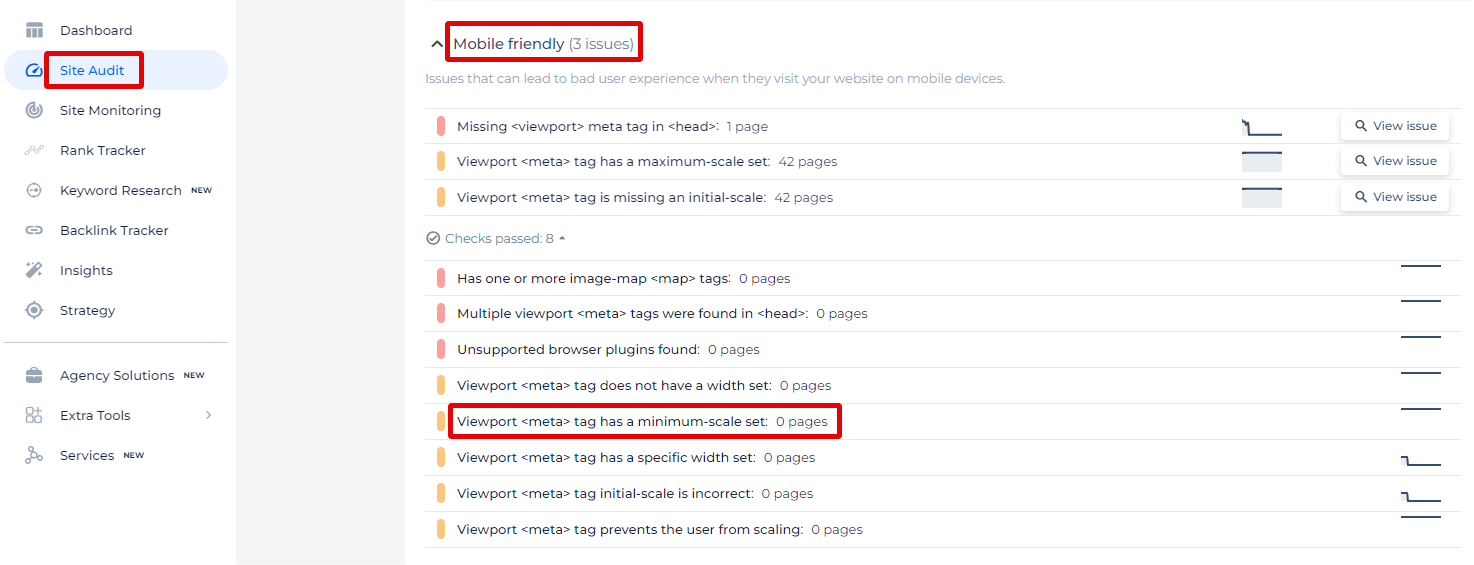
By clicking on “View issue,” users can receive a comprehensive list of pages where this particular issue has been detected.
Unlock Seamless Mobile Experiences!
Find and fix viewport minimum-scale issues swiftly with our Viewport Meta Tag Checker.
Why is This Important?
The minimum scale of the browser viewport is an optional attribute for the viewport. This attribute specifies the minimum scale that will be available to website users.
Specific setting instructions for the “minimum scale” attribute value can make it difficult for users to scale the viewport properly. It can reach the user, still not being able to adjust the scale to their needs. It will finally lead to a problem with the accessibility of your site for users.
Remember that accessibility is an important factor that search engine robots consider when ranking your site in search results.
How to Fix the Issue?
To fix the “Viewport Meta Tag Minimum Scale Issue,” you need to ensure that your viewport meta tag is correctly set up to allow users to zoom in and out on your website. Here’s how you can do that:
Use a Properly Configured Viewport Meta Tag
The viewport meta tag should be placed within the <head> section of your HTML document. A typically it looks like:
<meta name="viewport" content="width=device-width, initial-scale=1.0, minimum-scale=1.0">
Here’s a breakdown of what each attribute does:
- width=device-width: Sets the width of the viewport to the width of the device.
- initial-scale=1.0: Sets the initial zoom level when the page is first loaded.
- minimum-scale=1.0: Prevents the user from zooming out beyond 100% (the original size).
Allow User Scaling
If you want to allow users to zoom in and out, ensure that the user-scalable attribute is set to yes:
<meta name="viewport" content="width=device-width, initial-scale=1.0, minimum-scale=1.0, user-scalable=yes">
- Check for Conflicting Tags: Ensure there are no conflicting viewport meta tags in your HTML. Having multiple tags can cause unexpected behavior. Only one viewport meta tag should be present.
- Test Responsiveness: Use your browser’s developer tools to test the responsiveness of your website. Ensure that users can zoom in and out as intended. You can open developer tools (usually by pressing F12 or Ctrl+Shift+I), then toggle the device toolbar to see how your site looks on different devices and adjust the zoom level.
- CSS Considerations: Make sure your CSS does not override the intended behavior. For instance, avoid using fixed sizes and instead use responsive units like percentages, em, rem, or viewport units (vw, vh).
- Accessibility: Consider accessibility best practices. Users with visual impairments rely on zooming functionality to read content comfortably. Ensuring your screen area is configured correctly supports these users.
Here’s an example of a well-configured one:
  <!DOCTYPE html>

<html lang="en">

<head>

    <meta charset="UTF-8">

    <meta name="viewport" content="width=device-width, initial-scale=1.0, minimum-scale=1.0, user-scalable=yes">

    <title>Your Website Title</title>

    <!-- Other head elements -->

</head>

<body>

    <!-- Your content goes here -->

</body>

</html>


 URL in XML Sitemaps")