


What is a Viewport Meta Tag?
The viewport meta tag is a piece of HTML code that tells the browser how to display the web page on the device. It is placed in the <head> section of the HTML document.
The viewport meta tag has two main properties:
- width: Controls the width of the viewport. It can be set to a specific number of pixels or to the special value device-width, which is the width of the device in terms of CSS pixels.
- initial-scale: Sets the initial zoom level when the user visits the page.
The most common viewport meta tag is:
This tells the browser to set the width of the viewport to the width of the device and to display the page at its original zoom level.
The viewport meta tag is important for responsive web design, which is the practice of designing websites that look good and function well on all devices, regardless of their screen size or orientation. By using the viewport meta tag, you can ensure that your website will be displayed correctly on all devices.
Basic Properties of the “viewport” <meta> Tag
The tag is used to control the layout on mobile browsers. Here are some of the basic properties (or directives) you can set within the content attribute of this tag:
-
width: Determines the width of the viewport. Can be set to a specific number of pixels like or to the special value device-width, which means the screen width in device-independent pixels.
<meta name="viewport" content="width=device-width"> -
initial-scale: Sets the initial zoom level when the page is first loaded by the browser. A value of 1 indicates no zoom.
<meta name="viewport" content="width=device-width"> - minimum-scale: Determines the minimum zoom level to which a user can zoom out. For instance, a value of 0.5 means the user can zoom out until the page is half its original size.
- maximum-scale: Sets the maximum zoom level to which a user can zoom in.
- user-scalable: Specifies whether the user can zoom in or out. It can be set to yes (default) or no. However, it’s generally recommended not to disable user scaling for accessibility reasons.
Example (not recommended for most sites):
<meta name="viewport" content="user-scalable=no">- height: Similar to the width property, it determines the height of the viewport. However, it’s less commonly used than the width property.
- shrink-to-fit: In certain cases, particularly with websites that aren’t designed responsively, content can overflow the viewport width. The default behavior in some mobile browsers is to fit this content by shrinking it. By setting shrink-to-fit=no, you can override this behavior, but it’s less common since most modern websites aim for a responsive design.
You can combine multiple properties together by separating them with commas. A common configuration for responsive designs is:
<meta name="viewport" content="width=device-width, initial-scale=1">This configuration sets the width of the viewport to the width of the device and establishes an initial scale of 1, ensuring that the layout is scaled properly for the device from the outset.
Common Viewport Sizes for Mobile and Tablet Devices
Viewport sizes can vary widely among mobile and tablet devices due to the vast number of manufacturers, models, and screen resolutions. However, there are some common viewport sizes that designers and developers frequently use as reference points for responsive design.
| Small | Medium | Large | |
| Mobile Devices | 320px × 480px (e.g., older iPhones, many smaller Android devices) | 360px × 640px (e.g., many modern smartphones like some models of Samsung Galaxy, Google Pixel, etc.) 375px × 667px (e.g., iPhone 6/6S/7/8) 414px × 736px (e.g., iPhone 6/6S/7/8 Plus) 412px × 846px (e.g., some Android devices) |
428px × 926px (e.g., iPhone 15 Pro Max) |
| Tablet Devices | 600px × 1024px (e.g., Samsung Galaxy Tabs, Amazon Fire) | 768px × 1024px (e.g., iPad in portrait mode) | 834px × 1112px (e.g., iPad Pro 10.5-inch) 1024px × 1366px (e.g., iPad Pro 12.9-inch in landscape mode) |
Remember, these are just some of the most common sizes. Many devices fall outside these ranges, and new devices with different screen sizes and resolutions are released regularly.
Also, it’s important to note that when designing or testing for responsive web design, relying solely on specific viewport sizes isn’t the best approach. Instead, it’s often recommended to design with a fluid approach in mind, ensuring that content adjusts gracefully across a variety of screen sizes. This is often achieved using flexible grids, flexible images, and media queries.
Tools like Chrome DevTools and other browser development tools provide options to simulate different sizes, aiding developers and designers in testing their work across various devices.
Viewport Meta Tag Impacts SEO
The viewport meta tag doesn’t directly impact SEO in terms of search rankings, but it has indirect influences due to its role in providing a mobile-friendly user experience. Here’s a breakdown:
Mobile Friendliness: Google and other search engines prioritize mobile optimization. The viewport meta tag is a key component of making a website mobile-friendly. Without it, mobile devices might not display content properly, leading to a poor user experience. Websites that aren’t mobile-friendly can see a ranking decline in mobile search results.
User Experience (UX): User experience is a factor that search engines consider, especially when it comes to mobile users. A website that’s hard to navigate on a mobile device because it doesn’t use a viewport meta tag can have higher bounce rates, which can potentially affect its SEO ranking.
Page Speed: While the viewport tag itself doesn’t impact page speed, the broader concept of mobile optimization often includes optimizing for speed. If your site is optimized for mobile devices (using the tag and other techniques), it’s more likely that it’s also optimized for speed. Faster-loading sites can be favored by search engines.
Core Web Vitals: Google introduced Core Web Vitals as a set of metrics to measure the health of a website in terms of user experience. While the meta tag is not a direct metric within Core Web Vitals, ensuring your site is mobile-optimized (with the help of the viewport tag) can aid in achieving better scores in these metrics, which in turn can influence SEO.
Google About the Importance of Viewport Meta Tag
John Mueller has tweeted about the viewport meta tag a few times, and his general advice is to use it on all of your web pages. He has said that it is a good way to ensure that your website is displayed correctly on all devices, and that it is also a signal to search engines that your website is mobile-friendly.
In one tweet from September 20, 2018: Mueller said:
And in another tweet from March 28, 2019, he said:
Mueller has also said that there is no limit to the number of meta tags that Google can crawl and understand, but that it is important to use them wisely. He has also said that Google ignores the meta keywords tag, so there is no need to use it.
Overall, Mueller’s advice on the viewport meta tag is to use it on all of your web pages to ensure that your website is displayed correctly on all devices and that it is also a signal to search engines that your website is mobile-friendly.
Troubleshooting and Solving Viewport Meta Tag Errors
Non-responsive Design
When a site appears very small on mobile or requires horizontal scrolling, it may not be using a viewport meta tag or might be using it incorrectly. This affects mobile usability and can hurt SEO rankings on mobile searches.
<meta name="viewport" content="width=device-width, initial-scale=1">Disabled Zoom
Some sites restrict user zoom by setting the “user-scalable” property to “no”. This can hinder the usability for users who need to zoom for accessibility reasons.
Inconsistent Scaling
If the website appears zoomed in or out unpredictably on different devices, it might be due to incorrect values for the initial-scale, maximum-scale, or minimum-scale properties.
Fixed Width Viewport
Sometimes sites set a fixed pixel value for the viewport width, which can create issues on devices that have a different screen width.
Overriding Natural Scaling
Using values that force content to be too large or too small on certain devices can hamper the natural viewing experience.
Shrink-to-fit Issues
On some older mobile browsers, content that overflows the viewport width might cause issues. The browser’s default behavior might shrink content to fit, which can lead to small fonts and clickable elements.
Regularly testing your site on various devices and browsers will help catch viewport-related issues. Responsive design testing tools and browser developer tools can be instrumental in identifying and rectifying viewport meta tag errors.
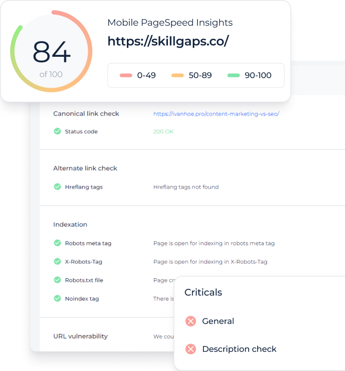
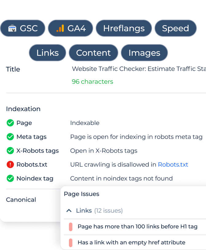
Verify if the Viewport Meta Tag is Functioning Properly on the Page With Sitechecker’s Viewport Meta Tag Checker
Viewport Meta Tag Checker is a specialized tool designed to assist website owners and developers in evaluating the presence and functionality of the Viewport Meta Tag on their sites. With the increasing importance of mobile optimization and responsiveness in today’s digital landscape, ensuring the correct implementation of this tag is crucial for an optimal user experience.
By simply entering the URL of your website into Sitechecker’s interface, the tool will swiftly scan the site to determine whether the viewport meta tag is present and set up correctly. Any issues or discrepancies are highlighted, giving users immediate feedback on potential areas of improvement.
Leveraging the insights provided by Sitechecker can help webmasters ensure their site’s design and layout render appropriately on various devices. This not only enhances user engagement but also aids in improving search engine rankings, as mobile optimization is a significant factor in SEO.
Conclusion
The viewport meta tag is an essential component of responsive web design, ensuring that web content is displayed correctly across various device sizes. Positioned within the HTML’s head section, it governs properties like width, initial-scale, and user zoom capabilities. Widely recognized viewport sizes for mobile and tablet devices guide designers, though fluidity in design is recommended over strict adherence to specific sizes. Importantly, while this tag does not have a direct impact on SEO rankings, it influences mobile-friendliness, user experience, page speed, and Core Web Vitals – all indirectly affecting SEO. Google’s John Mueller underscores its significance, advising its consistent use for mobile optimization. Errors related to this tag can adversely affect the mobile user experience, emphasizing the necessity of tools like Sitechecker’s Viewport Meta Tag Checker to ensure proper functionality.