


The Viewport meta tag is used to adapt the site to all devices from which users view your site and sets instructions for displaying the visible area in the mobile browser (like on iOS). The browser viewport is the window area in which the user can see media content. The browser then displays scroll bars to access all the content on a particular page. It is usually not the same size as the displayed page.
Narrow-screen mobile devices display pages in a virtual window, which is normally wider than the screen, and then shrink the result for instant viewing by users. Users can then move around the page and zoom in to see different areas. This method exists so that pages that are not optimized for mobile devices adjust their size to fit the device when displayed with a small viewing area width. With this CSS meta name=viewport, developers can improve the appearance of sites for devices with a narrow screen.
We have created a free tool Meta Name Viewport Test. With its help, you can check how the pages of your site are displayed on mobile devices and whether the tag on the page is contents correctly.
Let’s see how you can use the tool to check the settings of your website.
What is a Viewport Meta Tag
The window view area is shown to the user without scrolling. It means it’s easy for the user to read text, view pictures, scroll through content, fill in columns, and make purchases.
Let’s break down the element options. The width property indicates the size of the viewing area. This value can be set to a certain number of pixels. Sometimes a problem occurs when the viewport <meta> tag sets a certain width. You can also read the article about how to fix the issue of the specific HTML viewport width .
The initial-scale property controls the zoom level when the webpage first loads. The maximum-scale, minimum-scale, and user-scalable properties control whether users are allowed to zoom in or out. It is necessary to eliminate errors when the initial scale is missing in the <meta> viewport tag. Read the guide for fixing the issue of missing initial scale.
Meta Name Viewport Test Usage: A Step-by-Step Guide
The most appropriate value for the tag is to automatically scale the width to the size of the browser screen. In addition, you can set the page height, allow or disallow manual zooming in/out, allow or disallow scaling the site.
Our free Metaname Viewport Test tool will allow you to check how the meta viewport tag works and how properly its settings are set.
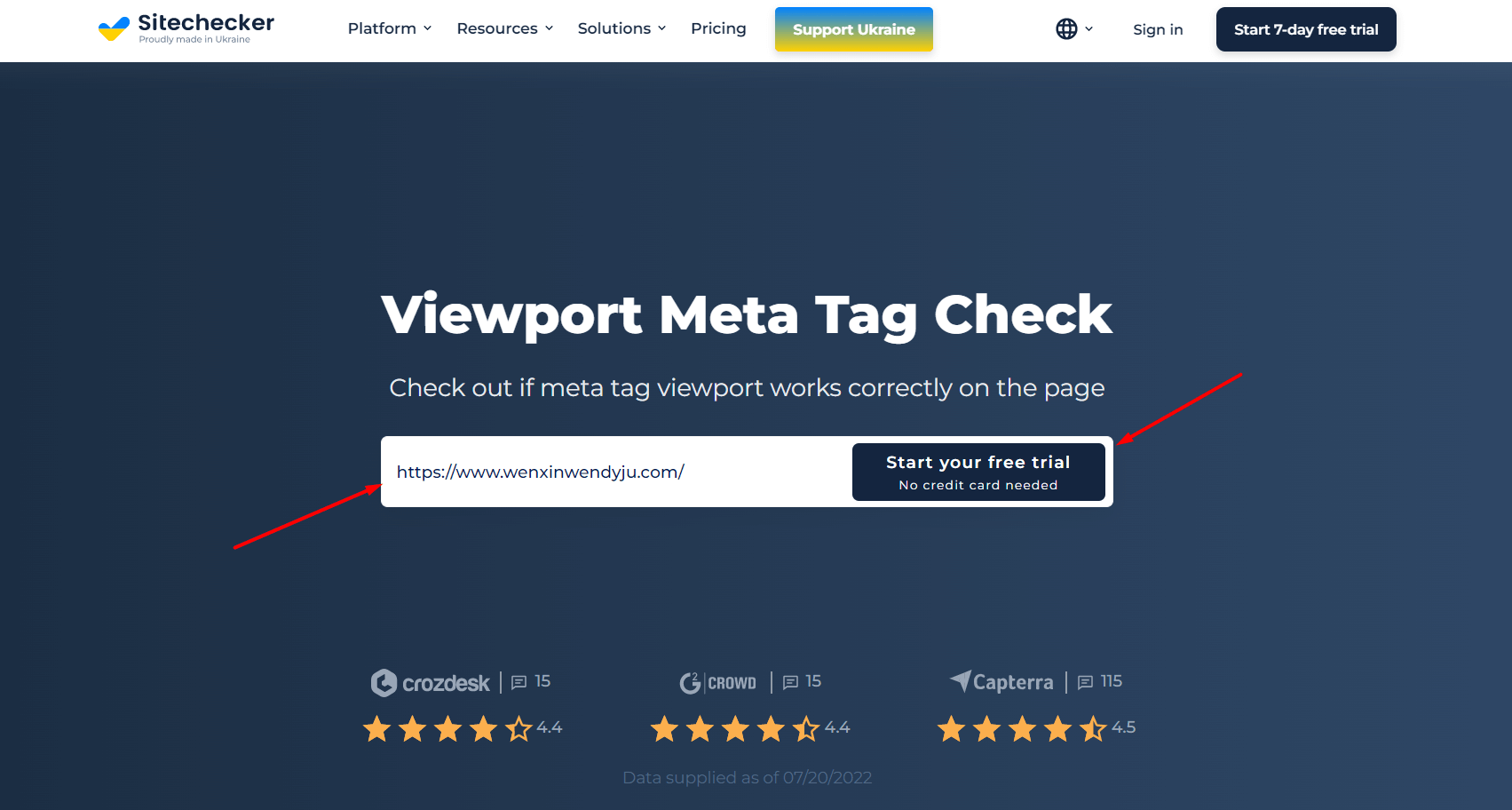
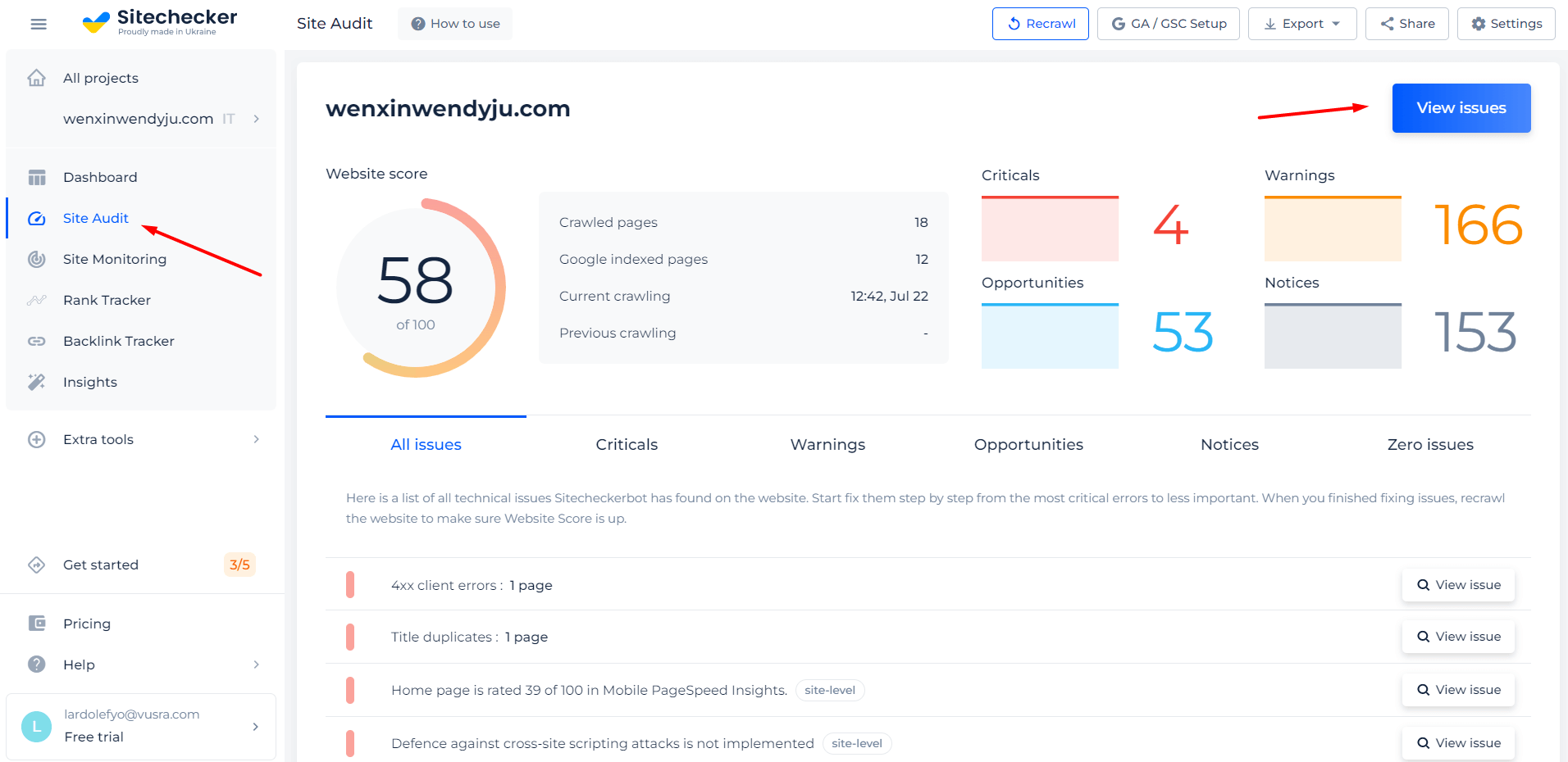
Below, we’ll show you step-by-step how you can use the tool. For example, we used the home page of our site sitechecker.pro.
Step 1: Insert Your URL and Start a Free Trial
Just enter your URL into the field and press the button below to get started. The process is easy and fast, and you don’t even need a credit card. You can sign up for a free trial using your Google or Facebook account with no hassle.
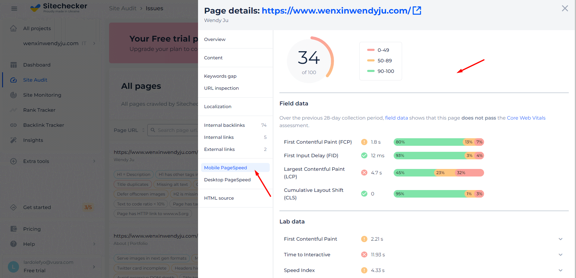
Step 2: Interpreting the Results Whether the Viewport Meta Tag Works Properly
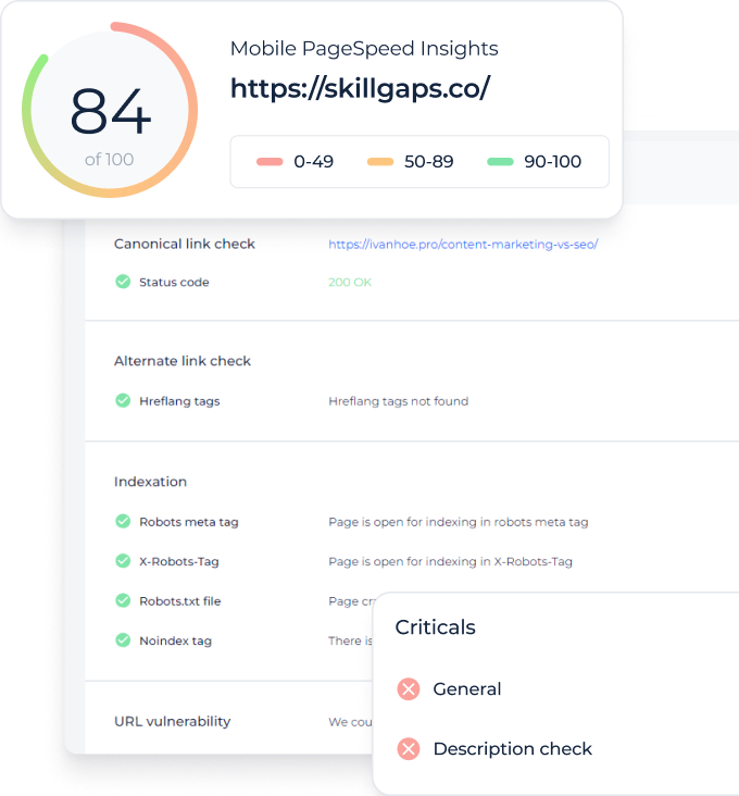
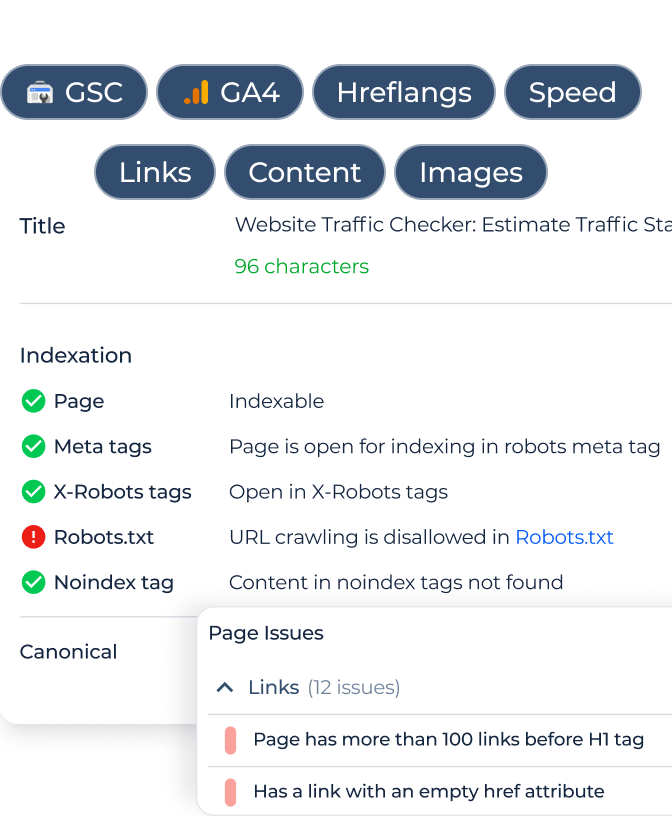
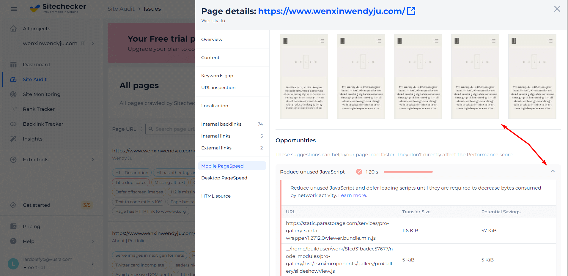
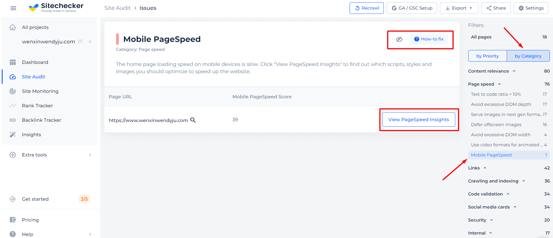
After you finish scanning in the tool, you’ll get results on whether the tag is set up correctly on the site page. Our tool checks whether the viewport meta tag works correctly with Mobile PageSpeed Insights.
The results table will show how the page displays on a mobile phone.
Features of URL Meta Name Viewport Analyzer
There are a few websites that don’t have any technical issues with their mobile versions. Most likely, your website has some sort of problem that affects its mobile version. After you start a free trial with us, we’ll launch an audit for your entire website. This way, you’ll be able to see a list of all the URLs that have issues with mobile version and speed, as well as our recommendations for how to fix them.
Checking Meta tag viewport is important but not enough to rank good enough!
Check not only the issue but make a full audit to find out and fix your technical SEO.
Cases When the Meta Name Viewport Check is Needed
The viewport meta tag allows you to tell the mobile browser what the virtual viewport design should be. It is often useful if you’re not redesigning your site for mobile devices. You don’t want to spend your time and effort creating a mobile version of your site. In that case, use this tag to make your site’s content display better with a larger or smaller virtual viewing window.
Check that the tag is set correctly with our tool, and rest assured that your site users see content the way you intended.
When You Don’t Use Meta name=”viewport”
The browser will look for instructions to scale the resource page in the “viewport” tag or setting. If you miss this point and don’t specify it, the browser will show the user the default web page size for the desktop and try to optimize the content by enlarging fonts and elements. With it, the user will see content that fits in the view window on the screen. The user will have to scale the page themselves or use horizontal scrolling to adjust the viewing area to fit their device.
Keep in mind that search engines such as Google will not consider such pages responsive and will not give them high positions in the search engine queries. Therefore, you should not lose potential traffic and search engine rankings.
What are the viewport options?
- Width – sets the width of the layout viewport.
- Initial-scale – sets the initial page scale and width of the layout viewport.
- Minimum-scale – sets the minimum zoom level.
- Maximum-scale – sets the maximum zoom level.