


What Does it Mean When the Viewport Tag Has a Maximum-Scale Set?
When discussing the viewport tag with a maximum-scale set, we’re delving into the realm of responsive web design. The viewport is a user’s visible area of a web page, and it varies with the device – being smaller on a mobile phone than on a computer screen. Web developers use the <meta> tag in HTML to control the viewport’s size and scale. This tag includes several properties, one of which is maximum-scale.
Setting the maximum-scale attribute in the viewport tag specifies the maximum level of zoom that users can apply to the webpage. It is a directive to the browser on how it should handle user-initiated scaling actions – pinch to zoom, for example. The attribute value is a number, indicating the maximum amount of zoom allowed. For instance, maximum-scale=1.0 means the page can be zoomed up to its original size but no more, effectively disabling zooming.
Why Developers Use Maximum-Scale
Developers use the maximum-scale attribute within the viewport meta tag for several compelling reasons, all aimed at enhancing the user experience and preserving the integrity of the website’s design across various devices. This attribute controls the maximum level of zoom that users can apply to the webpage, directly impacting how content is viewed on different screens, especially mobile devices.
| Consistency in Design and Layout | One of the primary reasons for using maximum-scale is to maintain a consistent look and feel of websites across different devices. By restricting the maximum zoom in level, developers can prevent the layout from breaking or looking different than intended. This is particularly important for complex web applications and sites with intricate designs, where zooming could disrupt the user interface and the overall user experience. |
| Responsive Design Enforcement | As part of responsive web design practices, maximum-scale helps ensure that web pages automatically adjust and look good on any device. It aids in keeping elements scalable and visible, according to the screen size without allowing the user to zoom in to a level that could break the layout or make the website hard to navigate. |
| Performance Optimization | Unrestricted zooming can lead to performance issues, especially on image-heavy sites. Limiting the maximum scale can help in reducing the load on the browser, as it doesn’t have to rerender the page at high zoom levels, thus contributing to a smoother, faster browsing experience. |
| Accessibility Considerations | While limiting zoom can potentially impact accessibility negatively, in some contexts, developers might use maximum-scale to control the display of content that is specifically designed to be accessed in a certain way. However, this practice has been reconsidered in recent years, with a greater emphasis on ensuring web content is accessible and usable for everyone, including those who need to zoom for readability. |
| Control Over Touch Gestures | On touch devices, zooming can interfere with the intended touch gestures. By setting a maximum-scale, developers can ensure that gestures like swiping or tapping function as intended, without accidental zooming affecting the interaction with the website. |
What Does the Hint Check?
The “hint” in the context of web development typically refers to a guideline or a check implemented by web development tools or browsers to ensure that web pages adhere to best practices for usability, performance, and accessibility. When we discuss what the hint checks in relation to the viewport tag having a maximum-scale set, we’re examining how these tools identify and flag issues related to the improper use of the maximum-scale attribute within the viewport <meta> tag.
This hint check is designed to scrutinize web pages for the following issues:
| Use of Maximum-Scale Attribute | The hint assesses whether the maximum-scale attribute is used within the viewport tag. The primary focus is to identify if the attribute restricts user zooming capabilities to a level that could potentially hamper accessibility and user experience, particularly for users with visual impairments who rely on zooming to read content. |
| Restrictive Zoom Levels | It evaluates the specific value set for the maximum-scale attribute, checking if it is too restrictive. A value like maximum-scale=1.0 effectively disables zooming on a webpage, which could be flagged as a potential usability concern. |
| Viewport Scalability | The hint also checks whether the webpage is set to be scalable by users at all. This involves looking for attributes like user-scalable=no or a maximum-scale setting that prevents scaling, both of which can negatively affect the user’s ability to interact with the webpage as needed. |
Examples that Trigger this Hint:
Several scenarios can trigger this hint, indicating potential issues with how the viewport’s maximum scale is set. Here are some examples:
Non-scalable Webpage:
<meta name="viewport" content="width=device-width, initial-scale=1.0, maximum-scale=1.0, user-scalable=no">
This example triggers the hint because it sets the webpage to be non-scalable, indicating that users cannot zoom in or out, which could affect accessibility.
Excessively Restrictive Zoom:
<meta name="viewport" content="width=device-width, initial-scale=1.0, maximum-scale=1.0">
Although less restrictive than the previous examples, this setting might still trigger the hint if the tool considers maximum-scale=2.0 as limiting for certain content types or user needs, particularly for users who need higher levels of zoom for readability.
In each of these cases, the hint serves as a nudge for developers to reconsider the use of maximum-scale settings in the viewport meta tag, encouraging practices that enhance accessibility and user experience. Adjusting these minimum scale of settings to be less restrictive, or removing them altogether, can help ensure that web content is accessible to a broader range of users, including those with visual impairments.
How to Resolve the Issue
Resolving issues related to the maximum-scale setting in the viewport tag involves making your website more accessible and user-friendly by allowing users to zoom in and out as needed. Here are steps and best practices to address and fix the potential problems caused by restrictive viewport settings:
1. Remove or Adjust the Maximum-Scale Attribute:
For Accessibility: Completely remove the maximum-scale attribute from the viewport tag. This change ensures that users can freely zoom in and out on your website, improving browser accessibility for everyone, including those with visual impairments.
<meta name="viewport" content="width=device-width, initial-scale=1.0">
If Adjustment is Necessary: If you have a specific reason for keeping the maximum-scale attribute, consider setting it to a less restrictive value. Ensure that the setting does not significantly hinder the user’s ability to zoom, keeping accessibility in mind.
<meta name="viewport" content="width=device-width, initial-scale=1.0, maximum-scale=5.0">
2. Ensure User Scalability:
Avoid using user-scalable=no. This attribute prevents zooming, which can be a critical barrier for users needing to magnify content for readability. Ensure your viewport tag allows user scalability.
<meta name="viewport" content="width=device-width, initial-scale=1.0, user-scalable=yes">
3. Test Your Website’s Accessibility:
Use accessibility testing tools and manual testing to ensure that your website is accessible. Tools like the WAVE Accessibility Tool, Google Lighthouse, and manual testing with screen readers can help identify and resolve any remaining accessibility issues.
4. Design for Flexibility:
Adopt responsive web design practices that ensure your website’s content is easily readable and navigable on devices of all sizes, without the need for zooming. Use flexible layouts, font sizes, and clickable areas to enhance usability across various devices.
5. Consider the Needs of All Users:
Engage with your user base through surveys or usability testing sessions to understand their needs better. Pay special attention to feedback from users with accessibility needs to ensure your website serves everyone effectively.
6. Stay Updated with Best Practices:
Accessibility and responsive design best practices evolve. Stay informed about the latest guidelines and standards from sources like the Web Content Accessibility Guidelines (WCAG) and implement changes as necessary to maintain compliance and usability.
By following these steps, you can resolve issues related to restrictive viewport settings, thereby improving the accessibility and user experience of your website. Making your website more accessible not only benefits users with specific needs but also enhances the overall user experience, potentially improving your site’s SEO and user retention.
How to Remove the Maximum-Scale Attribute
Removing the maximum-scale attribute from the viewport <meta> tag is a straightforward process that can significantly enhance the accessibility and usability of your website. This action ensures that users can freely zoom in and out on your web pages, improving accessibility for those with visual impairments and enhancing the overall user experience across various devices. Here’s how you can remove the maximum-scale attribute effectively:
1. Locate the Viewport Meta Tag:
First, you need to find the <meta> tag in your HTML document that controls the viewport settings. This tag is usually located within the <head> section of your HTML document. Look for a line that starts with <meta name=”viewport”.
Example Before Removal:
<meta name="viewport" content="width=device-width, initial-scale=1.0, maximum-scale=1.0, user-scalable=no">
2. Edit the Viewport Content Attribute:
Remove the maximum-scale portion from the content attribute of the viewport meta tag. If the user-scalable=no part is also present, consider removing it as well to enable user scaling.
Example After Removal:
<meta name="viewport" content="width=device-width, initial-scale=1.0">
3. Test Your Website:
In this screenshot, we’re looking at the ‘Mobile friendly’ section of Sitechecker’s SEO audit tool, which highlights critical viewport issues that could impact the user experience on mobile devices. Specifically, the tool is flagging pages with problems related to the viewport meta tag—such as missing tags, incorrect initial-scale settings, or a fixed width set—which are crucial for responsive design.
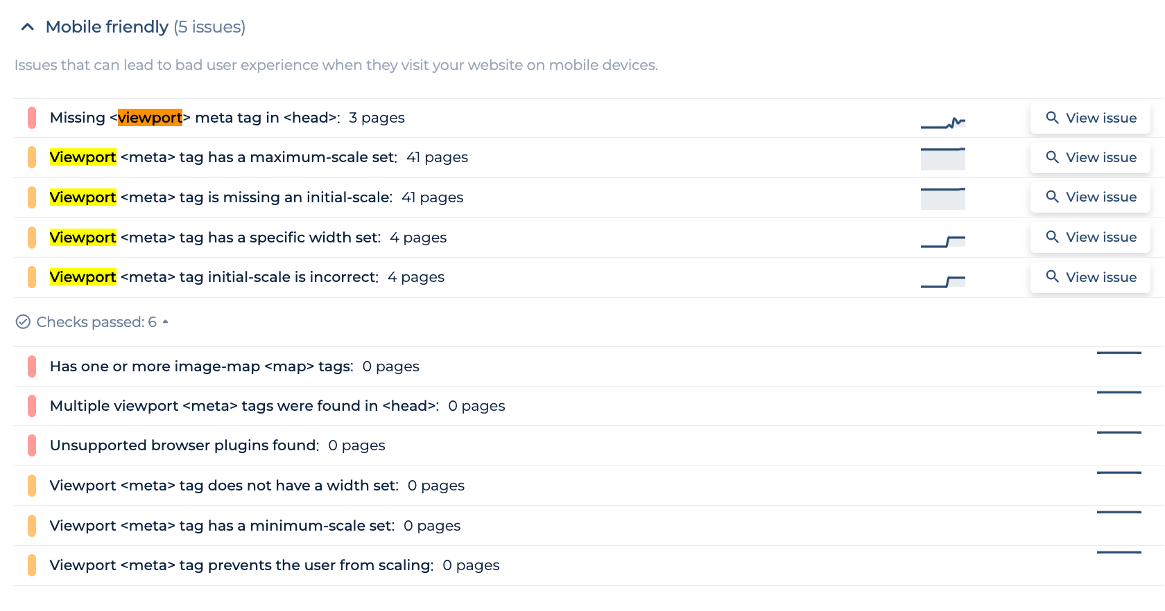
By selecting ‘View issue,’ you can obtain a detailed list of the affected pages, allowing for targeted troubleshooting. The focus here is not just on the number of issues detected but on understanding the specific viewport-related problems, indicated by the clear categorization and dynamic issue tracking presented by the tool. This function is key to ensuring that your site is fully optimized for mobile users, offering a seamless browsing experience across all devices.
Catch Viewport Missteps Before Users Do
Test your tags, tweak your design, triumph on mobile!
After making the changes, it’s crucial to test your website across various devices and browsers to ensure that the removal of the maximum-scale attribute has not adversely affected your site’s layout or functionality. Pay special attention to mobile devices, as these are most impacted by viewport settings.
4. Consider Accessibility and Usability:
With the maximum-scale attribute removed, users will now be able to zoom in and out on your website freely. This change is particularly beneficial for users with visual impairments who rely on zoom functionality to read and interact with web content. Ensure that your website design is responsive and can adapt to various zoom levels without breaking.
5. Update Your Web Design Practices:
Consider this an opportunity to review and update your web design practices. Ensure your website’s design is flexible and can accommodate different zoom levels and screen sizes without losing functionality or aesthetic appeal.
6. Validate Your Changes:
Use web development tools and accessibility validators to check your site for any issues that might arise from the change. This includes testing for responsive design, readability at different zoom levels, and overall usability.
By removing the maximum-scale attribute, you promote a more inclusive and accessible web environment. This adjustment aligns with modern web standards, emphasizing the importance of accessibility and responsive design to cater to all users’ needs.
How to Update Viewport Tags Across Your Site
Updating the viewport tags across your website is an essential step in ensuring that your site remains accessible, user-friendly, and optimized for all devices. As web standards evolve and the emphasis on mobile responsiveness and accessibility increases, it’s crucial to ensure that your viewport settings are configured to provide the best user experience. Here’s a step-by-step guide to updating viewport tags across your site:
1. Audit Your Current Viewport Tags:
Start by conducting a thorough audit of your website to identify all the pages that include a viewport <meta> tag. Use tools that can crawl your site and report on meta tags, or manually check the source code of your pages, especially if your site is not too large.
2. Determine the Optimal Viewport Settings:
Before making any changes, decide on the optimal viewport settings for your website. A commonly recommended viewport tag for responsive design is:
<meta name="viewport" content="width=device-width, initial-scale=1.0">
This tag instructs browsers to set the width of the viewport to the width of the device and start with a 1:1 zoom level, enhancing accessibility and ensuring that your site is mobile-friendly.
3. Prepare for Bulk Updates:
For websites with numerous pages, manually updating each page can be time-consuming. If your site uses a content management system (CMS), templates, or a site-wide include file for the header, you can update the viewport tag in a single location to apply the change across all pages. If your site is static, consider using search and replace tools or scripts to automate the process.
4. Update and Test in Stages:
It’s wise to update and test in stages if possible, especially for large sites. Begin with a small section or a single page template, update the viewport tag, and then test the results on various devices and browsers to ensure that your site remains responsive and accessible. Pay attention to layout, readability, and functionality at different screen sizes and zoom levels.
5. Roll Out the Updates:
Once you’ve tested and are satisfied with the results, proceed to update the rest of your site. If using a CMS or templates, the update may be instantaneous across all pages. For static sites, complete the bulk update process using your chosen method.
6. Validate and Monitor:
After updating the viewport tags, use validation tools and manual checks to ensure no errors were introduced during the update process. Monitor user feedback and site analytics to detect any potential issues with usability or site performance post-update.
7. Document the Changes:
Keep a record of the changes made, including the date of the update and the previous viewport settings. This documentation will be valuable for future site audits, troubleshooting, and compliance with web development best practices.
8. Educate Your Team:
Ensure that your web development and content teams are aware of the importance of the correct viewport settings for future updates, new pages, or site redesigns. This will help maintain consistency and accessibility across your site moving forward.
By systematically updating the viewport tags across your site, you’ll enhance the mobile user experience, improve accessibility, and ensure that your site adheres to modern web standards. This proactive approach demonstrates a commitment to user-centric design and accessibility, key factors in the success of any website in today’s digital landscape.
Final Idea
The discussion on the maximum-scale attribute within the viewport <meta> tag underscores its significance in responsive web design and its impact on user experience across various devices. Developers’ utilization of maximum-scale aims to ensure design consistency, optimize performance, and manage touch gestures, although it must be carefully balanced with accessibility considerations. Tools and browsers employ hints to highlight potential accessibility issues caused by restrictive zoom settings. Addressing these concerns involves removing or adjusting the maximum-scale attribute, enhancing website accessibility, and ensuring content adaptability across all devices. Moreover, updating viewport tags site-wide is recommended to align with evolving web standards, emphasizing the critical role of responsive design and accessibility in enhancing the digital user experience.