


The size of tap targets and the distance between them can affect the success of your site. Remember that the same text may appear differently on laptops and smartphones.
What Does “Not Size Tap Targets Appropriately” Mean?
This means that the page in question has buttons and links (tap targets) that are too close and small to each other. For the web version, this situation is not critical. But if users see this when using smartphones, the site needs to be fixed. Why? Because users may not be able to tap the right link with their fingers the first time. And they can get annoyed about it and leave such a site.
What Triggers This Issue?
You created the site first for the web version, where all the elements look harmonious together. But then you noticed that the pages look different on the mobile version: Some small tap targets are close to each other. You even used small clickable elements, but they are far enough apart. Below are some typical reasons:
- Using a different scale on the mobile version
- Adding new links
- Add or remove words or sentences
How to Check the Issue?
If you think that some tap targets on your site are close/small, then you need to do the following:
- Find all clickable elements within the chosen page
- Ensure that each tap target is a minimum 48x48dp in size or approximately 9mm in each dimension. But if there are smaller elements, they should be spaced about 32 pixels apart, both horizontally and vertically
We recommend that you use separate programs for Android and IOS to check for this problem.
You can find out more details about the touch target size here:
https://support.google.com/accessibility/android/answer/7101858?hl=en
Find out not only the information about Tap targets being too small and close, but also the presence of technical errors on it!
Conduct a full audit to find out and fix all the site level and page level issues on your website.
Why is This Important?
You’ve done SEO for your site, but some new users may not be happy with the mobile version because tap targets are not sized appropriately on your pages. And users can accidentally click on a neighboring element instead of the desired one. You’d better avoid placing tap targets close to each other.
How to Fix the Issue?
Tap targets, such as buttons and links, need to be sized appropriately to ensure that they are easily tappable on touch devices. This is especially important for mobile usability and accessibility. Here are some steps to fix issues with tap targets not being sized appropriately:
1. Increase Tap Target Size
Ensure that tap targets are large enough to be easily tapped. According to Google’s Material Design guidelines, the minimum recommended capacity is 48×48 pixels.
  button, .tap-target {

    min-width: 48px;

    min-height: 48px;

    padding: 10px; /* Adjust padding as needed */

}
2. Add Adequate Spacing Between Tap Targets
Make sure there is enough space to prevent accidental taps on adjacent elements. A minimum spacing of 8 pixels is recommended.
  button, .tap-target {

    margin: 8px; /* Adjust margin as needed */

}
3. Use CSS Media Queries for Responsive Design
Ensure that elements are appropriately fited on different screen sizes by using CSS media queries.
  @media (max-width: 600px) {

    button, .tap-target {

        min-width: 48px;

        min-height: 48px;

        padding: 12px; /* Increase padding for smaller screens */

    }

}
4. Check and Adjust Font Sizes
Ensure that text within buttons or links is legible and the elements are large enough to accommodate the text.
  button, .tap-target {

    font-size: 16px; /* Ensure the text is readable */

}
5. Use User-Friendly Button Shapes and Sizes
Make buttons and other interactive elements user-friendly with clear shapes and proportions.
  button {

    border-radius: 4px; /* Rounded corners for better tap experience */

    padding: 12px 24px; /* Increase padding for larger tap area */

}
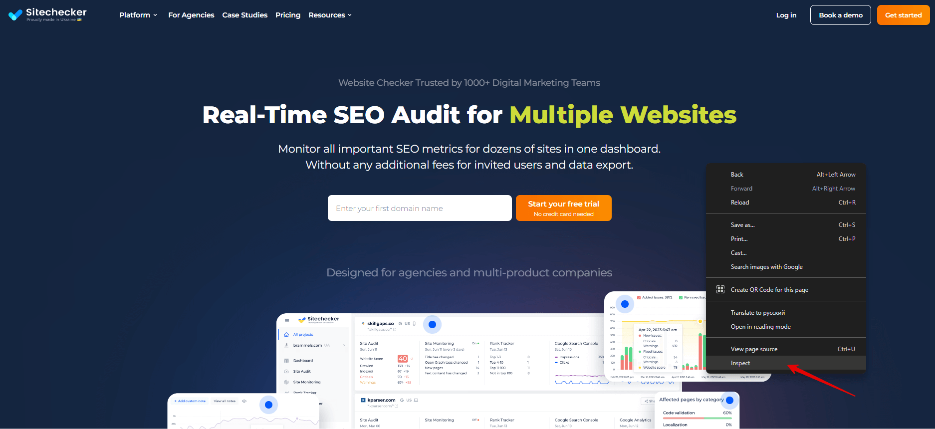
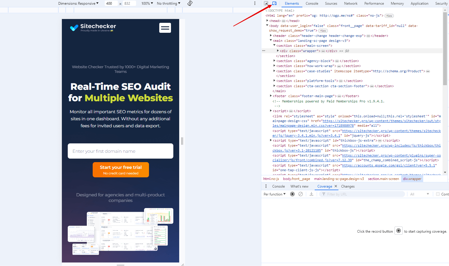
6. Verify in Browser Developer Tools
Use the browser’s developer tools to simulate different devices and check the proportion of elements.
- Open your website in a browser (Google Chrome is recommended).
- Right-click and select “Inspect” to open the developer tools.
- Click on the “Toggle device toolbar” button (or press Ctrl+Shift+M).
- Select different devices to see how your tap targets behave on various screen sizes.
7. Test with Real Devices
Finally, test your website on actual mobile devices to ensure that the elements are easy to use and appropriately sized.
By following these steps, you can ensure that elements on your website are sized appropriately, improving usability and accessibility for all users.