


What is the Mobile-Friendly Test?
The Mobile-Friendly Test by Sitechecker evaluates how well a webpage or an entire website performs on mobile devices. It offers a full audit for all pages, to check viewport data, detect unsupported browser plugins, identify mobile-friendliness issues, and provide continuous monitoring, or an instant report for a single page, analyzing viewport data.
How the tool can assist you
Mobile-friendliness of all website pages: identifies viewport issues, unsupported browser plugins, and other usability problems with ongoing monitoring (requires a free account).
Single page mobile test: analyzes a specific webpage for viewport configuration and basic mobile compatibility.
Detailed mobile usability report: provides clear insights and recommendations to improve mobile performance, user experience, and SEO rankings.
Key features of the tool
Unified dashboard: provides a centralized view of website performance, SEO issues, and analytics, making it easy to monitor and manage all website audits in one place.
User-friendly interface: designed for beginners and experts, offering intuitive navigation, clear reports, and actionable insights without requiring deep technical knowledge.
Complete SEO toolset: includes website audits, keyword tracking, mobile-friendliness testing, and other essential tools to optimize website performance and search engine rankings.
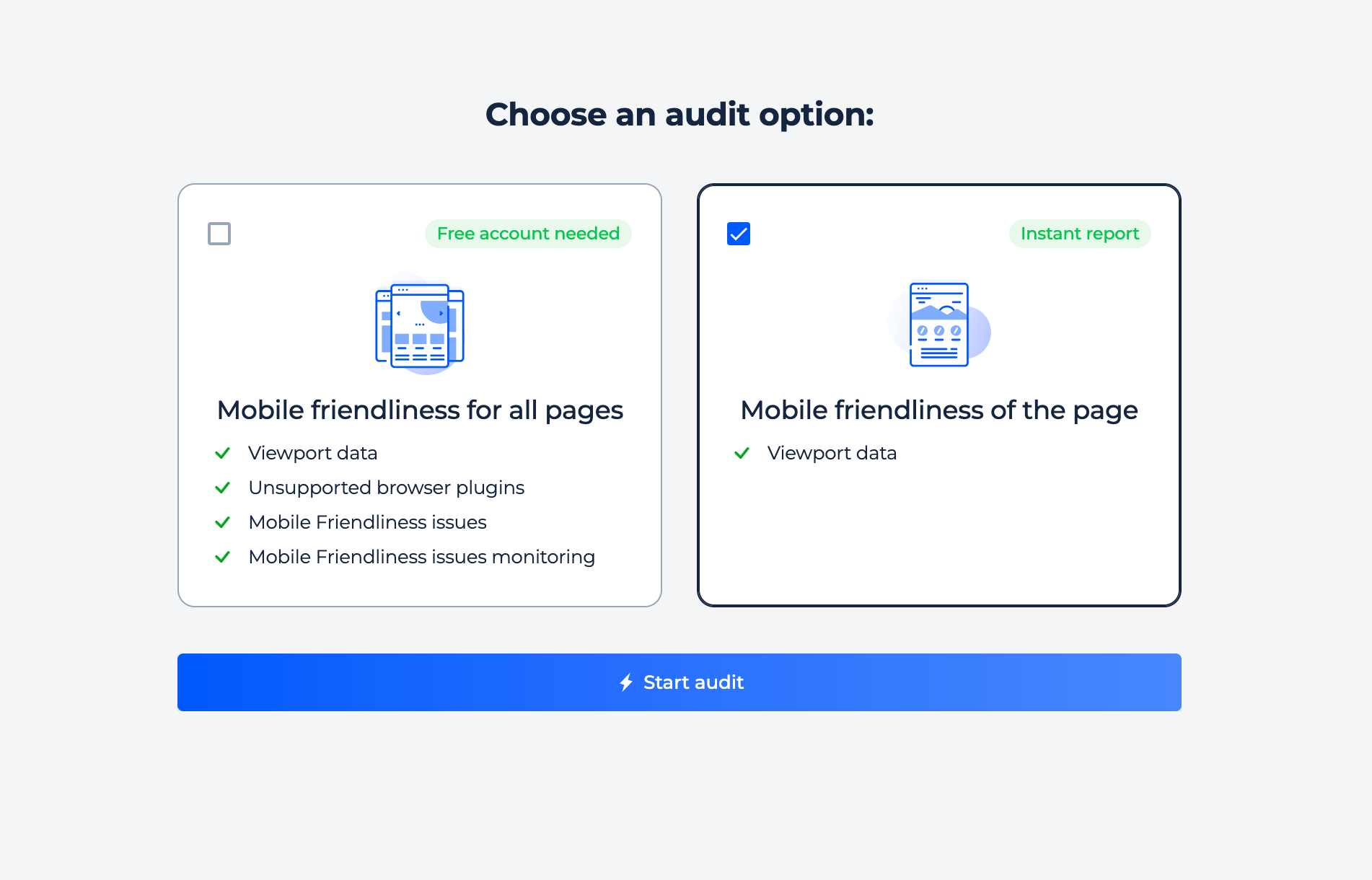
How to Use the Tool
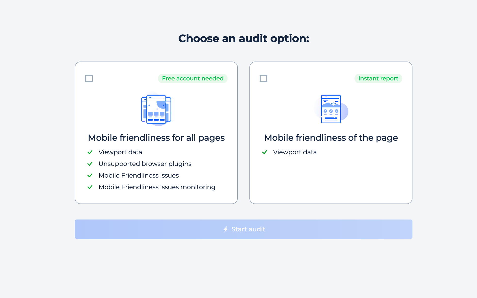
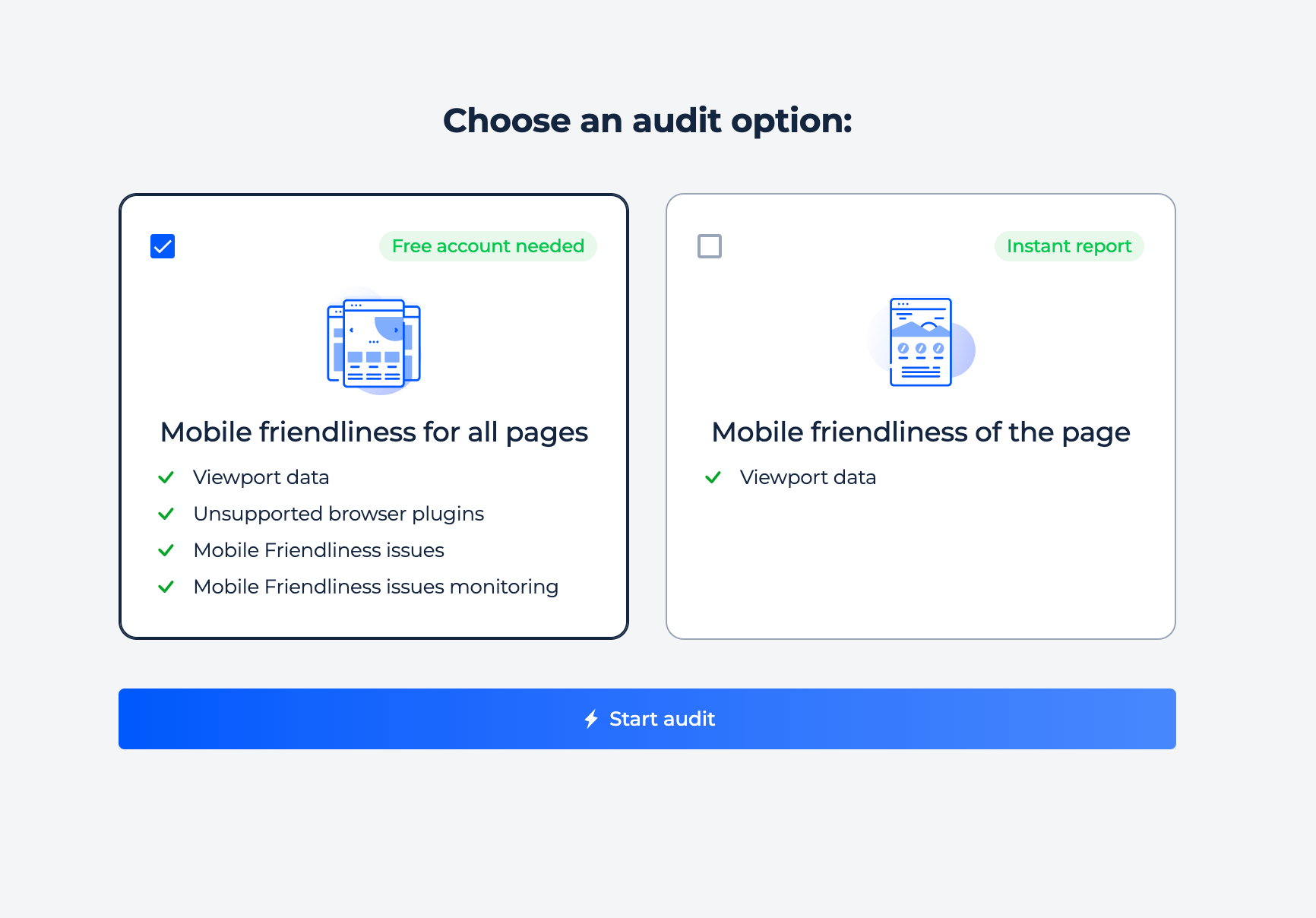
To use the Mobile-Friendly Test, select the type of audit you need. Choose “Mobile friendliness for all pages” for a comprehensive website analysis or “Mobile friendliness of the page” for an instant single-page report. After selecting an option, click the “Start audit” button to begin the analysis.
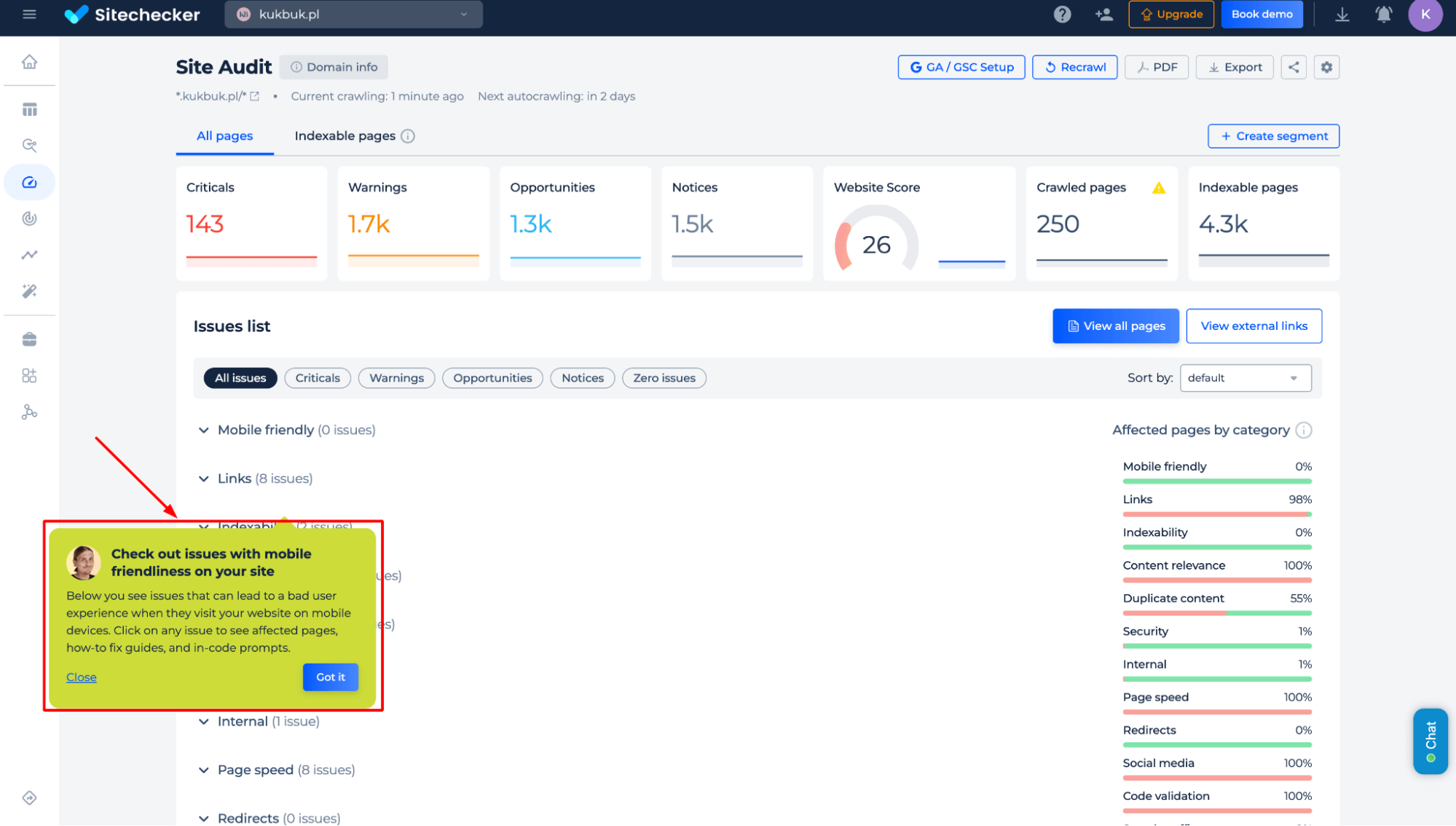
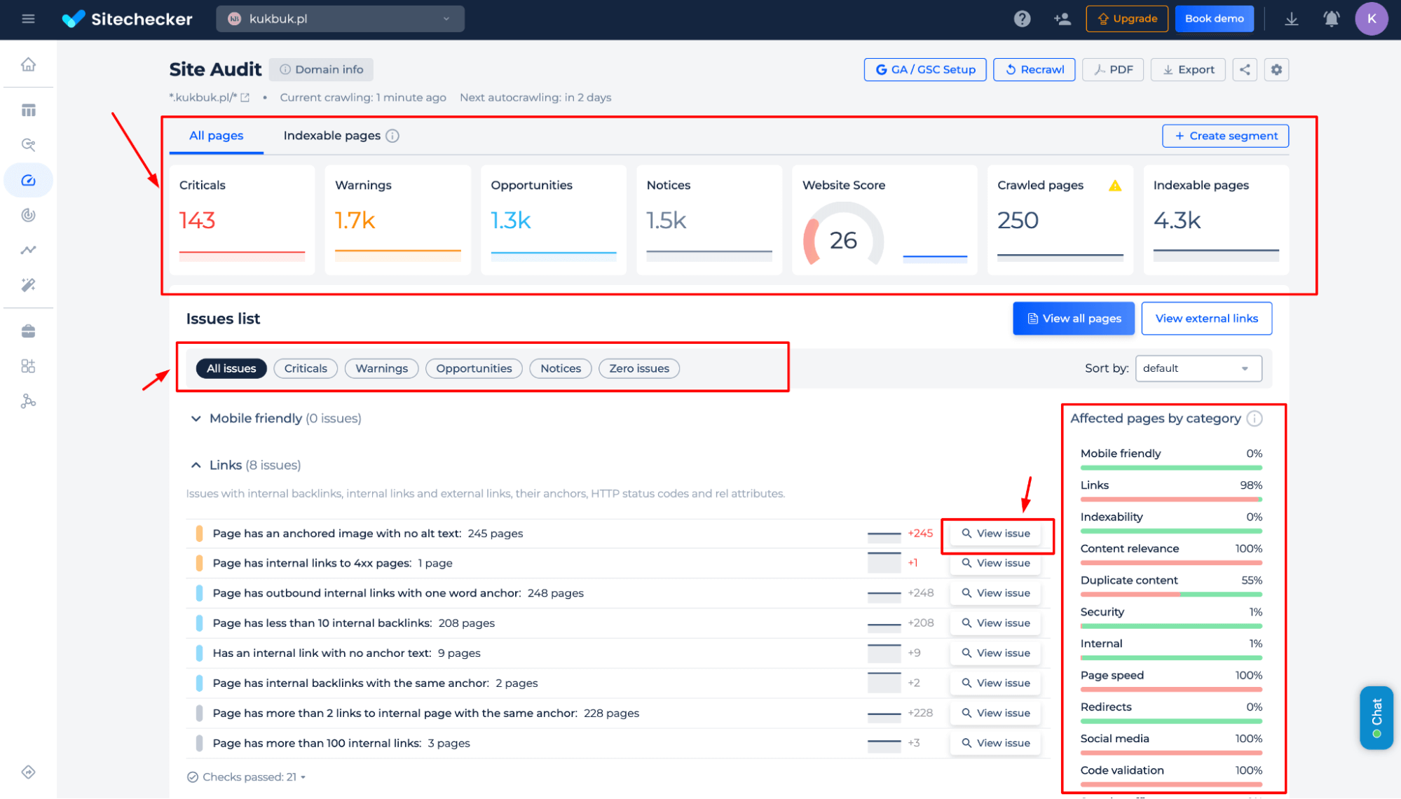
Website Mobile Friendly Test
Step 1: Insert the domain URL address
Step 2: Get the results
Identify issues affecting your website’s mobile usability, including poor user experience, navigation problems, and display inconsistencies. Get actionable insights, affected pages, and step-by-step fixes to optimize your site for seamless mobile performance.
Additional features of the tool
Go beyond mobile-friendliness with a full website audit. Get detailed reports on critical errors, warnings, and optimization opportunities. Analyze indexing issues, content relevance, security vulnerabilities, duplicate content, and page speed. Easily filter, prioritize, and resolve issues with actionable recommendations for a fully optimized site.
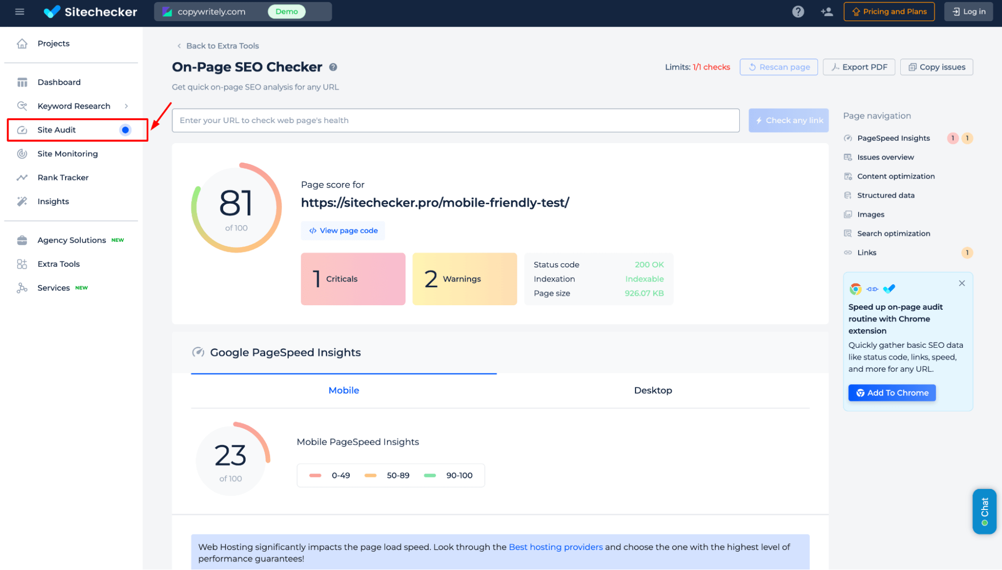
Test the Page Mobile-Friendliness
Step 1: Choose the page mobile-friendliness inspection, start the audit
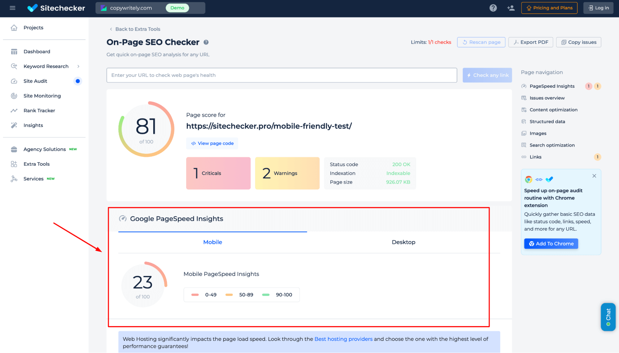
Step 2: Get the results
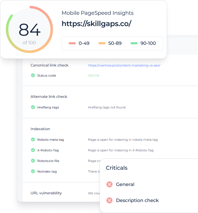
Analyze your webpage’s mobile-friendliness and performance with real-time Google PageSpeed Insights. Identify critical loading issues, speed bottlenecks, and optimization opportunities to enhance user experience and search rankings. Get actionable recommendations to improve responsiveness and loading times across devices.
Discover the full capabilities of the tool in the Site Audit section. Explore the demo version to see how Sitechecker tackles key technical SEO challenges and optimizes your website’s performance.
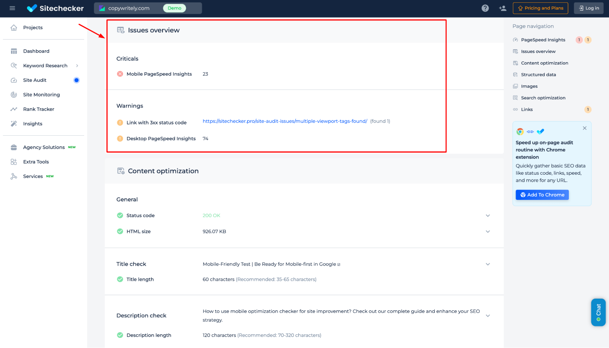
Additional features of the Mobile-Friendly Test by Google
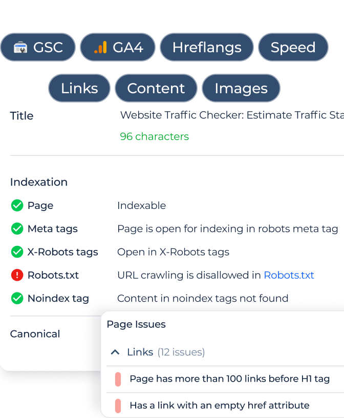
Gain deeper insights beyond mobile-friendliness with a detailed issue overview. Identify critical errors, warnings, and performance bottlenecks like slow load times, broken links, and indexing issues. The Page Navigation panel streamlines SEO improvements by optimizing speed, fixing errors, refining content, validating schema, enhancing images, analyzing keywords etc.
Final Idea
The Website Mobile Friendly Test evaluates your website’s mobile performance, detecting usability issues and providing actionable fixes. It offers a full-site audit or a single-page analysis, along with a comprehensive SEO audit to identify indexing, security, and speed concerns. With a user-friendly dashboard, it streamlines SEO improvements to enhance rankings and user experience.