


Growth of Average Web Page Size
Web page size is important! It’s not about the design or subject matter of the website, but much simpler – it all depends on the size of the monitor screen of website visitors. If the website is not optimized for each monitor size, it creates an automatic annoyance for the user and thus, it is very important to make your website convenient to view from any device, from a huge monitor to the screen of a small mobile phone.
The first web page appeared in 1990. Adding all sorts of fonts, images, videos and CSS / JS files to the websites and with years of tech development, the sizes of pages have significantly increased. In 2010, the average web page size was 702kb and in 2017 it was 3422kb, according to information provided by httparchive.org.
Why Website Page Size Matters
If you ask yourself about the proper dimension of your website, you are on the right way. In reality, the width of the page is a key factor in website design. If you decided to choose the width that is larger than the user’s screen resolution, soon you will notice that the website doesn’t fully fit in the browser, and a horizontal scroll bar will appear. As a result, the user might not see some of the necessary information or will be uncomfortable working with your project. The result will be one – reduction of behavioral factors.
In another hand, if you set a too small width, especially if the content part of your website is quite thin, then, again, your website will have a look of uncomfortable one too.
Let’s find out a little bit more about website dimensions from official statistics. Due to the latest data collected in 2019, the most usable webpage dimensions are:
1. Desktop Screen Resolution Stats Worldwide
| Width x Height | 1366×768 | 1920×1080 | 360×640 | 1440×900 | 1536×864 | 1600×900 |
| Using | 22.7% | 17.94% | 7.8% | 6.3% | 5.05% | 4.55% |
2. Mobile Screen Resolution Stats Worldwide
| Width x Height | 360×640 | 375×667 | 414×736 | 720×1280 | 360×720 | 320×568 |
| Using | 33.54% | 11.07% | 5.15% | 3.89% | 3.67% | 3.53% |
You may ask what is your screen resolution. It is easy to check with specialized tools. In browsers like Chrome, there are functions that allow receiving technical information about the client’s computer. It is a requirement for website creation due to individual characteristics of various devices.
One of these functions is the ability to find out the pixel resolution of the screen. The screen resolution is the size of the image that you see on your monitor, counted in points (pixels). Simply put, the resolution is the density of these points on your screen at a given time. This density is measured by the width and height of the screen.
Why Page Size Increases and How to Reduce it
This can be explained by a number of factors that all make a significant contribution to the increase in page size including . Below you can find the key ones.
1. JavaScript
JavaScript was created with the idea to add interactivity to the HTML pages. JavaScript gives HTML designers a strong but convenient programming tool. Although the majority of HTML designers have nothing to do with real programming, JavaScript simplified their job even more because it is a scripting language with very simple syntax. The first variation appeared in 1995. It was improved numerously until it reached the present form. Thus it is an effective tool that provides designers with the following possibilities and features:
- Adding or removing tags;
- Changing page styles;
- Web-based games;
- Information about user’s activity on the page;
- Making changes to the code;
- Animation of a web page.
Area of this language is unlimited. Therefore, it is very important to use JavaScript for your web resource, but not forget to minimize the files to reduce the page size as much as possible to make your site user-friendly and attractive for all users.
Scripts may slow down page loading and effect on page size. To solve this problem webmasters use website cache option. It helps to reduce the time between users query and server response.
2. Images
Images are the primary reason for the increase in page size these past 7 years. Over the years, imagery has become more frequent and it is one of the main things used to attract user’s attention. People rarely find an article interesting to read without images and nobody is going to buy an item without seeing an example of how it looks.
There are a lot of tools for the compression of the image size but it keeps the same high quality which makes an influence on website dimension:
- Compressor.io;
- Jpegmini.com;
- Optimus;
- Imagify.
In addition, WebP and FLIF formats including rel=”noopener” target=”_blank”>efficiently images encoding aim to reduce the image size further and thus help decrease web page sizes.
3. Fonts
How can a font affect the speed of a web page? Just like images, the quality of fonts has been improving all this time, and there are now millions of varieties available to create your own style. About 57% of sites are using custom fonts now. In 2017 an average site’s fonts took up about 113kb of space, when in 2010, this number was only 2kb. The font is very important for personal branding. Since it has an impact on the page size you need to choose a font that will not only fit the style of your site and brand, but also load quickly. Fortunately, there is a solution if you are sure that custom fonts are important for the design of your website: creating a WOFF2 file.
How many fonts is too many fonts? The rule of thumb is that three’s a crowd and it’s best to stick with two.
What is more, enabling text compression can help to reduce the page size.
4. Videos
The use of videos on web sites have also increasingly grown over the years. Videos are often used to attract the audience’s attention, for product presentation, and as an effective SEO tool. However, high-quality video really affects the site’s size. Over the past six years, the size of an average video has grown to 174kb and although it still only takes up roughly 7.7% of the total website size, it will soon become a bigger issue unless video compression gets better. If you’re working with video content, having a video editor help optimize and compress videos can keep file sizes manageable without sacrificing quality. Simply embed the iframe code from YouTube, Vimeo, and Amazon CloudFront, if you want your site to load quickly. Use the power of these internet video powerhouses. It’s their job and they do it well.
5. Advertising
In the modern world, ads have become more complex. They are no longer made from only plain text. In order to get the most attention, social media managers usually add photos, animations or even videos to their advertising and naturally, this increases the size and loading time of a web site. To solve this problem the user can use an Ad Blocker that can help reduce the visibility of the ads (your browser will not load them) and therefore, the loading speed should increase by several times.
nytimes.com
This is especially effective on mobile devices or tablets. You need to monitor the ads on the site to see how they affect the speed. Regulate and change ads on your web resource, so that they occupy as few bytes as possible and don’t greatly expand the page size. Or you can even completely remove the ad if you see that it slows down the site too much.
Check SEO score of your website
Audit your website to find what pages have SEO mistakes, how to correct them and get more traffic
Factors Contributing to Increased Page Size
The Role of JavaScript in Web Design
From its inception in the mid-90s as a means to make web pages dynamic, JavaScript has evolved immensely. It began as a way to add simple interactivity but has since grown to power single-page applications, server-side scripts, and even mobile applications. With the development of frameworks like React, Angular, and Vue, JavaScript’s presence in modern web design is undeniable.
Impact on load times and potential solutions
JavaScript, while powerful, can be a double-edged sword. Unoptimized scripts or too many of them can slow down a page’s load time. Heavy frameworks or libraries, if not used properly, can add unnecessary bulk. To mitigate these issues, it’s crucial to:
- Minimize and compress JavaScript files.
- Use asynchronous loading for non-essential scripts.
- Avoid or reduce reliance on large libraries for simple tasks.
The Significance of Images in Modern Websites
In the visually-driven digital age, images are key to capturing user attention. However, high-resolution images can dramatically increase page size. Striking the right balance between quality and size is crucial. While users expect clear, high-quality images, they also demand fast-loading pages.
Several tools and techniques can be employed to compress images without significant loss of quality:
Use tools like Compressor.io or Jpegmini.com for straightforward compression.
Implement responsive images to ensure devices download the appropriate image size.
Explore next-gen formats like WebP that offer better compression rates.
Influence of Custom Fonts on Web Design
The rise of custom fonts in branding
Custom fonts allow brands to stand out and create a unique identity online. Over the past decade, the use of custom fonts on the web has surged, with brands looking to differentiate themselves and create a consistent experience across platforms.
Strategies for Optimizing Font Usage Without Compromising Design
While custom fonts can be an asset, they can also add weight to a page. Here are some strategies to ensure optimal performance:
- Limit the number of font variations (weights, styles) you load.
- Use the WOFF2 format, which offers better compression.
- Employ font loading strategies to avoid “flash of unstyled text” (FOUT) or “flash of invisible text” (FOIT).
Videos: Engaging but Size-Intensive
The growing popularity of videos on websites
Video content has skyrocketed in popularity. From product demonstrations to engaging background videos, they can increase user engagement and time spent on a site. However, they come at a cost in terms of bandwidth and page size.
Solutions to integrate videos without bloating the site
To leverage the power of videos without compromising speed:
- Opt for streaming platforms like YouTube or Vimeo, which handle optimization for you.
- Implement lazy loading for videos, ensuring they only load when they’re about to be viewed.
- Consider using compressed video formats and adaptive bitrate streaming.
Advertising in the Digital Age
How complex ads add to page size
Modern ads are more than just text and images. Animated banners, interactive ads, and video ads offer richer experiences but can significantly bloat a page’s size, especially if multiple ads are loaded on a single page.
Balancing ad revenue with user experience
While ads are a primary revenue source for many websites, user experience should not be sacrificed. Here are ways to strike a balance:
- Limit the number of ads on a page.
- Optimize ad sizes and formats for mobile users.
- Consider using ad networks that prioritize performance and user experience.
Monitor ad performance and be ready to remove or replace ads that negatively impact site speed.
The Surge in Mobile Internet Usage
According to a study by Statista, as of 2022, over 50% of global internet traffic comes from mobile devices, marking a substantial growth from previous years. Additionally, Google’s mobile-first indexing, which prioritizes mobile-friendly sites, further underscores the rising importance of mobile browsing.
Why mobile optimization can’t be ignored
Mobile optimization is no longer just a luxury but a necessity. As users migrate to mobile devices for their browsing needs, websites that aren’t optimized risk alienating a significant portion of their audience. Moreover, search engines, prioritizing user experience, rank mobile-optimized sites higher, impacting visibility and organic traffic.
Challenges in Mobile Web Design
The mobile ecosystem is fragmented with various devices – from smartphones to tablets, each with its unique screen size and resolution. This diversity presents challenges in ensuring that content and design elements display correctly across all devices.
Addressing unique mobile user interactions
Mobile users interact differently than desktop users. Touch gestures, such as swiping and pinching, replace mouse clicks. Sites need to accommodate these interactions, ensuring touch targets are appropriately sized and essential functions are easily accessible.
Actionable Steps to Optimize Web Page Size
The importance of monitoring page size and load times
Regularly auditing a website is paramount to its health and performance. As web content grows and evolves, page sizes can inflate, and load times can increase. Regular monitoring helps in identifying bottlenecks and ensuring a consistent user experience.
Tools and metrics to gauge website performance
Several tools, such as Google PageSpeed Insights, GTmetrix, and WebPageTest, allow site owners to analyze their site’s performance. Metrics like First Contentful Paint (FCP) and Time to Interactive (TTI) give insights into user-perceived load times and site interactivity.
Embracing Modern Web Technologies
The role of Content Delivery Networks (CDNs)
CDNs are networks of servers that store cached versions of web content in various locations globally. By delivering content from the nearest server to a user, CDNs reduce the distance data has to travel, resulting in faster load times. They are crucial, especially for sites with a global audience.
Benefits of adaptive and responsive design
Adaptive design delivers different layouts based on the device accessing the site, while responsive design ensures that the site layout adjusts fluidly based on screen size. Both methods ensure optimal display and functionality across devices. With the multitude of devices in use today, leveraging these design principles ensures content is accessible and engaging to all users.
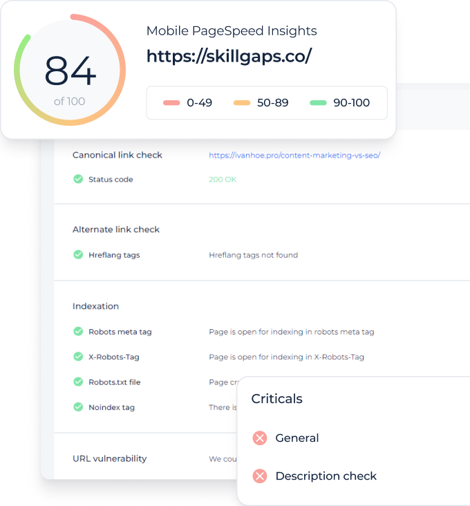
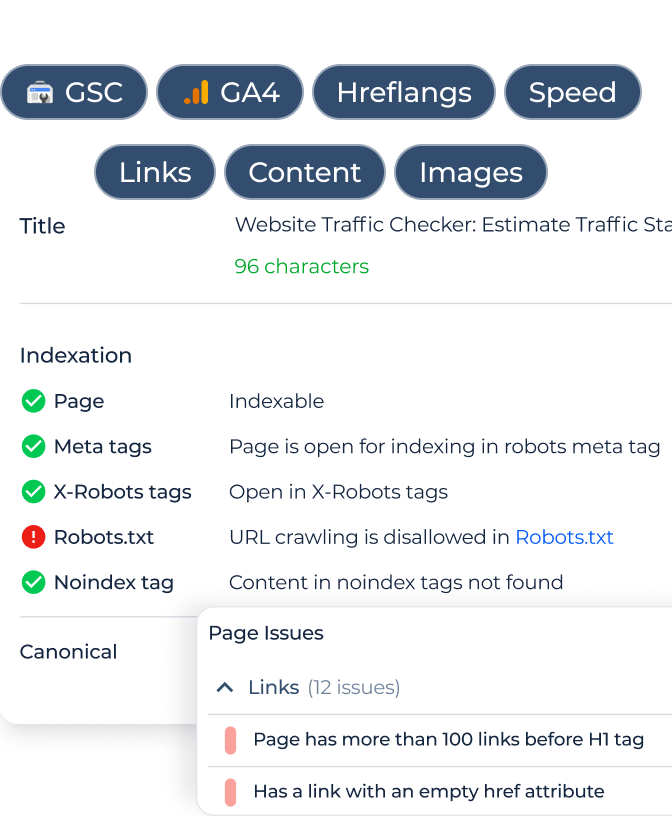
Optimizing Web Performance with SiteChecker’s Speed Test
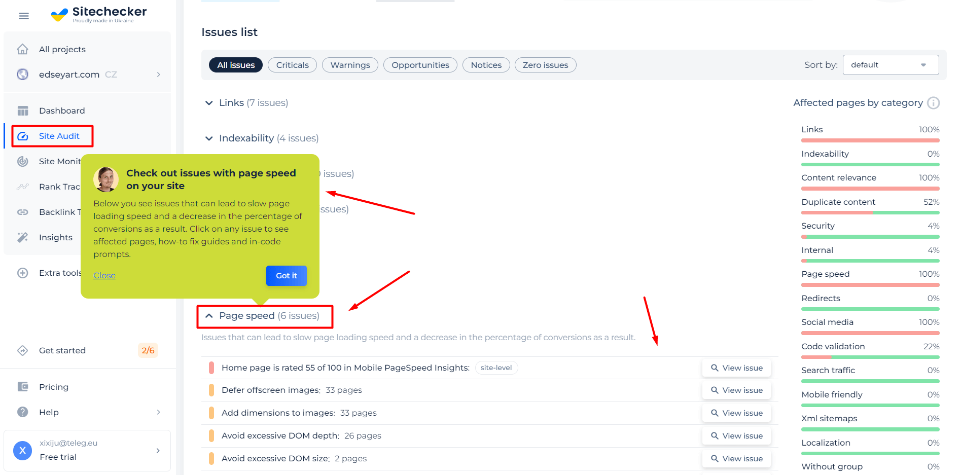
SiteChecker’s Speed Test is a crucial tool for understanding a website’s performance and its average web page size. It provides a comprehensive analysis of loading times, enabling users to identify elements that may slow down the website. Often, slow-loading issues are due to excessive page size, and SiteChecker efficiently pinpoints these large elements, ranging from high-resolution images to bulky JavaScript files. Beyond merely diagnosing problems, this tool offers practical solutions, such as suggesting image compression or file minification. Essentially, Speed Test is more than a diagnostic tool – it serves as a guide for optimizing websites for faster and more efficient performance.
Speed Matters: Test Your Website's Performance!
Measure, optimize, and race ahead with SiteChecker's Speed Test tool.
Web Page Size on Mobile Devices
According to statistics, people use mobile devices more often. Only in the last two years, the number of mobile device users have increased by hundreds of millions due to the reason that it is so much faster and more convenient to use phones and tablets instead of a PC or laptop.
It means that page speed will suffer if it is not optimized for mobile devices. This is vital for every site!
Mobile design challenges
- Screen shape. The screen of smartphones is taller than it is wide, the opposite of a desktop computer or laptop.
- Screen size. Different models of smartphones have different screen sizes, but usually, the aim is 340px as a maximum width for mobile design.
- User interactions. Cell-phones don’t have a mouse. So such effects as ‘on blur’ or ‘on hower’ don’t work.
- Navigation. Most website owners want to show a full-width top navigation bar. However, it doesn’t work in portrait mode.
- Lower bandwidth. Many customers use “data” in towns or in nature, so they can have slower internet speeds. Sometimes it’s better to replace the full-screen background video on the mobile version of your site.
It can require sacrificing some aspects like removing an animation or an inserted video, but the page size will decrease significantly, and mobile device users will be happy with the quick loading speed and great user experience. So always test website speed!
Your site should work as quickly as possible. For this, you need to do everything possible to reduce load time for all devices: pay the most attention to images, as those tend to occupy the largest part (about 44%) of the total size. However, to match average web page sizes, all aspects (from the fonts to the ads) should be optimized, as mentioned above – this is very important not only to attract new visitors but also to keep the attention of your loyal clients and users for many years.