


What Does the “Web Page too Small on Mobile” Issue in the Site Audit Mean?
The “web page too small on mobile” issue in a site audit typically refers to a problem where the webpage’s content is not optimized for viewing on mobile devices. This can lead to a poor user experience, making it difficult for users to read text, navigate, or interact with elements on the page.
What Triggers This Issue?
Here are some detailed triggers and conditions for this issue:
Font Sizes Less Than 12 Pixels
The audit tool identifies text elements on the webpage with CSS font sizes smaller than 12 pixels. Text that small can be difficult to read on mobile devices, leading to a poor user experience.
Viewport Meta Tag Issues
The absence or incorrect configuration of the viewport meta tag in the HTML head section can cause the content to render improperly on mobile screens. If the viewport is not set, the browser may display the page at a default desktop width, making everything appear too small on mobile devices.
Fixed Layouts and Widths
Webpages using fixed widths for containers and elements rather than flexible, responsive designs can trigger this issue. Such layouts do not adjust to the smaller screen sizes of mobile devices, resulting in content that is too small or requires horizontal scrolling.
Non-Scalable Content
Elements that do not scale appropriately with the viewport, such as images, videos, or other media, can also cause this issue. If these elements have fixed sizes that do not adjust for mobile devices, they can lead to an overall design that is not mobile-friendly.
CSS Media Query Issues
Ineffective or missing CSS media queries can result in styles that are not optimized for different screen sizes. Media queries are essential for adjusting the design and layout for various devices, including mobile phones.
How to Check the Issue?
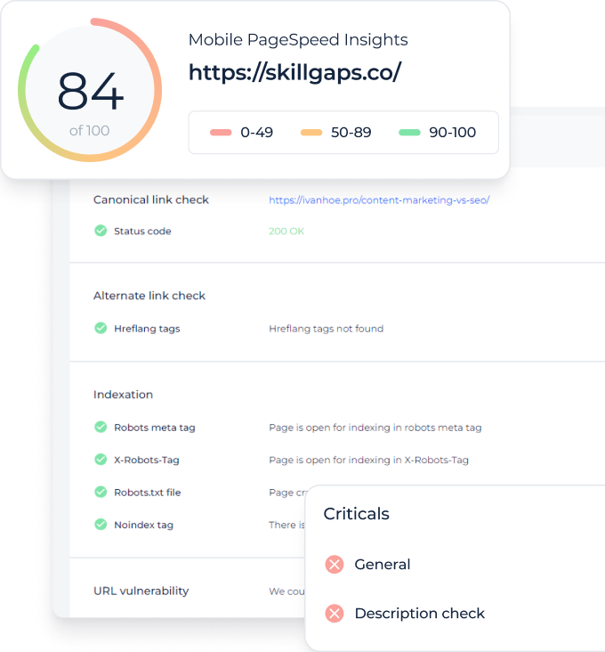
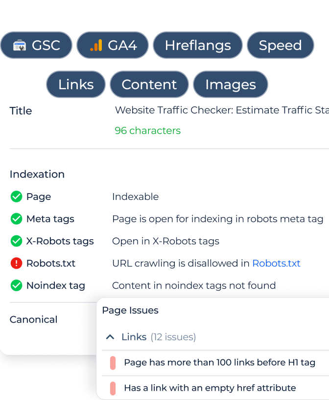
You can use webmaster tools that analyze your site and identify critical SEO mistakes. In the report at the end of the scan, you will find all internal URLs where this issue will be noticed.
Keep in mind the rule that this issue will usually be marked as medium critical because it directly affects users’ perception of your site. That, in turn, affects the behavioral factor and bounce rate.
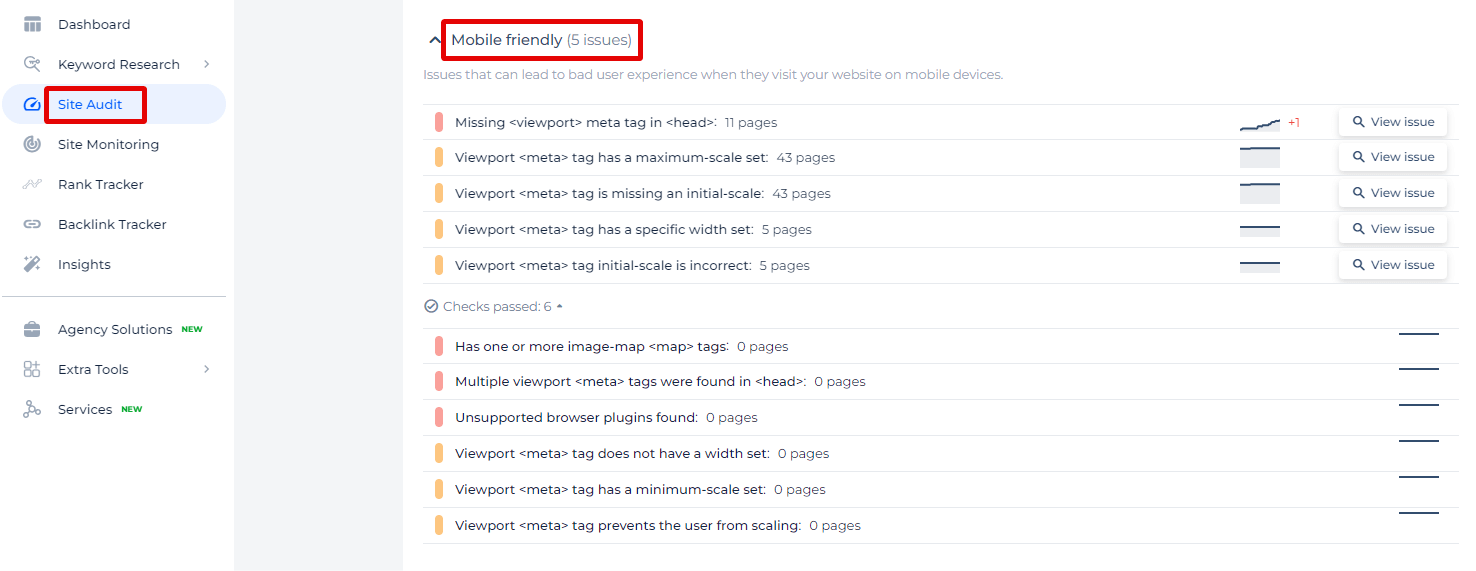
In the Sitechecker SEO tool, you can see an overview of issues classified under “Mobile Friendly,” which highlights potential problems affecting the user experience on mobile devices.
Each issue is quantified, showing how many pages are affected, allowing users to directly access these problematic pages by clicking the “View issue” link.
Make Your Website Mobile-Ready!
Use our comprehensive Site Audit Tool to find and fix any mobile-friendly errors.
How to Fix the Issue?
To fix the “web page too small on mobile” issue, you need to ensure that your webpage is mobile-friendly and the text is readable on smaller screens. Here are step-by-step instructions to address and resolve this issue:
1. Set the Viewport Meta Tag
Ensure that the viewport meta tag is included in the <head> section of your HTML. This tag controls the layout on mobile browsers.
    <head>

        <meta name="viewport" content="width=device-width, initial-scale=1">

    </head>
2. Increase Font Sizes
Make sure all text elements have a minimum font size of 12 pixels. Consider using relative units like em or rem for better scalability across different devices.
    body {

        font-size: 1rem; /* 1rem typically equals 16px */

    }
    p {

        font-size: 1rem; /* Adjust based on design needs */

    }
3. Use Responsive Design Techniques
Implement responsive web design to ensure your webpage adjusts to different screen sizes. This includes using flexible grids, fluid images, and CSS media queries.
Flexible Grids
Use a CSS framework like Bootstrap or write your own flexible grid system.
    .container {

        display: flex;

        flex-wrap: wrap;

    }
    .item {

        flex: 1 1 auto;

        padding: 10px;

    }
Fluid Images
Ensure images resize within their containers.
    img {

        max-width: 100%;

        height: auto;

    }
CSS Media Queries
Use media queries to adjust styles based on the screen size.
    @media (max-width: 600px) {

        body {

            font-size: 0.875rem; /* Adjust font size for smaller screens */

        }

        .container {

            padding: 10px;

        }

    }
4. Ensure Touch Targets are Appropriately Sized
Ensure that interactive elements (buttons, links, etc.) are large enough and spaced adequately to be easily tappable.
    button,

    a {

        min-width: 48px;

        min-height: 48px;

        padding: 10px;

        margin: 5px;

    }
5. Avoid Fixed Widths and Heights
Avoid setting fixed widths and heights on elements. Use relative units to make sure they scale properly.
    .container {

        width: 100%; /* Instead of fixed width like 960px */

    }
    .item {

        width: 100%;

        padding: 10px;

        box-sizing: border-box;

    }
6. Test on Real Devices and Emulators
Regularly test your website on various mobile devices to ensure that the content is easily readable and accessible. Use browser developer tools to simulate mobile viewports and detect issues early.
Testing Tools
- Google Chrome DevTools: Use the device toolbar to simulate different mobile devices.
- Responsive Design Mode in Firefox: Similar to Chrome DevTools for testing responsiveness.
- Online Emulators: Tools like BrowserStack and Sauce Labs provide access to real devices for testing.
7. Validate and Iterate
After making changes, validate your site using tools like Google Mobile-Friendly Test and Lighthouse audits to ensure all issues are resolved. Continuously iterate based on user feedback and test results.
By following these steps, you can effectively address the “web page too small on mobile” issue and provide a better experience for users accessing your site on mobile devices.