A viewport meta tag is an HTML element to adapt pages of the site to different devices and to define its visible area for smartphone browsers. For example, you have created a website with a unique design that displays well and correctly from your computer. But you also want it to be the same for smartphones and tablets. Then you add a viewport meta tag.
What Does “No Viewport Meta Tag on the Page” Mean?
This means that the page in question does not contain a viewport tag. Consequently, users who have entered your site from a smartphone will see a page not adapted for their devices. In this case, the text will be unreadable.
You can read more about using the viewport meta tag here.
Also, you can watch a video tutorial by Matt Cutts from Google to discover how much time you should spend on meta tags.
What Triggers This Issue?
This issue occurs when the developers have created your web-only site and have not added a viewport meta tag in the HTML document. A viewport meta element was not specified, which means that users will not be able to experience your project’s benefits if they access your site from smartphones. And as you know, more and more people use these devices every year. Therefore, you shouldn’t neglect this tag.
How to Check the Issue?
You can use two ways to check for the presence of a viewport meta tag:
- Go to your website page from your computer, press Ctrl+U, and then find “viewport” (Ctrl+F). If you did not find a viewport meta tag, then you need to add it
- Go to this page from your smartphone and see how it looks there in the browser. If the page scale is the same as on a computer, then there is a missing viewport meta tag
We recommend doing both of these steps.
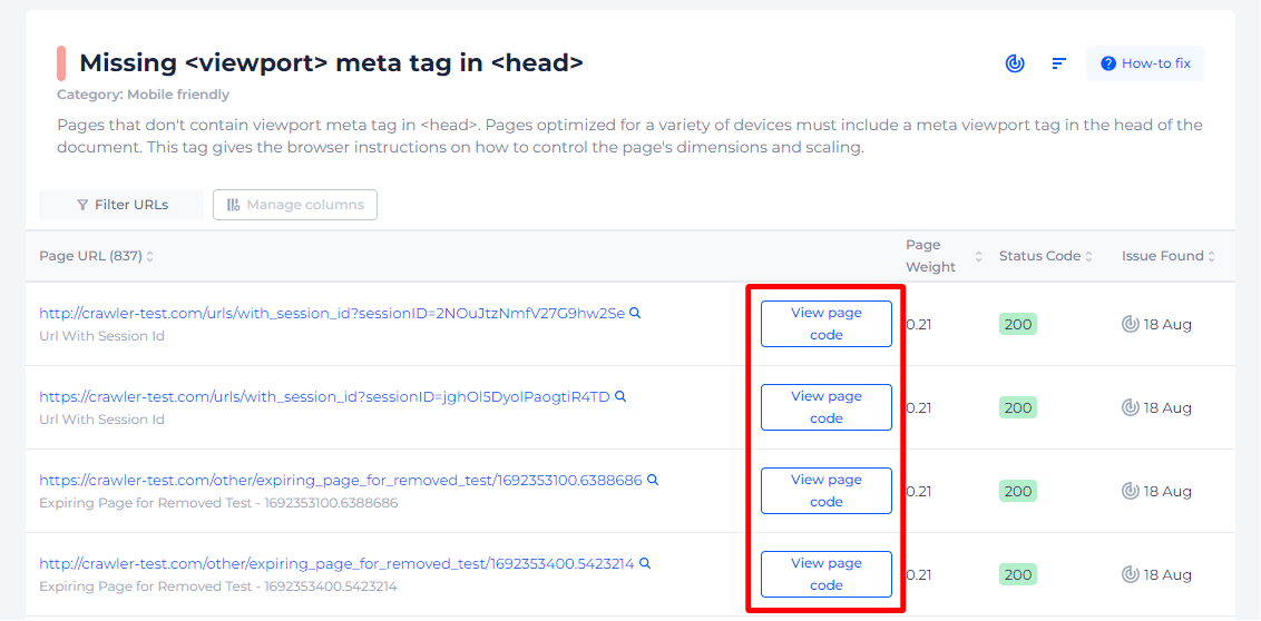
Or you can use the help of Sitechecker. It will scan your site and find all pages without viewport meta tag.

If you delve deeper, you can find a list of all affected pages with ability to view their source code.
Optimize your site for mobile users!
Ensure your site's pages have the viewport tag for the best viewing experience.
Why is This Important?
A viewport meta tag has a big influence on the number of users on the site. How? If you have not added it to the HTML document, then the scale of your pages will not be adapted for smartphones. Although you can fill the site with useful information, people will not find it out and go to your competitor’s site.
How to Fix the Issue?
The “Pages have no viewport tag” issue typically occurs in web development and affects the responsiveness of your website on different devices, especially mobile. To fix this issue, you need to add a viewport meta tag to the head section of your HTML documents. Here’s a step-by-step guide to resolve the problem:
1. Understand the Viewport Tag
The viewport tag instructs the browser on how to control the page’s dimensions and scaling. Without it, mobile devices might display your web page with a desktop screen width, making it difficult to read and interact with.
2. Add the Viewport Tag
To add the viewport tag, you need to insert the following line into the <head> section of your HTML:
<meta name="viewport" content="width=device-width, initial-scale=1">
Here’s what each part of this tag means:
- width=device-width: Sets the width of the page to follow the screen-width of the device (which will vary depending on the device).
- initial-scale=1: Sets the initial zoom level when the page is first loaded by the browser.
3. Verify the Tag is Correctly Placed
Ensure that the viewport meta tag is placed within the <head> section of your HTML document, like this:
  <!DOCTYPE html>

<html lang="en">

<head>

    <meta charset="UTF-8">

    <meta name="viewport" content="width=device-width, initial-scale=1">

    <title>Document</title>

</head>

<body>

    <!-- Your content goes here -->

</body>

</html>
4. Test Your Website
After adding the viewport tag, test your website on various devices to ensure that it scales correctly. You can use browser developer tools to simulate different screen sizes and resolutions.
5. Optional: Fine-Tuning
Depending on your website’s needs, you might want to fine-tune the viewport settings. Here are a few additional options you can use:
- minimum-scale and maximum-scale: Control the minimum and maximum zoom levels, respectively.
- user-scalable: Controls whether the user can zoom in and out (either yes or no).
For example:
<meta name="viewport" content="width=device-width, initial-scale=1, maximum-scale=1">
Summary
Adding a viewport meta tag is crucial for ensuring your website is mobile-friendly and responsive. By placing <meta name=”viewport” content=”width=device-width, initial-scale=1″> in the <head> section of your HTML document, you can address the “Pages have no viewport tag” issue effectively.
Test your site thoroughly after making this change to ensure it works well across various devices and screen sizes.
