: Importance and SEO Implications")


What is Cumulative Layout Shift (CLS)
Cumulative Layout Shift, commonly known as CLS, stands out as a unique performance metric in the world of web design and development. While many performance metrics focus solely on load times or interactivity, CLS addresses a fundamental aspect of user experience: visual stability.
Here’s why CLS is different from other performance metrics:
- Focus on Visual Stability: CLS quantifies the unexpected shifting of visual elements on a page. This is crucial because unexpected shifts can confuse or frustrate users, leading to a poor user experience.
- User-centric Metric: Unlike metrics that measure load times or server responses, CLS directly gauges the experience of the end user. If elements on a page move unexpectedly, it can lead to misclicks or difficulty reading content—real-world problems that users face.
- Aggregation of Multiple Shifts: CLS isn’t just about a single layout shift. It accumulates the scores of all individual layout shift scores, providing a comprehensive view of the page’s visual stability throughout its lifespan.
- Responsive to Dynamic Content: Web pages nowadays are dynamic, often loading content based on user interactions or live updates. CLS is vital in ensuring that these dynamic changes don’t disrupt the user’s experience.
- SEO Implications: With Core Web Vitals becoming a ranking factor for Google, CLS isn’t just a design consideration—it can also impact a website’s visibility on search engines.
- Not Just Load Time: Many metrics, like First Contentful Paint (FCP) or Time to Interactive (TTI), revolve around how quickly content loads or becomes interactive. CLS, on the other hand, emphasizes the quality and stability of what appears on the screen after loading.
In a digital landscape where user experience is paramount, CLS emerges as a pivotal metric. By addressing the visual stability of web pages, CLS ensures that users aren’t just receiving content quickly but are also able to engage with it without disruption. In this light, it’s clear why CLS is a different, and necessary, performance metric in the web development toolkit.
What is Cumulative Layout Shift?
Cumulative Layout Shift, or CLS for short, is one of the essential performance metrics in the realm of web development, specifically under Google’s Core Web Vitals. But what exactly does it measure, and why is it so critical?
At its core, CLS is all about visual stability. Imagine reading an article or attempting to click a button on a website when suddenly, without warning, the page content either shifts or moves. Not only can this be jarring, but it might also lead to accidental misclicks or disruptions in reading. Such unexpected layout shifts can negatively impact user experience, leading to user frustration and decreased satisfaction.
Here’s a breakdown of what CLS captures:
- Measurement of Visual Stability: CLS quantifies how often users experience unexpected layout shifts on a page.
- Calculation: The CLS score is computed based on two main components: the impact fraction (how much visible screen space an unstable element occupies) and the distance fraction (how far these elements shift). The score itself ranges from 0 to 1, with higher scores indicating poorer performance and more significant layout shifts.
- Aggregate Nature: Unlike some metrics that might capture a singular event, CLS measures the sum of all individual layout shift scores throughout the entire lifespan of a page. This cumulative nature ensures that even minor shifts, when taken together, are adequately represented.
- Not Tied to Interaction: It’s important to note that CLS is not about shifts that occur due to user interaction, like clicking a menu button to expand it. Instead, it focuses on the shifts that users don’t expect and cannot predict.
What Causes Cumulative Layout Shift?
Understanding the root causes of Cumulative Layout Shift (CLS) is essential for optimizing visual stability. Here are some primary contributors to unexpected layout shifts on web pages:
| Images without Dimensions | If images are added to a page without specifying width and height, they can cause content to move unexpectedly once they finally load. This is especially prevalent with larger images that take a longer time to load on a web page. |
| Dynamically Injected Content | Adding content to a page after initial load, like ads or banners, can push down existing content if not done carefully. This is especially noticeable when such content is injected at the top of a page or between existing content without allocating space. |
| Web Fonts causing FOUT/FOIT | Flash of Unstyled Text (FOUT) or Flash of Invisible Text (FOIT) happens when custom fonts are loaded, causing a shift from the fallback font. This change can cause the text size and layout to adjust, leading to layout shifts. |
| Actions that Wait for a Network Response | In cases where an element, like a button or a link, waits for a network response before shifting to its final position on the page, it can result in unexpected layout changes. |
| Animations and Transitions | While they can enhance user experience, if not implemented with care, animations or transitions can cause shifts, especially if they are not consistent in size or position before and after the animation. |
| Embedded Content and iFrames without Set Dimensions | Similar to images, embedded content (like videos or other interactive elements) without specified dimensions can resize once fully loaded, causing surrounding content to shift. |
| Unstyled or Late-loading CSS | If CSS styles are applied late in the page load process, they can cause elements to move or resize, leading to layout shifts. |
| JavaScript manipulating DOM | Scripts that dynamically alter the Document Object Model (DOM) can introduce changes in layout, especially if these changes are not anticipated or controlled. |
| Third-party Widgets and Ads | Often, third-party elements can introduce layout shifts, especially if their size isn’t reserved or known in advance. |
Why is CLS important?
Cumulative Layout Shift (CLS) stands as a vital metric in the modern web development landscape, not just as a technical measure but as a direct reflection of user experience. Here’s why CLS holds such significance:
- Direct Impact on User Experience: Unexpected layout shifts can be jarring for users. Whether they’re reading an article, filling out a form, or trying to click a button, sudden shifts can disrupt their interaction, leading to frustration. A website that remains stable throughout offers a much more pleasant and predictable user journey.
- Potential for Misclicks: Layout shifts can lead to erroneous clicks. For instance, if a user intends to click a ‘Read More’ button but an ad suddenly pushes it, they might accidentally click the ad instead. Such misclicks can lead to user annoyance and may affect conversion rates or user trust.
- SEO Implications: Google has integrated Core Web Vitals, which includes CLS, into its ranking criteria. Websites that offer a stable layout and maintain a low CLS score can potentially rank higher in search results, leading to better visibility and more organic traffic.
- Reflects Professionalism and Credibility: A stable site that doesn’t jump around gives an impression of professionalism and meticulousness. In contrast, a site with high CLS might appear unrefined or poorly developed, potentially impacting a brand’s perceived credibility.
- Inclusive Design: Certain groups, such as the elderly or those with motor disabilities, might find it especially challenging to interact with a shifting layout. Maintaining a low CLS ensures a more inclusive design that caters to a broader audience.
- Economic Impact: For e-commerce and online businesses, CLS can have a direct economic impact. A user disrupted by layout shifts might abandon a purchase or leave the site, leading to lost revenue.
- Performance Benchmarking: As websites become more dynamic with richer content, ensuring stability becomes paramount. CLS serves as a benchmark for developers and designers to gauge and continuously improve website performance.
Google About Cumulative Layout Shift (CLS)
John Mueller, a Webmaster Trends Analyst at Google, has tweeted about Cumulative Layout Shift (CLS) on several occasions, providing helpful advice and insights for web developers and SEO professionals.
Here are some of his notable tweets on the subject:
-
June 16, 2021:
CLS is a measure of how much the layout of a page shifts unexpectedly while loading. To provide a good user experience, sites should strive to have a CLS score of 0.1 or less. -
June 17, 2021:
There are a number of things you can do to improve your CLS score, such as:- Optimize your images
- Use preloading and prefetching
- Avoid using third-party scripts that block rendering
- Use a responsive design
-
June 24, 2021:
CLS is a relatively new metric, so we're still learning about it. However, what we know so far is that it's a good indicator of user experience. If you can improve your CLS score, you're likely to improve your users' experience, which will likely lead to better ranking in search results. -
July 21, 2022:
CLS is a metric that measures how much the layout of a page shifts unexpectedly while loading. A good CLS score is 0.1 or less. There are a number of things you can do to improve your CLS score, such as optimizing your images, using preloading and prefetching, and avoiding third-party scripts that block rendering.
In addition to these general tweets, Mueller has also responded to specific questions about CLS on Twitter. For example, he has clarified that CLS is a cumulative metric, meaning that it measures the total amount of layout shift that occurs over the course of a page load. He has also said that CLS is calculated per user, meaning that it can vary depending on the device and browser that a user is using.
Overall, Mueller’s tweets on CLS demonstrate that Google takes this metric seriously and sees it as an important factor in user experience and SEO. If you want to improve your website’s ranking in search results and provide a better user experience, it’s important to focus on improving your CLS score.
Also watch a video to learn how to reduce your website’s Cumulative Layout Shift.
Set Width and Heights on Images and iFrames
To address Cumulative Layout Shift (CLS) effectively, one of the foundational steps is to specify dimensions for images and iFrames. Doing so helps the browser understand the space these elements will occupy, ensuring content doesn’t move unexpectedly when they load. Here’s how and why to do it:
- Reserve Space for Elements: By defining the width and height attributes for images and iFrames, you’re essentially reserving a space for them on the page. Even if the image or iFrame hasn’t loaded yet, the browser will hold that designated space, preventing other elements from occupying it and then getting pushed out of the way later.
- Preventing Reflows and Repaints: When the browser can anticipate the size of an incoming image or iFrame, it reduces the number of reflows (recalculating layout) and repaints (redrawing elements), resulting in a smoother rendering process andless CLS.
- How to Do It:
-
Images: For every <img> element, you should include the width and height attributes. For example:
<img src="image.jpg" width="300" height="200" alt="Description"> -
iFrames: Similarly, specify the width and height for iFrames:
<iframe src="source.html" width="600" height="400"></iframe> - Using CSS: While specifying dimensions directly in the HTML is recommended, you can also define sizes using CSS. However, ensure that these sizes match across HTML and CSS to avoid inconsistencies.
- Responsive Design Considerations: With the prevalence of responsive design, you might be wondering how to accommodate varying screen sizes. In such cases, using CSS to set relative widths (like percentages) combined with aspect ratio boxes can help. This approach maintains the aspect ratio across devices while still giving the browser an idea of the space an element will occupy.
- Aspect Ratio Boxes: With CSS grid and flexbox, you can define containers that maintain a specific aspect ratio, ensuring that the space for images and iFrames is preserved regardless of actual size.
- Benefits for Load Time and Performance: Beyond just CLS, setting dimensions can lead to perceived performance improvements. When the browser knows an image’s size, it can render the rest of the page more efficiently, improving the overall load time and user experience.
In summary, setting widths and heights on images and iFrames is a relatively simple step that can have a significant impact on reducing CLS. It brings predictability to page load, enhancing stability, and overall user experience.
The New Aspect-Ratio CSS Property
The aspect-ratio property in CSS represents a significant step forward in handling design layouts, especially when it comes to addressing issues like Cumulative Layout Shift (CLS). Let’s delve into its properties and understand its importance.
-
What is the aspect-ratio Property?:
- The aspect-ratio property defines the inherent ratio between an element’s width and height. It allows designers and developers to set dimensions that maintain a specific ratio, ensuring consistent layout rendering across different viewport sizes and resolutions.
-
Syntax and Usage:
- The property is specified as a ratio, often represented by two numbers separated by a forward slash. For instance, an aspect ratio of 16:9 would be written as aspect-ratio: 16 / 9;.
-
How It Helps with CLS:
- Predictability: By setting an explicit aspect ratio, browsers can allocate the correct amount of space for an element even before its content (like an image) is fully loaded. This prevents unexpected layout shifts when the content finally renders.
- Flexibility: It offers a more dynamic approach compared to fixed height and width, ensuring design integrity across devices.
-
Common Use Cases:
- Responsive Images: When you want images to scale responsively across devices but maintain their proportions.
- Embeds: For embedded content like videos which often need to maintain a specific aspect ratio, such as 16:9 for wide-screen videos.
- Grid Layouts: Particularly useful in CSS grid layouts where you might want grid items to maintain a consistent ratio.
-
Integration with Other CSS Properties:
- When combined with properties like max-width, min-width, flex, and grid, the aspect-ratio property becomes even more powerful, allowing for complex yet stable layout designs.
-
Browser Support:
- As a newer property, aspect-ratio is gradually gaining support across modern browsers. However, it’s essential to check compatibility and consider fallbacks for older browsers.
-
Fallback for Older Browsers:
- Before aspect-ratio, developers used padding hacks to achieve the same effect. While these methods are less intuitive, they can serve as a backup for browsers that don’t support the newer property.
-
Performance Benefits:
- Using aspect-ratio can also boost performance as browsers can efficiently calculate layout dimensions without reflows, especially beneficial for responsive designs that adjust to different viewport sizes.
Make Liberal Use Of Min-Height
The min-height CSS property is a powerful tool that sets the minimum height of an element, ensuring that its height never falls below a certain value. Its significance includes:
-
Preventing Layout Shifts:
- By setting a min-height, you can ensure that a space is reserved for content, especially dynamic content, that might load or change after the initial render. This prevents subsequent layout changes, helping in reducing CLS.
-
Enhancing Responsiveness:
- In responsive designs, content might reflow depending on the viewport size. Using min-height ensures that certain elements remain visually consistent across devices.
-
Improved Content Presentation:
- It can be utilized to maintain design aesthetics, ensuring elements like banners or hero sections retain a consistent appearance even if their content varies.
-
Flexibility with Content Changes:
- Especially beneficial for content that changes, such as live data feeds, ensuring layout stability despite content variability.
Check Fallback Elements
Fallback elements are crucial when ensuring a seamless user experience, particularly when certain primary elements fail to load or render. Their impact on CLS includes:
-
Preventing Empty Spaces:
- Fallbacks ensure that if a primary element, such as an image or video, fails to load, another element takes its place, preventing abrupt layout changes.
-
Consistency in Experience:
- Fallback content, like a default image or placeholder text, provides users with a consistent experience even in case of load failures.
-
Potential CLS Issues:
- If the size of the fallback element is significantly different from the primary element, it can introduce layout shifts. It’s essential to size fallbacks similarly to their primary counterparts.
-
Use with Modern Web Technologies:
- With features like lazy loading, ensuring fallback or placeholder content is crucial to prevent CLS until the primary content is ready for display.
Web Fonts Cause Layout Shifts
Web fonts have become essential for modern web designs, allowing for branding and typography consistency across platforms. However, they can impact CLS:
-
Flash of Invisible Text (FOIT):
- When a web font is loading, browsers might hide the text, causing a momentary blank space, followed by a layout shift once the font loads and the text renders.
-
Flash of Unstyled Text (FOUT):
- Alternatively, browsers might display text using a fallback font until the web font loads. Once the web font becomes available, the layout might shift due to differences in font metrics.
-
Solutions to the Problem:
- Font Display Options: Using font-display: optional or font-display: swap in your CSS can control how fonts render. The “swap” value uses a fallback font until the custom font loads, while “optional” gives the browser flexibility to use the fallback font if the custom font takes too long.
- Preloading Fonts: This can ensure that fonts are loaded early in the page load process, reducing the chance of layout shifts.
- Hosting Fonts Locally: Reduces reliance on third-party servers and can speed up font loading times.
In summary, while web fonts enhance website aesthetics and branding, it’s crucial to implement them carefully, considering their potential impact on CLS and overall user experience.
Initial Templates For Client-side Rendered Pages
In modern web development, client-side rendering (CSR) has gained popularity, especially with the rise of JavaScript frameworks like React, Angular, and Vue.js. While CSR offers dynamic and responsive user experiences, it can contribute to CLS issues. Let’s understand why:
-
Dynamic Content Insertion:
- With CSR, content is often injected into the page after the initial HTML has been loaded. This late content can push existing content around, causing layout shifts.
-
Lack of Initial Placeholder:
- Without predefined templates or placeholders, CSR can introduce content to the page that doesn’t align with the initial layout, leading to CLS.
-
Solutions:
- Skeleton Loading: Utilizing skeleton screens or placeholders that match the eventual content’s dimensions can prevent shifts.
- Static Site Generation: Modern frameworks offer hybrid models where initial content is generated server-side, ensuring a stable layout on first load.
-
Improved User Experience:
- CSR’s benefits are undeniable, but it’s essential to pair it with strategies that prioritize a stable page layout, ensuring users aren’t disoriented by unexpected shifts.
How do You Measure Cumulative Layout Shift?
CLS is a core web vital, and understanding its value is crucial for optimizing user experience. Various tools and methodologies can assist:
-
Chrome DevTools:
- The Performance panel provides insights into layout shifts, highlighting the elements causing them.
-
PageSpeed Insights:
- Offered by Google, this tool provides a comprehensive analysis of a webpage, including its CLS score.
-
WebPageTest:
- A third-party tool that provides detailed performance metrics, including CLS.
-
Chrome User Experience Report (CrUX):
- A dataset that provides user experience metrics for how real-world Chrome users experience popular websites.
-
Field Data and Lab Data:
- It’s essential to understand both real-world (field) and controlled-environment (lab) data to get a comprehensive understanding of CLS.
More About Impact Fraction and Distance Fraction
Both Impact Fraction and Distance Fraction are components of the CLS calculation:
-
Impact Fraction:
- Represents the portion of the viewport that’s affected by unstable elements between two rendered frames. A higher impact fraction means a larger portion of the viewport was affected by the layout shift.
-
Distance Fraction:
- This measures the distance unstable elements have moved, relative to the viewport’s largest dimension (width or height). It quantifies how drastic a particular layout shift was.
-
Combining for CLS Score:
- The CLS score is calculated by multiplying the Impact Fraction by the Distance Fraction. A higher score indicates a more significant layout shift.
-
Relevance to Developers:
- By understanding these metrics, developers can pinpoint which elements are causing significant shifts, allowing for more targeted optimizations.
In conclusion, while CLS is a single metric, it has underlying components that provide deeper insights. Grasping these can guide web developers in creating smoother, more stable user experiences.
What is a Good CLS score?
Cumulative Layout Shift (CLS) provides a measure of visual stability on your website. To ensure a smooth user experience:
- Excellent: A CLS score of 0 to 0.1 is ideal, indicating minimal unexpected layout shifts.
- Needs Improvement: A CLS score between 0.1 and 0.25 suggests potential areas of refinement.
- Poor: Any score above 0.25 warrants immediate attention and optimization.
Ensure User Interactions Complete Within 500ms
Rapid website response is crucial. If user interactions, like button clicks, take longer than 500ms to produce a response, it can feel sluggish. Quick feedback:
- Boosts User Confidence: Demonstrates the system’s reliability.
- Enhances Engagement: Reduces bounce rates as users aren’t left waiting.
- Best Practice: Keeping interaction responses under 500ms is a recommended benchmark for optimal UX.
Synchronous JavaScript
Synchronous JavaScript execution can block the main thread, delaying page rendering and potentially causing layout shifts. Key points:
- Blocking Main Thread: Synchronous code doesn’t allow other operations to execute until it completes.
- Potential Delays: This can postpone render-critical resources, leading to an unstable page layout.
- Recommendation: Opt for asynchronous JavaScript, using “async” or “defer”, to prevent blocking.
How to Improve Cumulative Layout Shift
Reducing CLS improves user experience by offering a more visually stable environment. Here’s a holistic approach:
1. Use a CMS (content management system).
A CMS can help regulate and streamline content delivery, ensuring consistent layouts:
- Template Consistency: Most CMS platforms maintain a uniform structure, reducing chances of layout shifts.
- Optimized Media: Many systems automatically handle image and video optimization.
2. Specify size attributes for images and videos.
Assigning explicit dimensions:
- Prevents Reflow: The browser knows the space an element will occupy, reducing content movement.
- Reduces CLS: Properly sized placeholders prevent unexpected shifts when media loads.
3. Understand how ads can influence your layout.
Ads, if not managed well, can induce significant layout shifts:
- Reserve Space: Always allocate space for ads to prevent content displacement.
- Avoid Top-of-page Ads: These can push content down, disrupting user interaction.
4. Use transitions and animation to provide context around page changes.
Smooth transitions can guide the user’s eye and make layout changes feel deliberate:
- Reduce Sudden Shifts: Animations can make shifts seem intentional.
- Enhance UX: Transitions can turn potential disruptions into design elements.
A Note On Expected Vs Unexpected Layout Shift
It’s essential to differentiate between the two:
- Expected Shifts: Result from user interactions, like clicking a dropdown menu.
- Unexpected Shifts: Happen without user initiation, often disrupting their experience. These should be minimized for a stable web environment.H2 Offer A Better User Experience With CLS Optimization
Website Speed Test to Check Page Speed for Entire Website or Specific Page
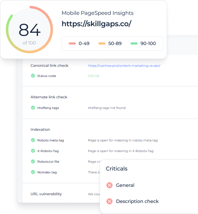
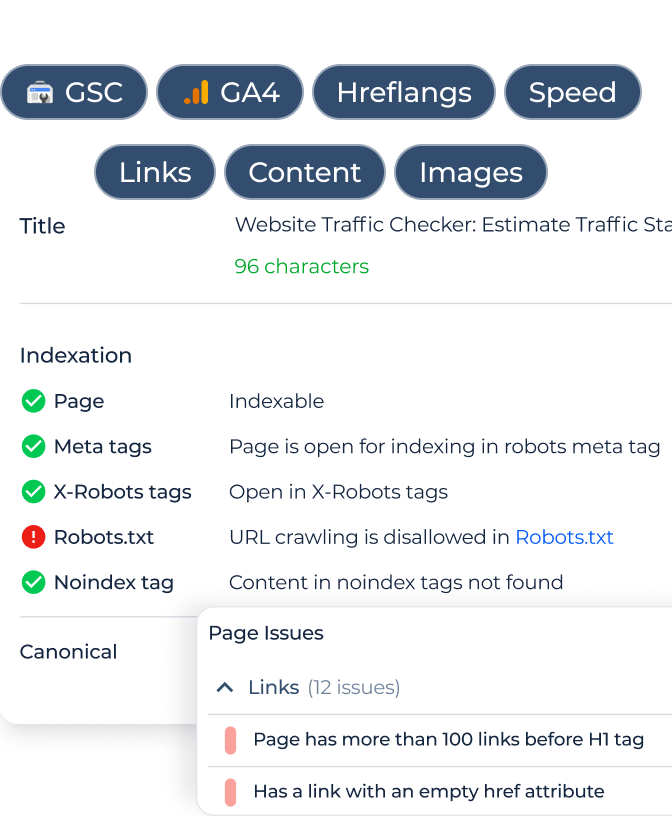
The Website Speed Test tool by Sitechecker is a pivotal instrument for webmasters and businesses alike. In the fast-paced digital realm, site load speed is paramount. Slow-loading websites can deter potential visitors and negatively affect conversion rates. With this tool, users gain insights into their website’s speed performance, allowing them to address issues that could be hindering optimal site functionality.
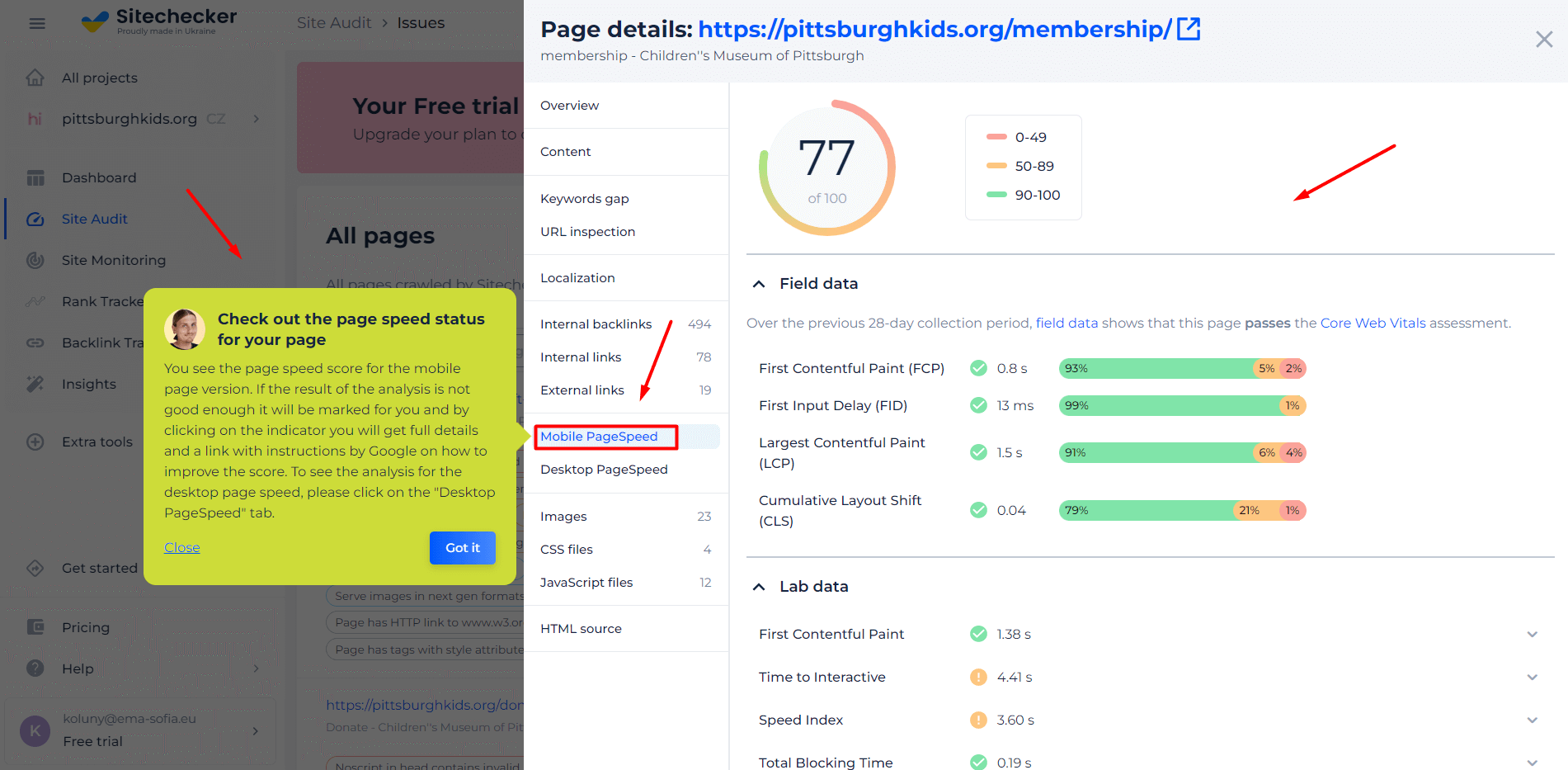
Beyond just gauging your site’s load time, the tool offers a deep dive into specific elements affecting speed. It categorizes and pinpoints bottlenecks, be it heavy images, scripts, or CSS files. Moreover, the tool provides actionable recommendations to optimize each component, ensuring your website delivers a swift and seamless experience to every visitor.
Unlock Peak Website Performance!
Discover what's holding you back and optimize for the best user experience.
Conclusion
Cumulative Layout Shift (CLS) stands as a pivotal metric in understanding and enhancing the visual stability of a website. By meticulously addressing elements like image dimensions, JavaScript handling, and the dynamic nature of ads, web developers can curate an uninterrupted and user-friendly browsing experience. Recognizing the factors contributing to CLS and implementing best practices ensures that visitors engage with content as intended, without disorienting layout changes. In the evolving landscape of web performance metrics, prioritizing CLS not only aligns with industry standards but also epitomizes the commitment to user-centric web design.