


Images account for more than 60% of the bytes on average needed to load a web page. You need to pay special attention to this when working with your site.
What Does “Mismatches in Size of Images on a Site” Mean?
This means that the page contains images that are larger than the size they are displayed at. Why? On different smartphones and tablets, images can render at different sizes, depending on the viewport size. And the browser wastes time resizing the images down to fit. Moreover, users should download useless data, which increases the duration of loading.
You can read more about using images on your websites:
What Triggers This Issue?
You have a site that works well on the web, and there you have no problem with image sizes. But things can be completely different in the mobile version of your project since you did not foresee this question in the HTML document of the pages. Then the images cannot adapt to different screen sizes of portable devices. And you have a “Mismatches in size images on a site” issue.
How to Check the Issue?
You need to crawl the site using a special desktop or online tools. For example, the Lighthouse app can collect all the images on a page and then compare the size of the rendered image to the size of the actual picture. You get a warning that the image fails validation if the rendered size is at least 4KB smaller than the actual size. Next, you need to check the other pages on your site.
Also, you can check your site for other problems with images. In this screenshot from the Sitechecker SEO tool, we are focused on identifying and addressing issues related to “images” on your website. Specifically, this tool can help you pinpoint where your site may be using images that are either too large, improperly formatted, or not optimized for faster page loading. Each listed issue, such as “Image size over 100 KB”, “Defer offscreen images”, and “Serve images in next-gen formats”, represents a specific problem that could be slowing down your site and affecting user experience.
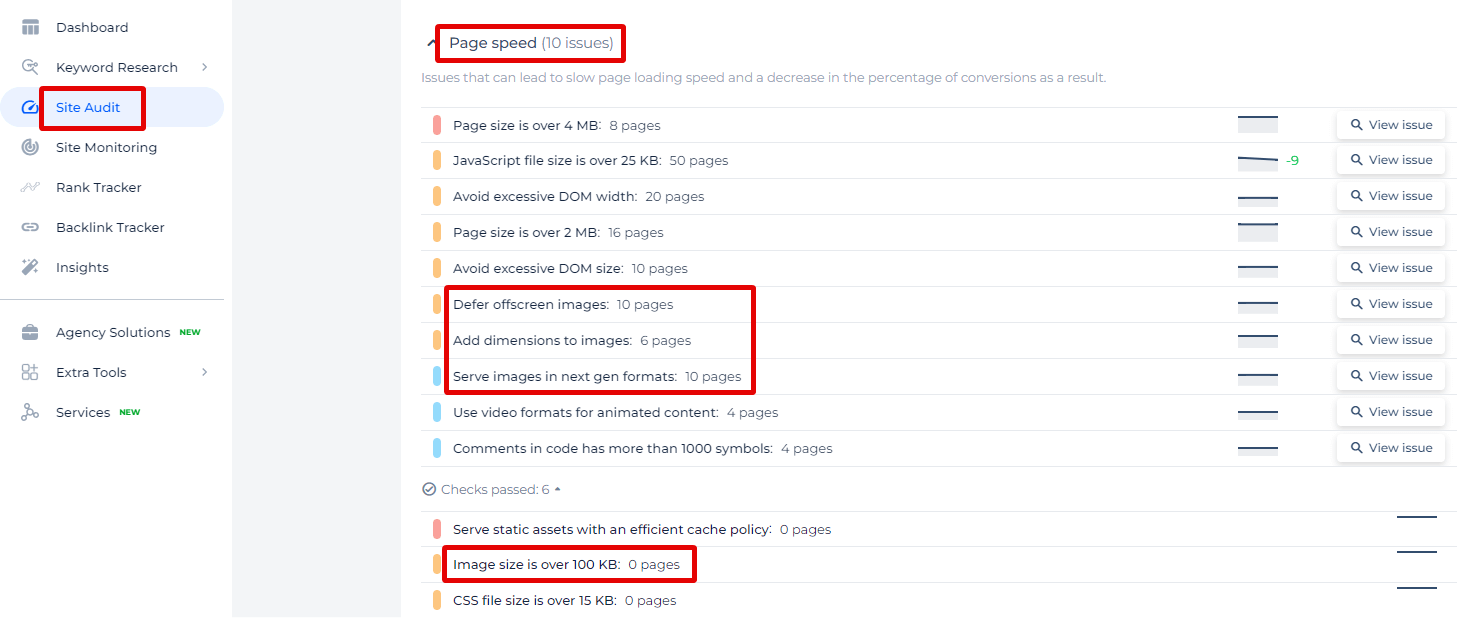
By clicking on “View issue”, you gain access to a detailed list of pages where these image-related problems occur, alongside actionable recommendations.
Boost Your Page Speed with Optimized Images!
Utilize our Site Audit Tool to detect oversized and unoptimized images that are dragging down your site speed.
Why is This Important?
Users value speed and want to work with pages that load quickly. Therefore, you need to keep track of the correspondence between the rendered size and the actual size of the images on your site.
How to Fix the Issue?
Properly sizing images on a website is crucial for optimizing load times, improving user experience, and ensuring that your site looks good on all devices. Here are steps and tips to help you properly size pictures on your site:
1. Understand Image Requirements
Identify where the image will be used (e.g., banners, thumbnails, product pictures) and what dimensions it should have for different screen sizes. Maintain the aspect ratio to avoid distortion.
2. Use Responsive Images
HTML5 picture element: Use the <picture> element to provide different versions of an image for different device sizes.
  <picture>

    <source srcset="image-large.jpg" media="(min-width: 1200px)">

    <source srcset="image-medium.jpg" media="(min-width: 768px)">

    <img src="image-small.jpg" alt="Description">

  </picture>
srcset attribute: Use srcset and sizes attributes on the <img> tag to specify multiple image sources.
  <img src="image-small.jpg"

  srcset="image-small.jpg 500w, image-medium.jpg 1000w, image-large.jpg 1500w"

  sizes="(max-width: 600px) 480px, (max-width: 1200px) 800px, 1000px"

  alt="Description">
3. Optimize Image Files
- Compress images: Use tools like TinyPNG, ImageOptim, or online services to compress pictures without losing quality.
- Choose the right format: Use JPEG for photographs, PNG for pictures with transparency, and SVG for icons and logos.
4. Use CSS for Scaling
Max-width and height: Use CSS to ensure pictures resize properly within their containers.
  img {

    max-width: 100%;

    height: auto;

  }
5. Lazy Load Images
Lazy loading: Load pictures only when they are about to enter the viewport to improve initial load time.
<img src="placeholder.jpg" data-src="image.jpg" alt="Description" class="lazyload">
  document.addEventListener("DOMContentLoaded", function() {

    let lazyImages = [].slice.call(document.querySelectorAll("img.lazyload"));

    if ("IntersectionObserver" in window) {

      let lazyImageObserver = new IntersectionObserver(function(entries, observer) {

        entries.forEach(function(entry) {

          if (entry.isIntersecting) {

            let lazyImage = entry.target;

            lazyImage.src = lazyImage.dataset.src;

            lazyImage.classList.remove("lazyload");

            lazyImageObserver.unobserve(lazyImage);

          }

        });

      });

      lazyImages.forEach(function(lazyImage) {

        lazyImageObserver.observe(lazyImage);

      });

    } else {

      // Fallback for older browsers

      let lazyLoadThrottleTimeout;

      function lazyLoad() {

        if (lazyLoadThrottleTimeout) {

          clearTimeout(lazyLoadThrottleTimeout);

        }

        lazyLoadThrottleTimeout = setTimeout(function() {

          let scrollTop = window.pageYOffset;

          lazyImages.forEach(function(img) {

            if (img.offsetTop < (window.innerHeight + scrollTop)) {

              img.src = img.dataset.src;

              img.classList.remove('lazyload');

            }

          });

          if (lazyImages.length == 0) {

            document.removeEventListener("scroll", lazyLoad);

            window.removeEventListener("resize", lazyLoad);

            window.removeEventListener("orientationchange", lazyLoad);

          }

        }, 20);

      }

      document.addEventListener("scroll", lazyLoad);

      window.addEventListener("resize", lazyLoad);

      window.addEventListener("orientationchange", lazyLoad);

    }

  });
6. Test on Various Devices
Ensure your pictures load and display correctly on different browsers and devices.
Use tools like BrowserStack or Responsinator to see how your images look on various screen sizes.
7. Use a Content Delivery Network (CDN)
Serve your pictures from a CDN to reduce load times by delivering images from servers closest to your users.
By following these steps, you can ensure that your pictures are properly sized, optimized, and delivered efficiently, enhancing the overall performance and appearance of your website.
You can also watch a video by Pete LePage from Google Developers about using secret for responsive images.