


What is the Mobile Rank Checker & Tracker Tool?
The Mobile Rank Tracker by Sitechecker is a tool designed to help monitor and improve the website ranking on mobile devices. Given the significant amount of internet traffic coming from mobile sources, this tool is vital for ensuring good website performance and SEO metrics on different platforms and regions. It offers various features.
Mobile Rank Checker & Tracker can help You in Many Ways
Mobile vs. Desktop Data: Separate data for mobile and desktop rankings is provided, recognizing the growing importance of mobile search.
Rank Checking and Tracking: This tool shows your website’s mobile keyword rankings, compared to competitors, and tracks these queries over time.
Keyword Analysis: You can analyze specific targeted queries, getting deeper insights than from standard search consoles.
Keyword Suggestions: The tool suggests related keywords, including search volumes, to optimize your content.
Customizable Frequency Reports: Data analysis by days, weeks, and months.
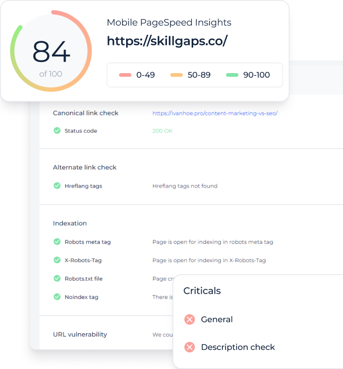
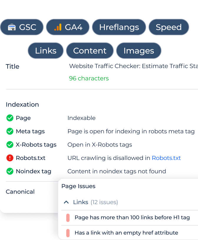
Visibility Metrics: It evaluates performance scores for your site and individual pages, highlighting strengths and improvement areas.
Competitor Analysis: Monitors mobile search rankings of competitors’ websites.
SERP features: Offers detailed insights into changes in mobile query positions, aiding in refining your SEO strategies.
Local SEO: It targets specific cities or regions, crucial for businesses focusing on local mobile users.
Local multi-ranking: Enables simultaneous tracking of keyword rankings across multiple local regions.
Custom Reports: Allows exporting data in various formats (.csv, .pdf, Looker Studio) for reporting and sharing.
Key Features of Mobile Ranking Checker
Unified Dashboard: This dashboard consolidates all SEO metrics and data in one place. It allows for a comprehensive view of your website’s SEO performance, including keyword positions and competition rankings, facilitating easier management and decision-making.
User-friendly Interface: The tool is designed with usability in mind, ensuring that even those with limited SEO experience can navigate and utilize its features effectively for search optimization.
Complete SEO Toolset: It offers a full suite of SEO tools. This includes keyword tracking, site audits, backlink analysis, and more, providing a holistic approach to improving and maintaining your website’s search results.
How to Use Mobile SERP Checker
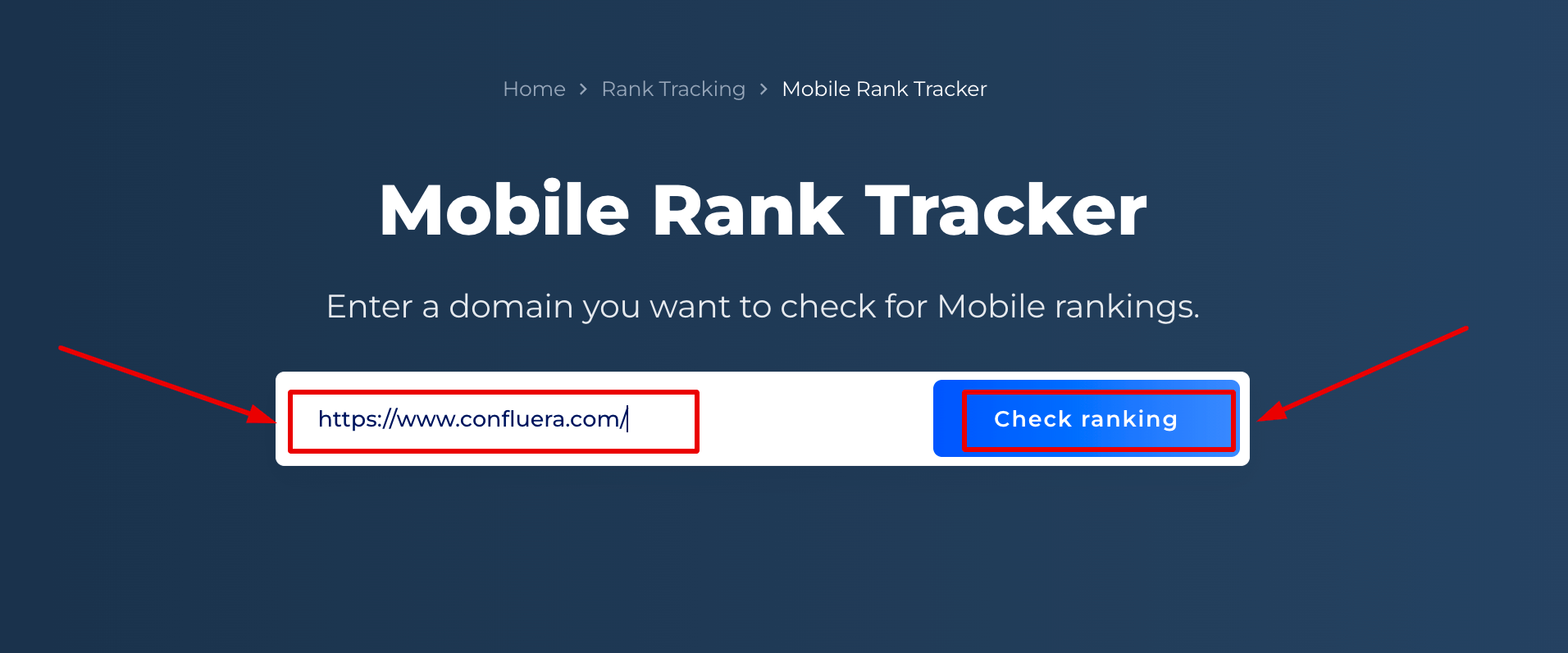
Step 1. Insert your domain name
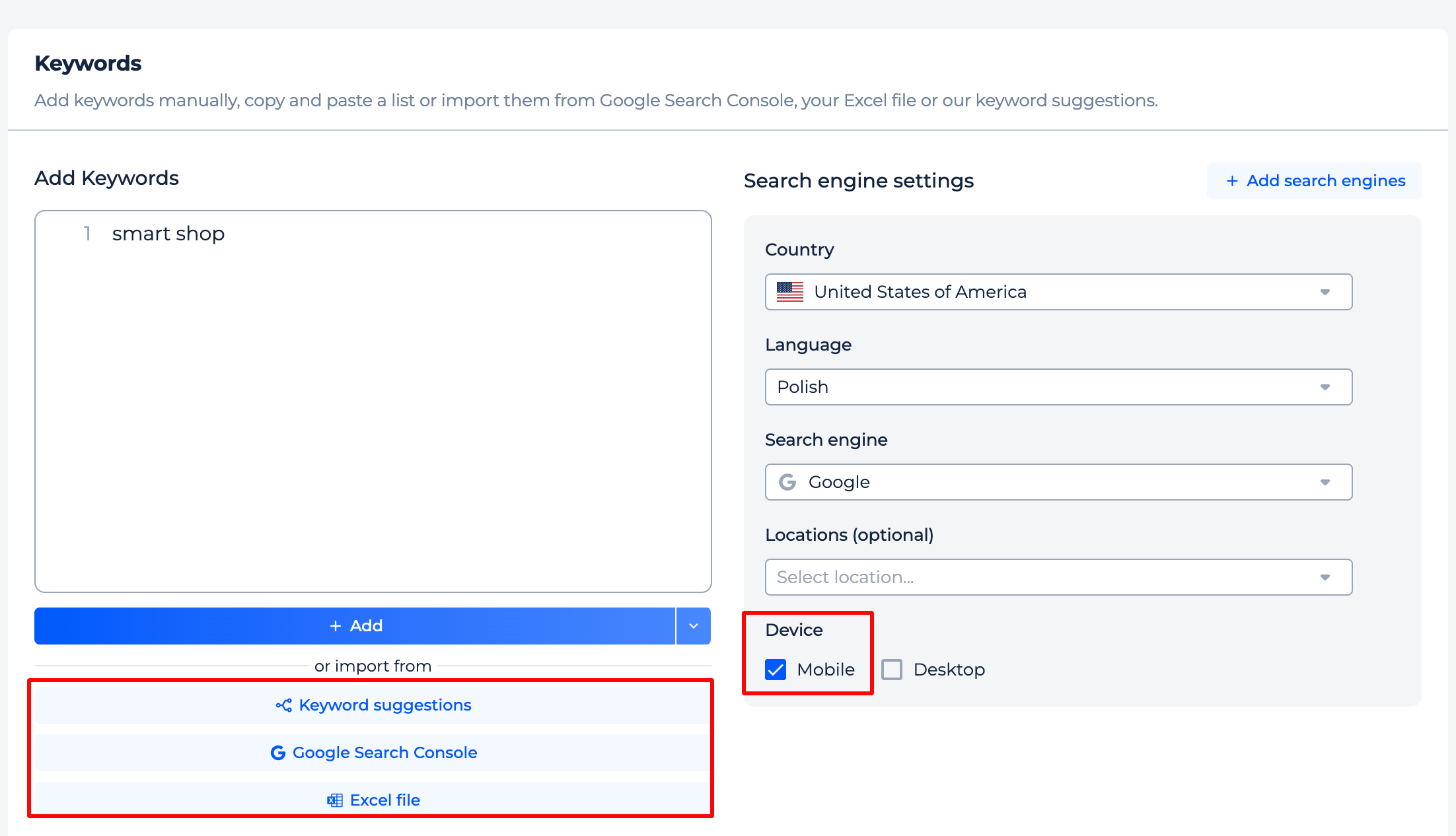
Step 2: Add and manage keywords for tracking
You can easily select and begin monitoring your preferred keywords using three simple approaches: obtaining keyword recommendations, leveraging data from Google Search Console (GSC), or importing keywords from an Excel file.
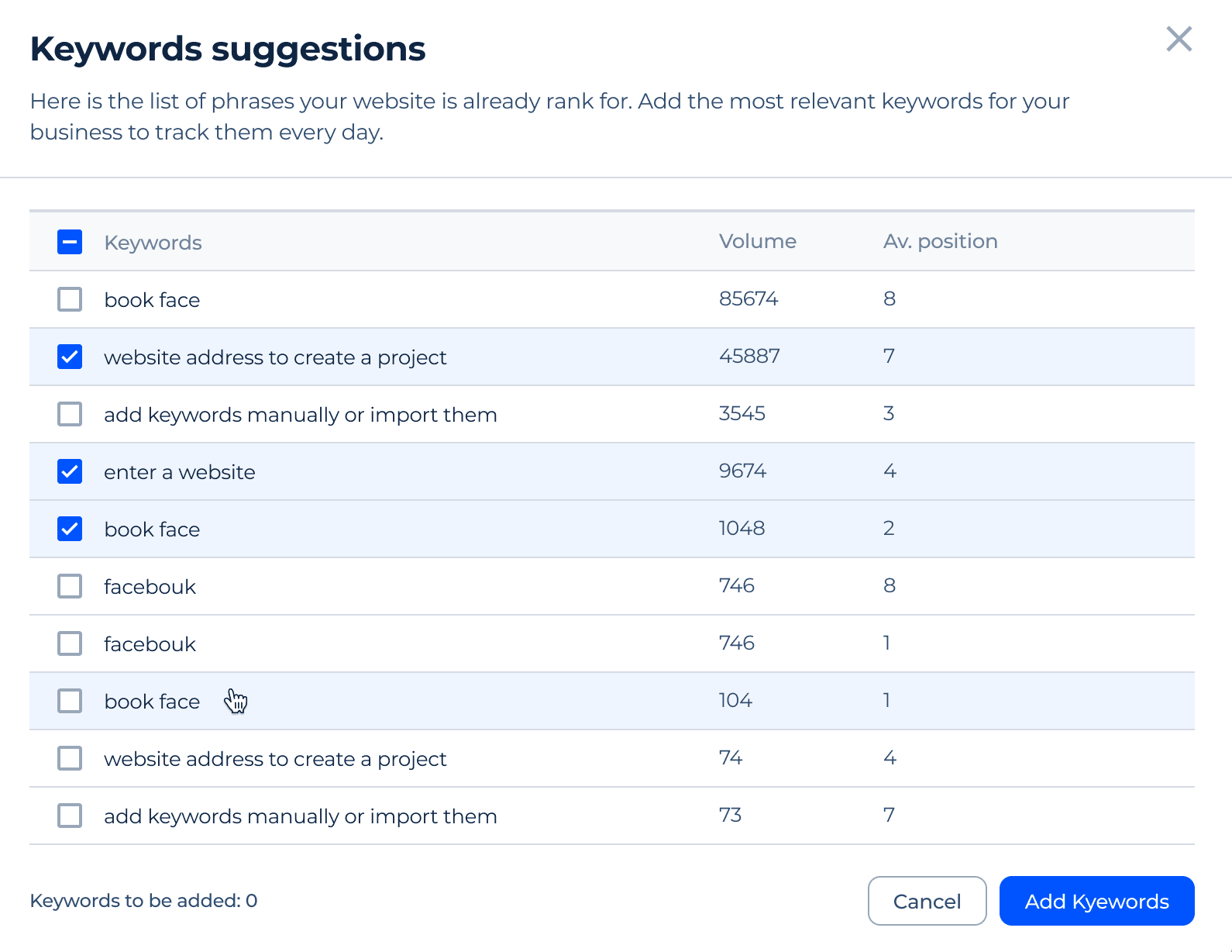
Utilize the suggested list of keywords that we will quickly assemble, grounded on the search queries where you already have rankings in the Search Engine Results Pages (SERP):
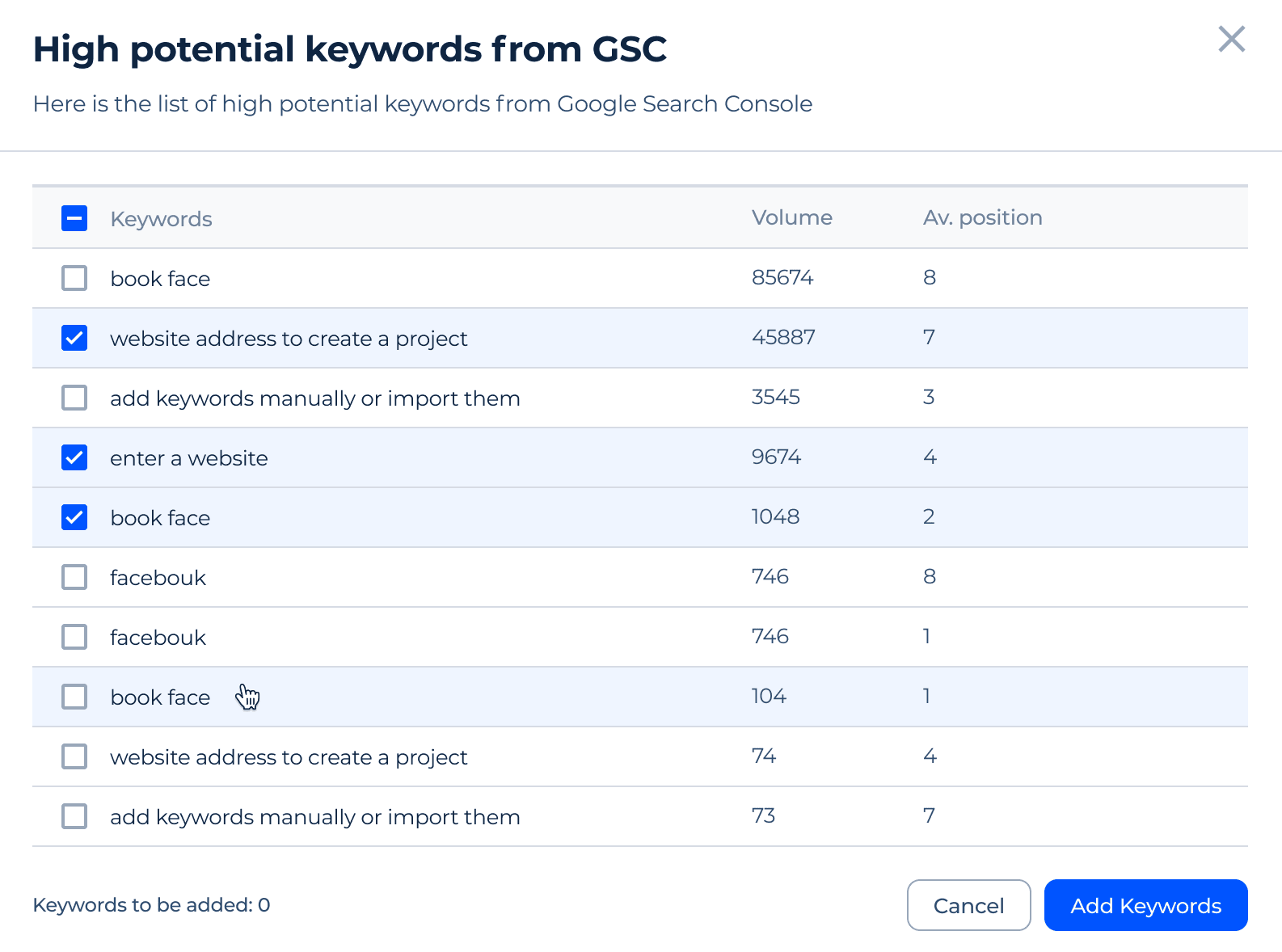
To import keywords from Google Search Console, choose the “Google Search Console” option. Following this selection, a dialog box will emerge, prompting you to create a link with Google Search Console and Analytics.

This feature allows our tool to fetch keywords from Google Search Console, together with your existing ranking information, and effortlessly incorporate them into your tracking list:
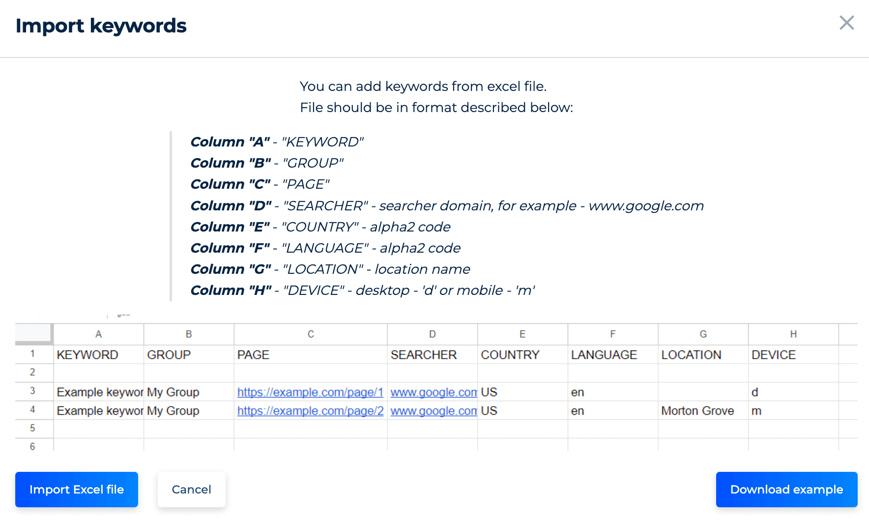
To incorporate a list of personal keywords from an Excel spreadsheet, use the “Excel file” button. This function offers an intuitive format that makes it easier to add a large volume of specific queries for personalization and monitoring:
On the side panel, you have the power over search engine configurations. Define your target parameters and precisely adjust search engine, locations, languages, and devices such as desktop or mobile.
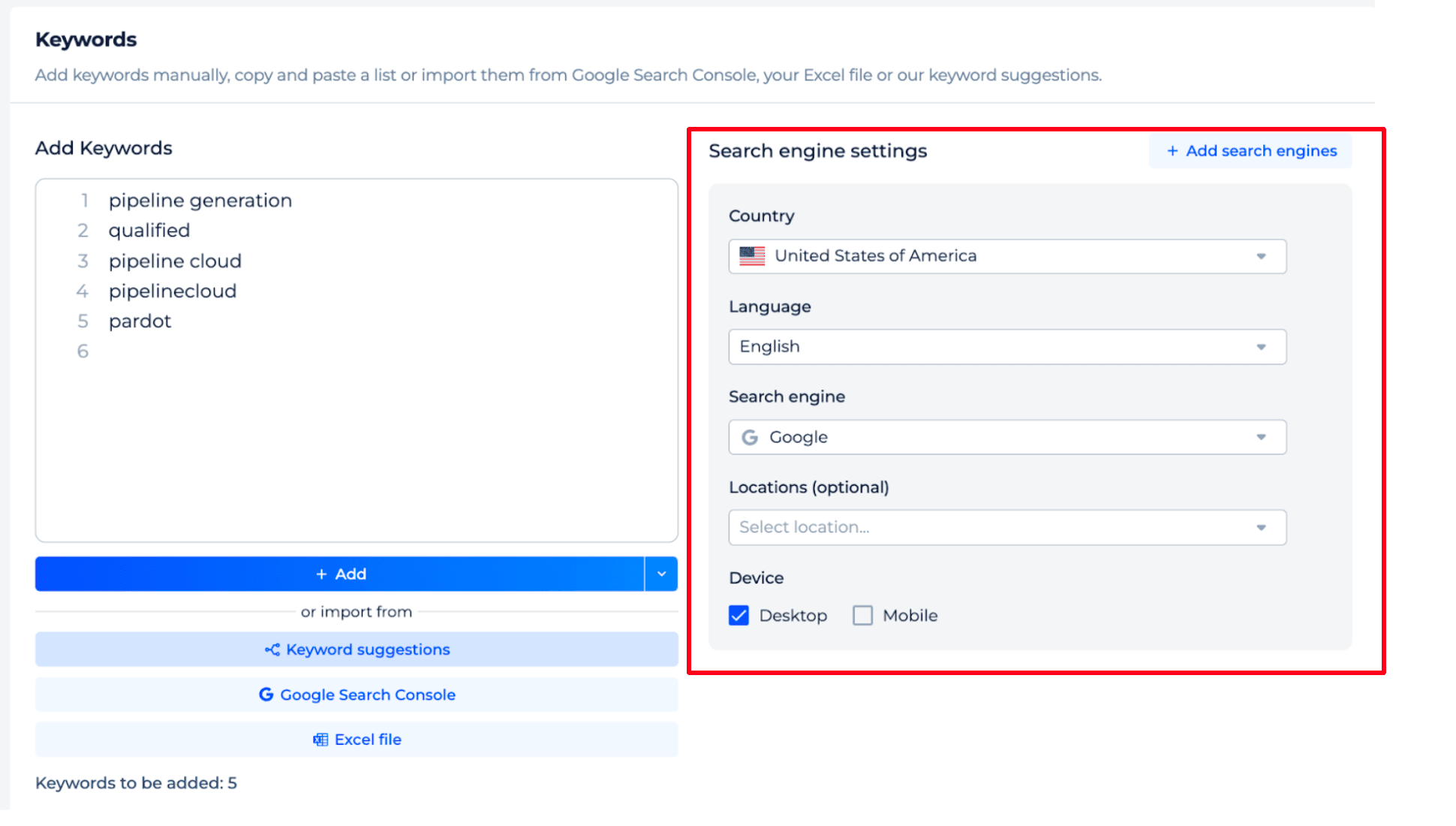
Once everything is set, click ‘Add’.
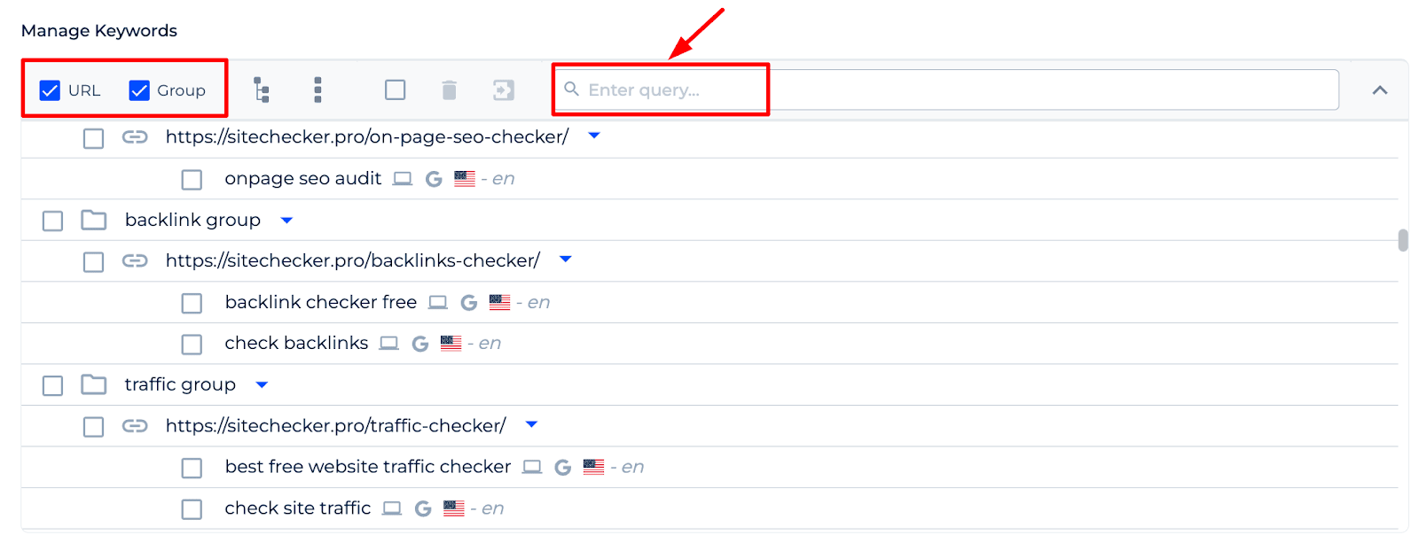
The ‘Manage Keywords’ function that follows enables you to organize the keywords into groups and arrange them by pages in line with your marketing strategy:
Step 3: Result Analysis
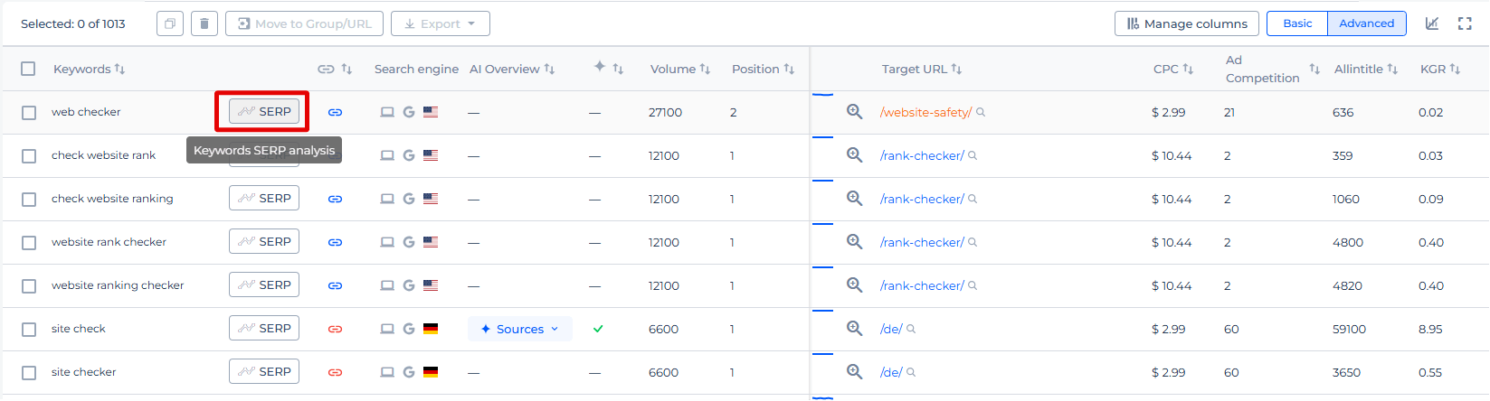
The Mobile SERP Tracker provides a seamless interface for tracking keyword performance. You can conveniently add keywords to track their rankings and search volumes and view the cost per click (CPC) for each keyword. Additionally, you can customize your view to be basic or advanced, manage columns for the data displayed, and export this information for further analysis.
This streamlined functionality makes it easier to manage and improve your SEO strategy.
Upon completion, the Mobile Rank Checker & Tracker offers a detailed report with the initial results. This report becomes a reliable tool for regular SEO monitoring.
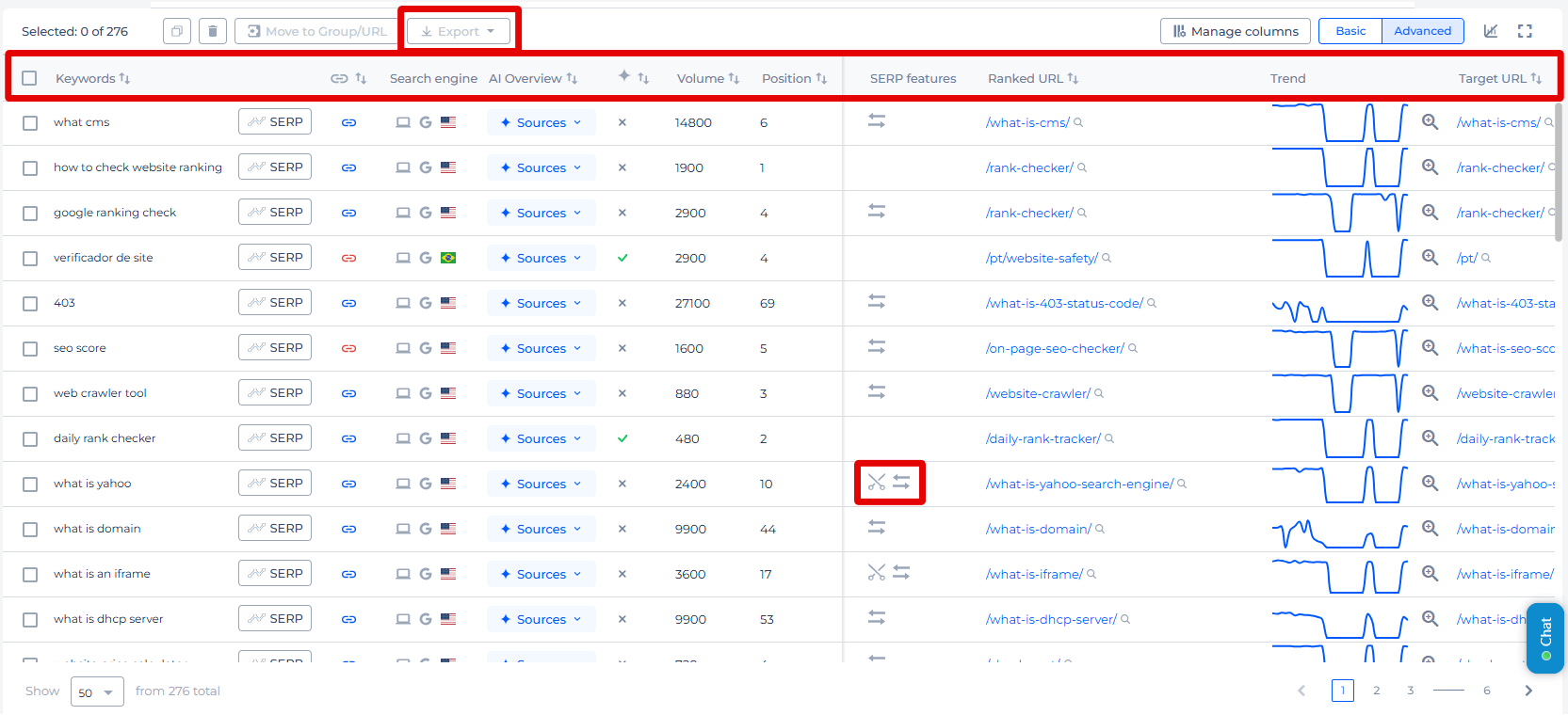
Mobile Rank Tracking Software offers a clear overview of your site’s SEO performance in mobile searches, including keyword rankings and visibility metrics. It features an indexation graph for tracking page indexing and an interactive timeline to analyze ranking trends with customizable daily, weekly, or monthly views. The keyword section highlights essential data like ranked URLs, search volume, current rankings, positions in SERPs, AI Overview Checker data and more, aiding in improving your presence.
Additionally, it shows cost-per-click values and identifies if the keyword is featured in prominent mobile SERP elements, giving a thorough overview of your keyword’s performance.
Additional Features of Mobile Rank Checker & Tracker
Using the tool, select the “SERP” button beside any listed keyword to reveal its trend graph.
The graph displays the historical ranking data of different URLs for a chosen keyword, with each URL’s performance depicted in a distinct color. This visual tool helps you understand the ranking dynamics of various pages for the same keyword within a specified period. It also allows for in-depth analysis by entering a URL directly. With customizable filters for date ranges and page selection, this feature enhances your capacity to track and plan your SEO tactics effectively.
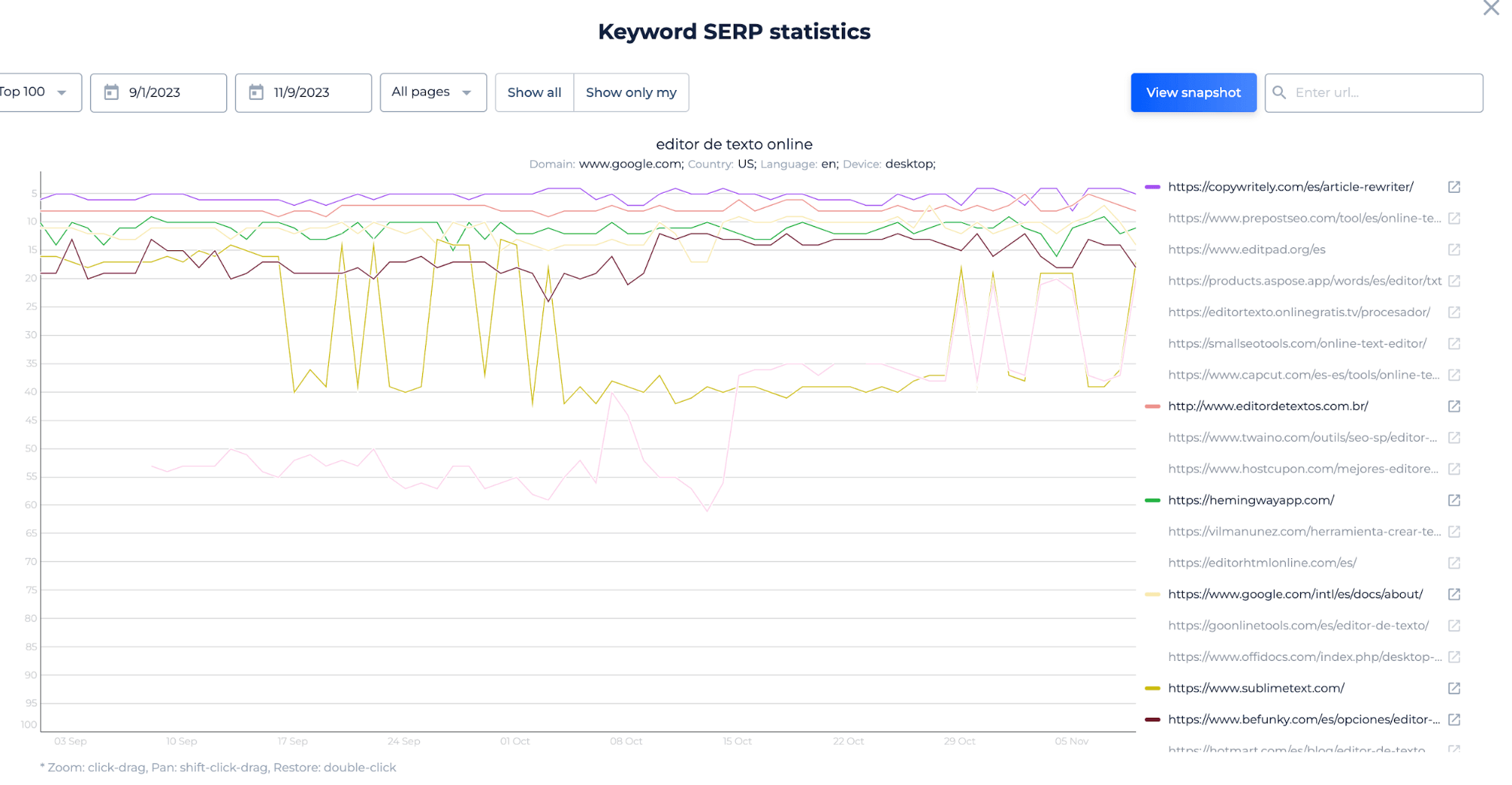
With customizable filters for date ranges and page selection, this feature enhances your capacity to track and plan your SEO tactics effectively.
Final Idea
The Google Mobile Rank Tracking Tool is a comprehensive tool for monitoring a website’s mobile SEO performance. It provides a unified dashboard for visibility into keyword rankings, local SEO targeting, and competitor analysis. The tool’s features include user-friendly interfaces, a complete SEO toolset, and detailed SERP statistics. Users can add keywords, adjust search settings, and receive reports to guide their SEO strategies. A free trial is available, with options to connect to Google Search Console for enhanced tracking. Its visualization capabilities offer insights into keyword performance trends, making it a vital asset for optimizing mobile presence.
