


Mobile-First Indexing Definition
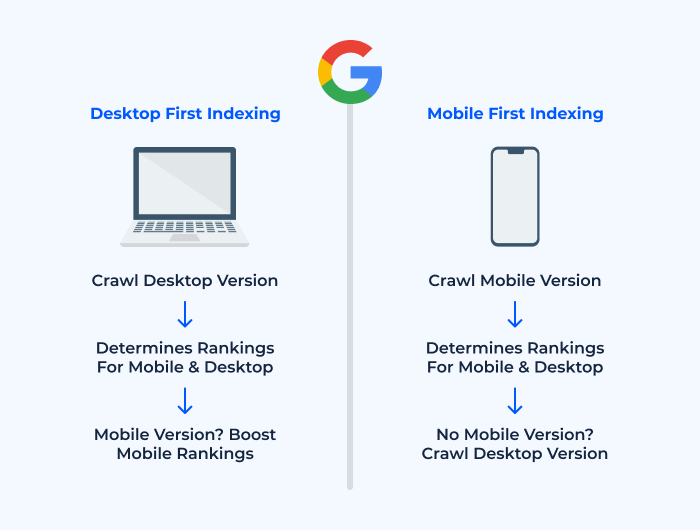
Mobile-first indexing refers to the practice adopted by search engines, predominantly Google, to use the mobile version of a website as its primary source for indexing and ranking. In other words, when search engines crawl and index content, they look at the mobile version of a website first, rather than the desktop version, which was traditionally the case.
Why the Shift to Mobile-First?
The evolution and adaptation of mobile-first indexing are largely in response to the dramatic increase in mobile internet usage. Today, more people access the internet through mobile devices than desktop computers. Recognizing this trend, search engines decided to prioritize mobile content to ensure the results they serve reflect the majority of user experiences.
What it Means for Websites
For websites, this shift indicates a pressing need to ensure that their mobile versions are not only accessible but also optimized for performance and user experience. If a site doesn’t have a mobile-friendly version or if the mobile version lacks crucial content present in the desktop version, it can negatively impact its search engine rankings.
How it Differs from Past Practices
Traditionally, search engines prioritized the desktop version of websites. This meant that SEO strategies and website designs were often heavily tilted towards desktop users. With mobile-first indexing, the dynamics have shifted. Even if a website has a stellar desktop version, it might suffer in rankings if its mobile version isn’t up to par.
In conclusion, mobile-first indexing is a testament to the changing landscape of internet usage. As the name suggests, it puts mobile at the forefront, signaling to website owners the importance of optimizing for mobile devices in the current digital age.
What Does Mobile-First Indexing Mean for SEO?
With the onset of mobile-first indexing, the Search Engine Optimization (SEO) landscape has seen a significant shift in priorities and strategies. This change underscores the necessity of ensuring a website’s mobile version is not just functional, but optimized for the best user experience. Here’s a deeper look into what mobile-first indexing implies for SEO:
You Can’t Opt-Out of Mobile-First Indexing
One of the most important things to understand about mobile-first indexing is its inevitability. Websites don’t have the luxury to choose whether they want to be part of this new indexing approach.
- Irrespective of Preference: Even if your primary audience uses desktops, and you believe the desktop version of your site offers a superior experience, search engines will still prioritize your mobile version for indexing purposes.
- Immediate Action Required: This underscores the urgency for sites, especially those that have traditionally been desktop-centric, to revamp and optimize their mobile experiences. Failing to do so can lead to a decline in search rankings and visibility.
- Universal Application: It’s a blanket policy, meaning that all new websites are now assumed to be mobile-friendly and are indexed with mobile-first indexing by default. For older sites, search engines have been migrating them to mobile-first indexing based on signals of their readiness.
There Is Only One Index
A common misconception is that with the advent of mobile-first indexing, there are separate indexes for mobile and desktop. This is not the case.
- Single Source of Truth: Search engines use a single index to store and retrieve information. The “mobile-first” in mobile-first indexing only refers to the priority given to the mobile version of websites when populating this single index.
- Consistent SERPs: This means that there isn’t a distinct mobile index and desktop index leading to different search engine results pages (SERPs) for different devices. Everyone views results from the same index, but the ranking of these results might vary based on various factors, including device compatibility.
- Ensuring Content Parity: Given this single index system, it becomes imperative for websites to maintain content parity between desktop and mobile versions. If certain content or pages are only present on the desktop version and omitted from the mobile version, they risk being excluded from the index altogether.
In essence, mobile-first indexing has profound implications for SEO strategies. It reinforces the idea that mobile optimization isn’t just a ‘good-to-have’ but an essential component of modern digital presence. Ignoring this shift can have tangible repercussions on a website’s search visibility and performance.
Best Practices to Boost Your Site’s Ranking in the Mobile-First Era
In the mobile-first era, it’s crucial for websites to adapt and adhere to best practices to remain competitive in search engine rankings. Below are some essential strategies and considerations to enhance your site’s mobile optimization:
Optimize content for mobile devices
- Readable Text: Ensure that the text on your mobile site is easily readable without requiring users to zoom in. This includes using legible fonts and appropriate font sizes.
- Visual Content: Images and videos should be appropriately sized so that they load quickly and fit within the screen’s width without horizontal scrolling.
- Structured Content: Break content into short, digestible paragraphs with clear headings. Mobile users often skim content, so it’s essential to make it easily scannable.
- Pop-ups and Interstitials: Minimize the use of pop-ups and interstitials on mobile as they can be disruptive to the user experience. When used, ensure they’re easily dismissible.
Use responsive web design (RWD) techniques
- Fluid Grids: Use fluid grid systems to ensure that content resizes smoothly across various screen sizes and resolutions.
- Flexible Media: Images and other media should resize within their containing elements, preventing layout issues or horizontal scrolling.
- CSS Media Queries: Apply styles and layouts based on different device characteristics, like width, height, or screen resolution, ensuring the design fits all device types.
- Consistent Testing: Regularly test your site on various devices and screen sizes to ensure the responsive design is functioning as intended.
Increase site speed
- Minimize Code: Minimize HTML, CSS, and JavaScript files to reduce load times. Utilize minification tools to compress your code.
- Optimize Images: Use compression tools to reduce image file sizes without sacrificing quality. Also, consider implementing modern image formats like WebP.
- Leverage Browser Caching: Store frequently used files on the user’s browser to speed up subsequent page loads.
- Content Delivery Network (CDN): Use a CDN to distribute content more efficiently to users based on their geographic location.
Boost user experience
Provide the same experience across mobile and desktop devices
- Content Parity: Ensure all essential content available on the desktop version is also present and accessible on the mobile version.
- Functionality: All tools, forms, and site functions should work seamlessly across both desktop and mobile platforms.
Don’t confuse mobile-first indexing with mobile usability
- SEO vs. UX: While mobile-first indexing is an SEO principle, focusing solely on it and neglecting mobile usability can harm user experience. Both should go hand in hand.
- Prioritize Users: Always prioritize the user’s experience on your mobile site. A technically optimized site for mobile-first indexing won’t succeed if users find it difficult or unappealing.
In summary, as mobile-first indexing becomes the norm, websites must be proactive in their optimization strategies. By focusing on content, design, speed, and overall user experience, sites can ensure they’re not just keeping up but thriving in the mobile-first era.
Use structured data
Structured data, often in the form of schema markup, provides search engines with additional information about the content on your site, enhancing its visibility and the way it’s presented in search results.
- Enhanced Results: Implementing structured data can lead to rich snippets or enhanced search results, such as star ratings, product prices, or event dates directly visible in the search listings.
- Consistent Information: Ensure that the structured data on your mobile site is consistent with your desktop site. This can help in conveying accurate and coherent information to search engines.
- Use Relevant Schemas: Depending on your website’s content, make use of relevant schema types like articles, products, reviews, events, etc.
- Validation: Use tools provided by search engines, like Google’s Structured Data Testing Tool, to validate your structured data implementation and ensure there are no errors.
Test your site’s mobile-friendliness
Given the emphasis on mobile-first indexing, it’s paramount to ensure that your site is genuinely mobile-friendly.
-
Mobile-Friendly Test: Utilize online tools like Mobile-Friendly Test to gauge how well your website performs on mobile devices.
-
Regular Audits: Conduct regular audits using website analysis tools to identify any mobile usability issues and rectify them promptly.
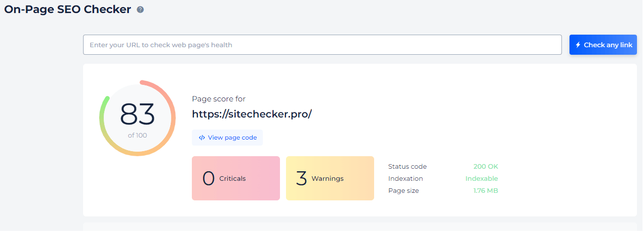
- Consider Touch: Design with touch in mind, ensuring buttons and links are adequately spaced and easily tappable.
-
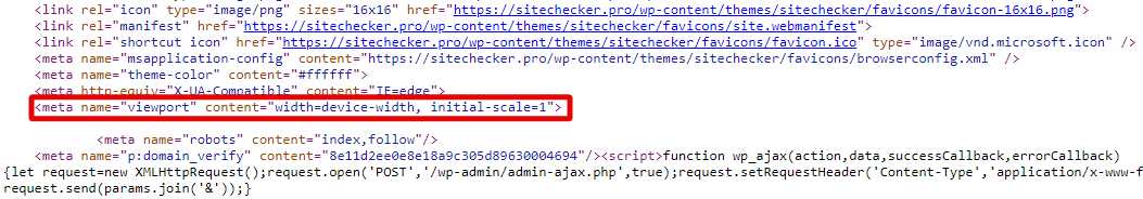
Viewport Configuration: Ensure that your site uses a responsive viewport meta tag to adapt correctly to different devices.
Handling separate mobile and desktop sites
Some websites opt for separate mobile and desktop versions. While this approach can have advantages, it comes with its own set of challenges in the mobile-first era.
- Consistent Content: If there are significant content differences between your mobile and desktop sites, the mobile content will be the one predominantly indexed. Ensure that vital content is present and easily accessible on both versions.
- Rel=Canonical and Rel=Alternate: Use the “rel=canonical” link attribute on the desktop version pointing to the mobile version, and the “rel=alternate” attribute on the mobile version pointing to the desktop version. This helps search engines understand the relationship between the two versions.
- Verify Both in Search Console: If using tools like Google Search Console, ensure both the mobile and desktop versions are verified, providing insights into potential issues for each version.
- Avoid Redirection Errors: If users are automatically redirected based on their device, ensure that the redirects are correctly configured. For instance, a mobile user should not be mistakenly directed to the desktop version.
In conclusion, while mobile-first indexing has implications for all websites, those with separate mobile and desktop versions need to be particularly attentive. The key is to provide a seamless and consistent experience, regardless of the approach taken.
Checking and Adapting to Mobile-First Indexing
With mobile-first indexing becoming the default behavior of search engines, it’s essential for webmasters and site owners to ensure their websites are properly indexed and aligned with this new paradigm. Here’s how you can check and adapt accordingly:
You can check if your site is on mobile-first indexing
Knowing whether your site has been moved to mobile-first indexing is crucial for identifying any potential adjustments needed. Fortunately, there are straightforward methods to determine this:
- Google Search Console: One of the easiest ways is to use Google Search Console. Once logged in, you can navigate to the “Settings” section. If your site has been moved to mobile-first indexing, you’ll receive a notification under the “About” tab indicating that your site is being primarily crawled by Google’s mobile crawler.
- Server Logs: Another method involves analyzing your server logs. If you notice that the majority of Googlebot’s crawls are from its mobile agent rather than its desktop agent, it’s an indication that your site is on mobile-first indexing.
- Official Notifications: Google usually sends notifications to website owners (via Search Console) when their site is transitioned to mobile-first indexing. Keep an eye on your registered email for such alerts.
Adapting to Mobile-First Indexing:
Once you’ve confirmed that your site is on mobile-first indexing, or even if you’re preparing for the inevitable transition, consider the following adaptations:
- Ensure Mobile Optimization: As a priority, ensure that your mobile website is not just a diminished version of your desktop site. It should be fully functional, offering a complete user experience.
- Responsive Design: If you haven’t already, adopting a responsive design ensures that your website provides a consistent experience across devices.
- Content Parity: Ensure that crucial content (text, images, videos) present on the desktop version is also accessible on the mobile version.
- Structured Data: Maintain consistency in structured data between both versions. If you use schema markup on your desktop site, ensure it’s also present and correctly implemented on your mobile site.
- Metadata Consistency: Meta titles and descriptions should be equivalent across both versions to maintain a uniform signaling to search engines about your content’s context.
- Verify Mobile Site in Search Console: If you have separate mobile and desktop versions, ensure both are verified in Google Search Console for comprehensive insights and alerts.
The mobile-first era demands proactive measures. By regularly checking your site’s status and making the necessary adaptations, you can ensure optimal performance in search results and a positive user experience.
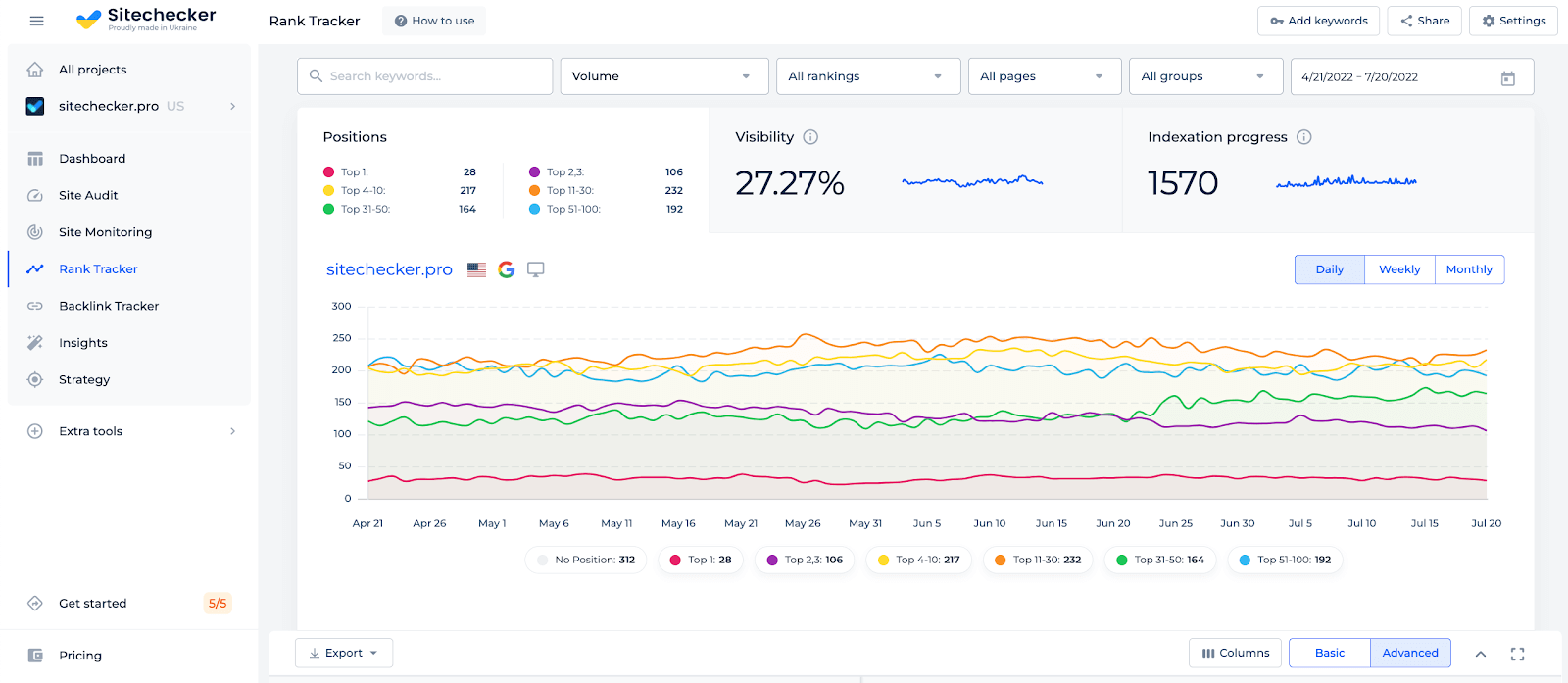
Check a Domain for Mobile Rankings With Mobile Rank Tracker
The Mobile Rank Tracker tool by SiteChecker is an indispensable solution for anyone looking to excel in the increasingly important mobile search market. In a digital landscape where mobile searches are rapidly overtaking desktop, this tool provides detailed insights into how your website ranks in mobile search engine results. Tailored specifically for mobile SEO, it enables users to track and analyze their site’s performance on various mobile devices, ensuring they can optimize their content and strategy to meet the unique demands of mobile users.
Apart from tracking mobile rankings, the tool offers additional functionalities like tracking keyword performance and competitor analysis for mobile search results. It helps users to understand which keywords are driving traffic to their mobile site and how their mobile performance compares to their competitors. This level of analysis is critical for fine-tuning SEO tactics to target the mobile audience more effectively. The Mobile Rank Tracker tool is user-friendly and provides actionable data, making it an essential tool for businesses and individuals aiming to enhance their online presence in the mobile-first world.
Track Your Rankings Now!
Use our Mobile Rank Tracker to monitor your site's performance on mobile devices.
Conclusion
Mobile-first indexing represents a transformative shift in the digital landscape, emphasizing the ever-growing importance of mobile accessibility and optimization. As search behaviors evolve, businesses and webmasters must prioritize mobile user experience to remain competitive and visible in search results. By understanding and embracing the principles of mobile-first indexing, site owners can ensure they cater to modern user needs and search engine preferences alike. In this dynamic digital age, being mobile-ready isn’t just an advantage; it’s a necessity. Adapting to this paradigm ensures a website’s continued relevance, reach, and resonance with its audience.


")