


What Is Website Navigation?
Website navigation refers to the system that allows visitors to a website to move around that site. Navigation is most often thought of in terms of menus, but links within pages, breadcrumbs, related links, pagination, and any other links that allow a visitor to move from one page to another fall under this category. At its core, website navigation should help users find the information they seek quickly, without confusion or delay.
What Is a Website Navigation Menu?
A website navigation menu is a list of links, typically organized in a list, that direct users to the different sections or pages of a website. These menus can be horizontally or vertically oriented and can appear in various styles, such as dropdowns, fly-out menus, or even full-page directories. The primary goal of a navigation menu is to guide and facilitate the user’s journey throughout the site, making the experience intuitive and straightforward. Common elements found in navigation menus include home, about us, services, contact, and blog or news sections.
What Is the Navigation Structure of a Website?
The navigation structure of a website refers to the way information and pages are organized and interlinked. It is the framework that dictates how users progress through a website. A good navigation structure ensures that users can easily find what they’re looking for and understand where they are within the website’s hierarchy. This structure often follows a hierarchical model, starting with the main home page at the top and branching out to sub-pages and further sub-categories. It’s essential to ensure that this structure is logical, with related pages grouped together and crucial pages easily accessible.
What Is Sub-navigation on a Website?
Sub-navigation, often termed as “secondary navigation”, refers to the set of links or menu items that appear beneath the primary navigation, guiding users to more specific content within a broader section or category. It plays a vital role in improving user experience by decluttering the primary navigation and providing direct access to deeper, more detailed content. An example of sub-navigation could be a primary menu item titled “Services”, and beneath it, the sub-navigation items might list specific services like “Consulting”, “Design”, and “Development”. This structure ensures that users can drill down into more specific content areas without feeling overwhelmed by too many choices in the primary navigation.
Why Is Navigation Important on a Website?
Website navigation serves as the roadmap for your online domain, guiding users seamlessly through your content. It plays an instrumental role in determining the user experience and the effectiveness of your website. Below are some reasons why navigation is critically important:
| Enhances User Experience (UX) | An intuitive navigation system ensures that users can easily find the information they’re looking for without confusion. A positive user experience often leads to prolonged site visits, return visits, and increased engagement. |
| Improves Accessibility | Effective navigation systems, especially when designed with accessibility in mind, ensure that all users, including those with disabilities, can browse the website without hindrance. |
| Boosts Search Engine Ranking | Search engines, like Google, assess the structure of websites. A clear and logical navigation can positively impact your site’s search engine ranking, making it easier for potential visitors to find your site through search queries. |
| Increases Conversions | Whether your goal is to sell products, gain subscribers, or encourage visitors to reach out for a consultation, a streamlined navigation system can guide users towards these conversion points more efficiently. |
| Reduces Bounce Rate | A confusing or complicated navigation can lead to increased bounce rates, where users leave the site without delving deeper into your content. Effective navigation encourages exploration, thereby reducing this rate. |
| Facilitates Content Discovery | Especially for websites with a vast amount of content, like blogs or news sites, a well-organized navigation helps users discover new and relevant content that they might not have initially sought out. |
| Establishes Information Hierarchy | Through navigation, webmasters can guide visitors on a journey, emphasizing certain pages or pieces of content over others. This hierarchy can influence users’ actions and perceptions of the brand. |
| Builds Trust and Credibility | A professional-looking and smooth navigation instills trust in the visitor. It gives the impression of a well-structured, user-centric design, emphasizing the brand’s reliability and authenticity. |
Website navigation is not just about linking different parts of your website. It’s about enhancing the overall experience, guiding users effortlessly from one point to another, and ensuring that they find value and relevance in your content. A well-structured navigation system benefits both the user and the website owner, making it a crucial element in web design.
Google about Website Navigation
Here are some of the things John Mueller has said about “Website Navigation” on Twitter:
Overall, Mueller’s advice on website navigation is to focus on making it clear, concise, and easy for users to find the information they need. Avoid overloading your navigation menu with too many links, and make sure that the links are descriptive and relevant to the content of your website.
Types of Web Navigation
Website navigation is multifaceted, with various types designed to optimize the user experience depending on the website’s content, design, and objectives. Let’s delve into the common types of web navigation:
1. Global Website Navigation
Global website navigation refers to the primary navigation menu that is consistent and appears on every page of a website. It offers a comprehensive view of the main sections or categories on a site, ensuring that users can quickly jump to different areas irrespective of their current location on the website. This type of navigation is crucial for orienting users and provides a sense of coherence and consistency.
2. Hierarchical Website Navigation
Hierarchical navigation is structured in a tree-like form, reflecting the organization of the website’s content from general categories to specific sub-categories. The homepage serves as the tree’s trunk, main sections as the primary branches, and sub-sections and pages as the smaller branches and leaves. This navigation type is intuitive, as it follows a top-down approach, making it easier for users to understand the site’s structure and content flow.
3. Local Website Navigation
Local navigation, sometimes called contextual or in-context navigation, refers to links within the content or adjacent to it that direct users to related pages. This can include “Read Next” links at the end of blog articles, related product links on e-commerce sites, or any navigation element that’s not part of the primary or global navigation but helps in enhancing the content’s context.
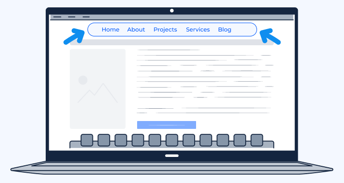
4. Horizontal Navigation Bar
One of the most common designs, the horizontal navigation bar, typically appears at the top of a website. This layout is ideal for sites with a moderate number of main categories. Due to its widespread use, it’s familiar to most users, making it an effective choice for many websites.
5. Dropdown Navigation Menu
Dropdown menus are extensions of the horizontal or vertical navigation bars. When a user hovers over or clicks on a primary category, a list of sub-categories “drops down.” This design is useful for websites with a vast amount of content, but care must be taken to ensure it doesn’t become too cluttered or overwhelming for users.
6. Hamburger Navigation Menu
Popularized with the rise of mobile web browsing, the hamburger menu (often represented by three horizontal lines) conserves space by hiding the main navigation. When clicked, it expands to display the site’s sections. While it offers a clean design, especially for mobile views, it’s essential to ensure that users recognize and can easily access this menu.
7. Vertical Sidebar Navigation Menu
Often situated on the left or right side of a website, vertical sidebar navigation provides a list of links or categories in a vertical manner. This style can be particularly effective for websites with multiple subsections or for sites that want to emphasize content exploration, such as portfolios or blogs.
8. Footer Navigation Menu
Located at the bottom of web pages, footer navigation typically contains links to essential pages like terms of service, privacy policies, and contact information. It can also offer secondary navigation to main site sections, ensuring that users have one more opportunity to explore the site fully before reaching the page’s end.
Website Navigation Bar Design
The navigation bar is a cornerstone of website design, providing users with a roadmap to your site’s most important content. A well-designed navigation bar can significantly improve user experience, facilitate conversions, and reflect your brand’s professionalism.
What Should be Included in Your Website Navigation Bar?
A website’s navigation bar should be both comprehensive and concise, guiding users to essential content without overwhelming them. Here’s a closer look at what you might include:
Attribution Reports
Attribution reports can be crucial for businesses, especially in the realm of digital marketing. If your website offers insights or analytics on marketing campaigns, user behavior, or other data-driven content, having a direct link to attribution reports can be beneficial.
Users Flow
Understanding how users move through your website can provide valuable insights for optimization. If your site offers a dashboard or analytical insights for users, especially in platforms that track user behavior, the “Users Flow” link can be an essential addition.
How Should You Order Your Navigation Items?
Ordering of navigation items plays a pivotal role in usability. The sequence should reflect the content’s priority and the user’s expected journey:
- Start with the Basics: Begin with universally recognized links such as ‘Home’, ‘About Us’, or ‘Services’.
- Prioritize by Popularity and Importance: The most accessed or critical pages should be more prominently placed, usually towards the beginning or center of the navigation bar.
- Group Related Items: If you have multiple services or product categories, consider using dropdown menus or sub-navigation to group related items.
- End with Secondary Information: Links like ‘Contact’, ‘Blog’, or ‘FAQs’ often find their place towards the end of the navigation bar, providing an endpoint for users exploring your site.
How Should You Phrase Your Navigation Options?
Your navigation should communicate clearly and swiftly. The choice of words, while reflecting your brand’s tone, should prioritize clarity.
Object-Based
This approach names navigation items after the things or objects the user will find or interact with, such as ‘Products’, ‘Blog’, or ‘Gallery’. It’s straightforward and highly intuitive for users.
Action-Based
This emphasizes what users can do on the page. Examples include ‘Sign Up’, ‘Learn More’, or ‘Get Started’. It’s especially effective for call-to-action buttons or sites aiming to drive user interaction.
Audience-Based
If your website caters to different user groups, you might structure your navigation around these audiences, like ‘For Students’, ‘For Teachers’, or ‘For Parents’. This provides immediate direction for users to find content relevant to them.
Search Engine Optimized
Incorporate keywords that users might search for, improving your site’s SEO. For instance, instead of just ‘Services’, a digital marketing agency might use ‘Digital Marketing Services’. However, it’s vital to ensure that SEO efforts don’t compromise clarity or usability.
Website Navigation Examples
Analyzing real-world examples of website navigation provides valuable insights into design choices, user-centric approaches, and innovative methods to guide users through a website. One prominent example worth examining is the New York Times.
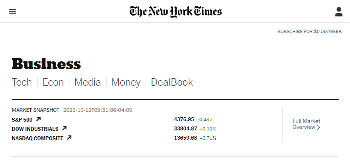
News Website: New York Times
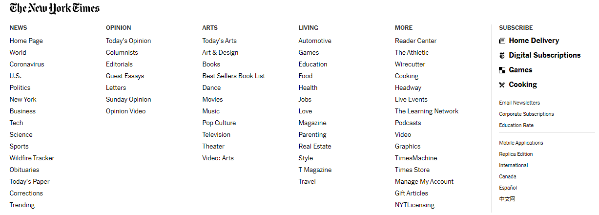
The New York Times, an esteemed global news organization, has continuously adapted its online presence to cater to evolving user behaviors and technological advances. Here’s a breakdown of their navigation structure:
Homepage
- Main Navigation Bar: Located at the top, it showcases primary news categories such as ‘World’, ‘U.S.’, ‘Politics’, ‘Business’, ‘Opinion’, and more. This bar gives readers immediate access to key sections.
- Secondary Navigation: Underneath the main categories, users find more specific sections like ‘Tech’, ‘Science’, ‘Health’, etc.
- Search Icon & User Profile Access: On the top right, enhancing usability for those looking for specific content or wanting to log in.

Homepage (Mobile)
- Hamburger Menu: To conserve space on mobile, the numerous sections are tucked into a hamburger menu, which when clicked, expands to show the various categories.
- Top Stories & Trending: The focus on mobile is immediately directed to top news and trending stories, optimized for scrolling.

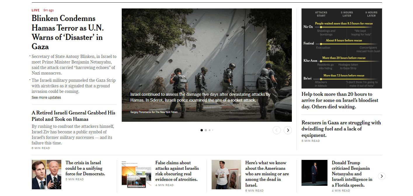
Category Page
- Sub-categories: When you dive into a category, like ‘Business’, you’ll find sub-categories or topics related to that category, making it easier for readers to drill down into specific content areas.
- Featured Stories: Prominent stories within the category are highlighted at the top for easy access.

Category Page (Mobile)
- Simplified Layout: While the main elements remain the same, the mobile version streamlines content for vertical scrolling, ensuring that readers don’t miss out on key stories while navigating on smaller screens.
Single Article
- Social Share Icons: At the beginning or the end of the article, allowing readers to easily share stories on various social platforms.
- Related Articles: Often found on the sidebar or at the article’s end, driving user engagement and prolonging site visits.
- Comments Section: Typically found at the bottom, fostering a community of readers and encouraging discussions.

Single Article (Mobile)
- Readability Focus: The design shifts to prioritize the article’s content, minimizing distractions. Social share icons become more subtle, and related articles appear as users scroll down.

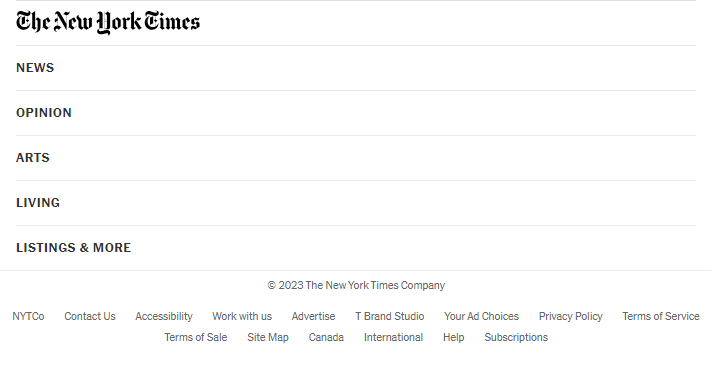
Footer
- Comprehensive Links: Here, users find links to various site sections, company information, services like subscriptions, and policies.
- Newsletter Signup: A common feature promoting engagement and return visits.
Footer (Mobile)
- Simplified & Collapsible Sections: To accommodate the smaller screen real estate, the footer on mobile typically groups links under collapsible sections, ensuring users can still access all areas without feeling overwhelmed.
Content Layout
- Grid Layout: The New York Times often uses a grid layout, especially on the homepage, allowing multiple stories to be showcased simultaneously. This layout is balanced with clear imagery, concise headlines, and white space, ensuring readability.
What Makes Good Website Navigation?
Website navigation is more than just a tool to explore a website; it’s an integral part of the user experience. Good navigation ensures that visitors can find the information they’re looking for swiftly, and it aids in retaining them on the site longer. Here are the fundamental characteristics and components that contribute to effective website navigation:
| Clarity & Simplicity | The primary aim of website navigation is to help users find what they’re looking for without confusion. Clear labels, straightforward language, and an uncomplicated layout are vital. |
| Consistency | Regardless of where a user might be on a website, the navigation system should remain consistent. This ensures that the user always knows where they are and how to move to a different section. |
| Logical Flow | A good navigation system follows a logical order that resonates with the user’s expectations. Group related items together and order sections based on their relevance or popularity. |
| Responsiveness | With users accessing websites from various devices, from desktops to smartphones, it’s imperative that navigation adapts seamlessly to different screen sizes without compromising usability. |
| Highlighting Current Location | It’s always helpful for users to know where they are within a site. Highlighting the current page or section within the navigation can prevent confusion and improve usability. |
| Easily Accessible | The primary navigation menu should be easy to locate, usually at the top or left side of a page. Additionally, sticky menus that remain visible while scrolling can enhance user experience, especially on content-rich pages. |
| Descriptive Labels | Navigation labels should be descriptive enough to convey what content lies behind them. Instead of vague terms like “Services,” a more descriptive term like “Digital Marketing Services” can be more effective. |
| Use of Visual Cues | Icons, different font weights, or color highlights can serve as visual cues, enhancing understandability and guiding users more intuitively. |
| Efficient Dropdowns | If using dropdown menus, ensure they’re not overwhelming. It’s a balance between providing enough information without causing choice paralysis. |
| Fast Loading Time | Even the most well-designed navigation is ineffective if pages take too long to load. Speed is crucial for a good user experience. |
| Search Functionality | For content-rich websites, a search bar is essential. This allows users to quickly find specific information without having to manually navigate through different sections. |
| Feedback Mechanisms | Hover effects, changing button colors, or animations can provide feedback to users, letting them know their action (like clicking a link) has been recognized. |
| Breadcrumbs | Especially useful for websites with deep content hierarchies, breadcrumbs show users their current location relative to the site’s hierarchy and offer a quick way to trace back to higher-level pages. |
| Minimize Dead Ends | 404 pages or broken links can disrupt the user journey. Ensure all navigation elements lead to active, relevant pages, and incorporate helpful features on error pages to redirect users. |
8 Principles for Improved Website Navigation
Good website navigation can make the difference between a visitor staying on your site and leaving in frustration. These eight principles offer guidance to create an intuitive, efficient, and user-friendly navigation experience.
1. Plan Your Page Structure and Navigation
Before diving into design or coding, it’s imperative to plan. Understanding the content you have, how it relates to other pieces of content, and how users might want to move between them is the foundation for good navigation.
- Site Mapping: Start by creating a visual representation (a sitemap) of all your pages and how they interrelate.
- User Flow Analysis: Consider how a user might naturally want to navigate your content. Which pages are likely to be visited first? Which ones are secondary?
2. Follow Established Standards
While creativity is essential in design, certain navigation standards exist for a reason – users are familiar with them.
- Positioning: Main menus are often at the top or on the left. It’s where users expect them.
- Symbols: Symbols like the hamburger menu or the magnifying glass for search are universally understood.
3. Use Your Users’ Vocabulary
Using terminology that’s familiar to your users, rather than internal jargon, ensures clarity.
- User Testing: Testing navigation terms with actual users can clarify which labels are most intuitive.
- Feedback: Allow users to give feedback about the site’s navigation for continuous improvement.
4. Use Responsive Menus
In a mobile-first world, it’s crucial that your navigation adapts to various screen sizes without losing functionality.
- Collapsing Menus: On smaller screens, menus can be collapsed and accessed via the familiar hamburger icon.
- Prioritize: On smaller screens, essential navigation items should take precedence.
5. Take Advantage of Your Footer Menu
The footer is an often-underutilized navigation tool, perfect for secondary navigation links.
- Information Hierarchy: While primary links belong at the top, secondary or tertiary links can find a home in the footer.
- Include Essentials: Contact info, terms and conditions, or site maps are commonly found in footers.
6. Use Color and White Space to Separate Navigation from Other Elements
Visual clarity is crucial for user-friendly navigation.
- Contrast: Navigation elements should stand out but not clash with the site’s overall design.
- Grouping: Related items can be grouped closer, with white space separating different groups.
7. Avoid Dropdown Menus
While dropdowns can seem like a neat solution to save space, they can be problematic, especially on mobile devices.
- Visibility: All navigation options should be visible without requiring hover actions.
- Alternative Solutions: Tabbed navigation or mega menus can sometimes serve as more user-friendly alternatives.
8. Flatten Your Structure
Deep hierarchies can confuse users. The flatter your site structure, the fewer clicks a user needs to get to their destination.
- Limit Levels: Aim to have content accessible within 2-3 clicks from the homepage.
- Categorization: Proper grouping can reduce the need for multiple layers.
Website Navigation Best Practices
Optimizing the navigation of your website isn’t just about aesthetics or modern design trends; it’s fundamentally about the user experience. When visitors can navigate your site easily and intuitively, they’re more likely to stay longer, explore more content, and convert into loyal customers or subscribers. Here are some best practices to keep in mind:
1. Be Consistent
Consistency is key to preventing user confusion. Once a visitor learns how your navigation works, they shouldn’t have to relearn it on a different page.
- Uniform Layout: Whether it’s the placement of your logo, menu items, or search bar, keep these elements in consistent locations throughout your site.
- Consistent Naming: If a link is labeled “Blog” on one page, avoid renaming it to “Articles” on another. Stick with one term for clarity.
2. Design for Every Screen Size
With an array of devices available today, your website needs to look good and be navigable on all of them.
- Mobile Optimization: Many users will access your site from mobile devices. Ensure menus are easily expandable and that touch targets (like buttons) are adequately sized and spaced apart.
- Test on Multiple Devices: Use tools or manually check your site on different devices and browsers to ensure navigation remains smooth.
3. Make the Most Important Information Accessible
Your visitors shouldn’t have to hunt for the information they want. Prioritize content based on user needs and business objectives.
- Prioritize Menu Items: The most crucial pages or actions (like “Shop” for an e-commerce site or “Services” for a business site) should be front and center.
- Limit Primary Navigation: Overloading your primary navigation can overwhelm visitors. Stick to essential items and utilize sub-menus or footer navigation for secondary content.
4. Add Breadcrumbs
Breadcrumbs are a secondary navigation scheme that reveals the user’s location in a website’s structure. They’re especially useful for sites with a significant amount of content.
- Hierarchy Display: Breadcrumbs show the path from the homepage to the current page, providing a clear hierarchy.
- Easy Backtracking: Users can easily go back to a previous page or section without using the back button on their browser.
- Enhanced SEO: Breadcrumbs can also help search engines understand the structure of your website better, potentially boosting your SEO efforts.
Website Navigation Menu Trends
The digital world is always evolving, and website design is no exception. As user behavior changes and technology advances, designers have found new and innovative ways to present website navigation to enhance user experience and increase engagement. Let’s delve into some of the current trends in website navigation menus:
Expandable Categories in Full-Screen Mobile Menus
As mobile devices continue to dominate web browsing, designers are looking for ways to display extensive site content without overwhelming a small screen.
- Full-Screen Experience: When activated, the menu takes up the entire screen, providing users with a clear, distraction-free navigation experience.
- Expandable Sub-Menus: Rather than having all options displayed immediately, categories can be expanded to show sub-categories or pages, allowing users to drill down to more specific content.
- Benefits: This design trend maximizes screen real estate, provides a clean look, and can potentially improve user engagement on mobile devices.
Floating Header Menus
Floating header menus, also known as “sticky” menus, stay visible at the top of the browser window as users scroll down a page.
- Persistent Access: This design ensures that users always have immediate access to the site’s primary navigation, no matter where they are on the page.
- Enhanced User Experience: By reducing the need to scroll back to the top to navigate, sticky menus can decrease user frustration and improve the overall browsing experience.
- Variations: Some floating menus might minimize or change form as users scroll to be less intrusive while maintaining functionality.
Overlay Dropdown Menus on Desktop
Moving away from traditional dropdowns, overlay dropdown menus offer a more immersive experience by displaying menu options in a full or partial overlay.
- Focused Interaction: When users hover over or click a menu item, the dropdown content overlays other page content, allowing users to focus solely on the navigation options.
- Design Flexibility: This trend provides designers with more space and freedom to create visually appealing dropdowns, often incorporating images, icons, and even animations.
- Enhanced Clarity: By isolating the dropdown content, users can more easily digest and navigate the presented options without being distracted by underlying page content.
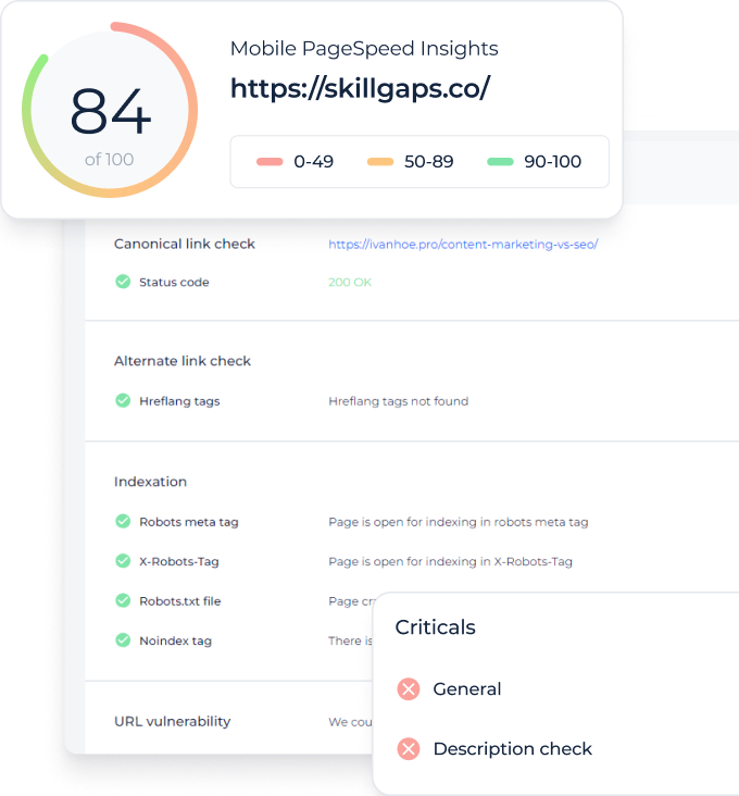
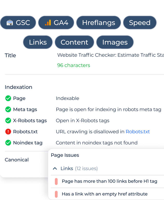
Audit Your Website with Website SEO Checker & Audit Tool by Sitechecker
The Site Audit tool provides a thorough analysis of your website, identifying areas for improvement such as SEO optimizations and broken links. Its user-friendly interface simplifies site auditing, making it accessible to all users and ensuring your website performs optimally.
The tool offers advanced features like detailed crawl reports, backlink analysis, and on-page SEO evaluations. These in-depth insights are key to refining website strategies, improving organic rankings, and enhancing user experience. Try it to see the positive impact on your website’s performance.
Unleash Your Site's Potential!
Discover, refine, and optimize with our comprehensive Website Checker & Audit tool.
Conclusion
In the digital landscape, the importance of intuitive website navigation cannot be overstated. It serves as the roadmap for users, guiding them through the vast content a website might offer and ensuring they find what they’re seeking. With ever-evolving design trends, the key remains to prioritize the user experience above all. While innovative designs and trendy layouts can enhance a site’s appeal, its core functionality should remain clear, accessible, and user-friendly. In essence, effective website navigation merges the science of user behavior with the art of design, ensuring that visitors not only stay longer but also return, transforming casual browsers into loyal users.